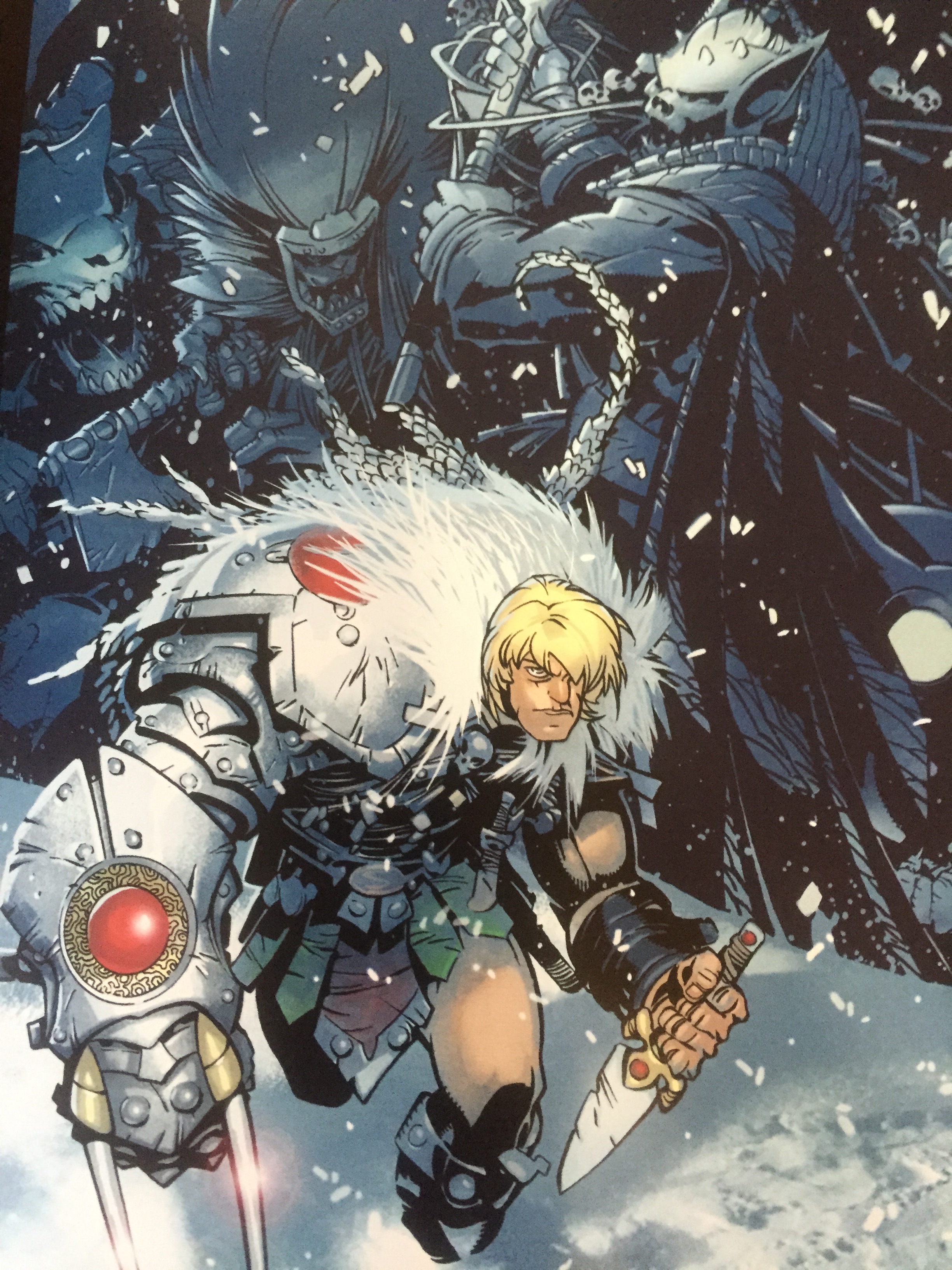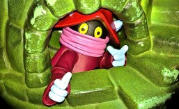
Masters of the Universe Minicomics Collection

I reviewed the Masters of the Universe Minicomics Collection back in May, after having a tough time getting my hands on a copy.  Since then, I have slowly read through every page, and can give you more of a review of the contents rather than just the product.

VINTAGE MASTERS OF THE UNIVERSE

First thing first.  “Miniternia” is definitely a favorite universe of mine now.  I was aware of it, and had read a few books from it.  When I was a kid, these books just confused me because they were so different from what I was used to (the Filmation cartoon.)  But reading these as an adult, there is a definite vibe to those books not found anywhere else.  There are comparisons to Conan the Barbarian, but as a Conan fan, I don’t think so.  Miniternia is a great comic story…an innocent story in a way, and in a way more pure of a story from a writers standpoint.  Mattel gave the writers carte blanche, as long as they depicted the toys.  The barbarian He-Man is awesome, and the miniternia Skeletor is more insane than his other versions.

I remember hearing that there were fundamentalist Christians boycotting and protesting He-Man and the Masters of the Universe.  I was vaguely aware of this as a child (I AM a Christian, and was raised in a Christian home.)  But as an adult, I heard people talk about it on the Roast Gooble Dinner podcasts.  I can see how, after reading over half of the book, I’d bet the word “demon” and “devil” were invoked in almost every single story!  Watching the Filmation show, this also comes up…I don’t know if that was daring on the part of the writers, or what?


You can clearly see transitional guidance between Miniternia and the comics that more closely resembled Filmation shows.  The stories become even flimsier sometimes, and highlighting of the products becomes central, rather than story and character development.  Then one day, out of nowhere, the Evil Horde becomes more prominent.  As a kid, the Horde annoyed me because to me, Skeletor was supposed to be the ultimate baddy.  And Hordak was apparently his teacher.  I came to love the Horde as much as anything else in MOTU, but I can see why I felt that way.  Mattel began to push the Horde in the mini comics, and there were more Horde figures on the shelves, and the commercials depicted the Horde more.  They were supposed to be another faction…which worked well in a house with three kids.  Hordes became She-Ra’s main villain, but I didn’t watch She-Ra…(yeah, right!)

I remember the Snake Men story vibrantly from when I was a child…my oldest brother was very interested in them.  My mother (and grandmother) are deathly terrified of snakes, so…I never really thought of them as another faction…just as a side team that worked for Skeletor, which is exactly how the mini comics portray them.  Throw in that Kobra Kahn and Tongue Lasher appeared on Skeletor’s team on the Filmation show working with Skeletor, and you can see why.  It was the Mike Young 200x show that really highlighted them as another team…an even deadlier team that Skeletor’s bunch.

Of all of the things about He-Man and the Masters of the Universe, I rarely ever complain. But now is my chance.  The “Three Towers” really annoy me.  It is one of the rarest toys to be found, and is therefore a valuable item.  But I don’t care.  The whole concept is STUPID.

Lets replace Castle Grayskull and Snake mountain with two smaller versions, and put a stupid lion tower in the middle.  We can connect the whole universe together with a roller coaster thingy.

There are SOO many reasons why I dislike the three towers.  It is billed as “playset Eternia.”  So the whole planet of Eternia can fit into one Playset?  This was EXACTLY how it was depicted in the minicomics.  I heard someone call it “Grayskull 2.0.”  Castle Grayskull was supposed to be this ultimate place of power.  But the Three Towers were meant to supplant all of that.

Eternia must be about the size of Spartanburg or upstate South Carolina…It seems it takes King Grayskull in the Mike Young cartoon about three days to cross the whole place.  Maybe the three towers fit that scheme?  There is a map in the He-Man art book, it came with certain characters if you subscribed to the “Club Grayskull” or whatever.  That map shows the towers stretched out across a huge central continent.  That MIGHT be plausible.  But why would they all connect together by a vehicle?  And if “Viper Tower” was meant to be Snake Mountain (It DID more closely resemble the cartoon version), and Grayskull tower was supposed to be the base for the good guys…just why?  I believe Mattel sensed that the vintage line was coming to an end, and were getting desperate.

SHE-RA, PRINCESS OF POWER

The She-Ra comics were pretty cute.   One of the interviews mentions that there were strict guidelines for drawing female characters.  That is apparent…the depictions of all those she-ra women are not sexy at all.  Sometimes they are child-like and pretty.  The She-Ra comics “de-evolve” from Minicomics format into Storybook format.  There is an incorrect footnote in the first She-Ra story, that says the Evil Horde is not mentioned in the comics ever again after the first one.  But that was inaccurate as the final two She-Ra stories have Catra mentioning the Horde, and also depict Horde troopers.

These books give you less of a sense of “the great rebellion,” and more just sweet little stories.  Catra, “the jealous beauty” is the main villain in these stories, but she can’t really do anything worse than children do to each other, it seems.  She steals a treasure box, she crashes a party by spraying everyone with water.  She spreads a rumor.  SERIOUSLY?

I made it through all of the She-Ra books, and rather enjoyed them.  But they are far too shallow.  I enjoyed the way they usually depicted She-Ra with the mask and Adora with the headband…A device you never saw on the cartoon.  And I thought the story of “Crystal Dimension” was interesting, where Swift Wind was transformed into a crystal version of himself.

I never really got a sense that The Crystal Castle was a She-Ra’s place of power?  It seemed to be a place where she and her friends lived instead.  The enchanted forest was there.  But Catra seemed to be homeless.

THE NEW ADVENTURES OF HE-MAN

As a child, I was just getting “too old” for toys as New Adventures came out.  My oldest brother wasted no time in getting a few toys, but I don’t think I ever saw a single episode of the cartoon.  I DID remember reading the comic, however.

I wasn’t aware that there were only four comics ever produced for that toy-line.  I DID know that it was short lived.

Basically, the vintage He-Man and Skeletor characters translated smoothly over to the futuristic versions, with Skeletor getting burned badly while witnessing Adam transform into He-Man, and having to “fix himself” with bionic parts.  The only idiotic thing is that He-Man’s sword is already a “techno sword.”  They should have been able to draw the classic sword in those few panels.  I always thought it was kind of stupid that the power of Grayskull had to be transferred into that starship…Really?  The art and the storytelling in these books is good, but different from the earlier ones.  As we read through all of these, we really see Bruce Timm’s art style mature up.  Once, He-Man even looks like we would see Batman on the nineties cartoon!  (Not in a New Adventures book…one of the final vintage comics.)

200x COMICS

I almost forgot!  The singular “pack-in” comic is included here.  With Val Staples and Emiliano Santalucia forming the bond that would become MV Creations, (and eventually break apart into the saddest schism maybe in the whole brand.) There are two comics here, one that never made it to print.

These are similar to the 200x comics that Image and Cross Gen would publish, but shorter and having a lot less content.  The art is just about exactly the same.  Emiliano is great!  (The second book was drawn by someone else, who somewhat emulated Emiliano’s style.)

MASTERS OF THE UNIVERSE CLASSICS MINI COMICS

Before the collection, I had no opportunities to read these stories.  I heard fans complain about them because they leave out a lot of story details that should be filled in.  The first one is a modern retelling of the first vintage Preternia book, and the following two pull together the entire story to include even the New Adventures.  An interesting detail, this story portrays He-Ro as the originator of the Power of Grayskull when he passes the Sword of He over to King Grayskull in death.  Funny how it ended, with a remark about building a castle and naming it after He-Ro.  (It would be named Castle Grayskull!)

I also thought the twist where Skeletor gets the techno virus from Bionatops in order to transform into his New Adventures form was also fun!  I was confused about King Grayskull, King He-man (he makes an appearance!) and King Miro.  What was that all about?

The art on these books are terrifically modern, and yes, they COULD have gave us more story.  I see how these serve the same purpose as the earlier mini comics…justify more toys.  They even introduced members of He-Ro’s team that have never been produced, simply to spark interest.  Ultimately, mini-comics aren’t the best vehicle for telling a grand story…they are a place to jump off and use your imagination.  And since Scott Neitlich was the guy in charge of these, that statement sounds exactly like something he would have said.

EXTRAS

The Mini-Comic collection contains lots of interviews…most of them seem to have come directly from Roast Gooble Dinner podcasts.  Maybe the DID actually re-interview some of the people…and maybe these are redacted and edited versions of those interviews.  I enjoyed reading them all, thought they didn’t teach me much of anything new because I had already heard it from the mouth of the person being interviewed.

So, just when I think James Eatock has astounded me with his intense Fanhood and knowledge of He-Man and the Masters of the Universe, he surprises me yet again!

James “Bustatoons” Eatock apparently is the owner of a discarded and never produced mini comic, which is published at the back of this book.  It apparently never made it to the coloring stage.  I wonder if more stuff like this is out there?  And what a find…AND how does someone like him find all this stuff?  The comic is apparently the supposed pack-in with Flying Fists He-Man…it has some details issues, which might be why it was scrapped.  But it is a terrific read.

And finally we have an outline of a never-produced mini comic, which would have featured Faker prominently.  It is cool to read over, and I wonder if any fans who are good artists have made this book as fan art?

I enjoyed reading the Minicomics collection, and recommend it to anyone who is a fan of He-Man…a great value at under $30.  Reading this kept me from purchasing other comics for awhile…I always had something new to read, and this will make its way to my office at work to read in my “spare time.”


SpartanNerd Unboxing and Review…Masters of the Universe Classics Evilseed

When Evilseed went on sale, I decided I would get him, only to be held off by circumstances.  I thought I would have to catch him on Cyber Monday, maybe.  But he remained on sale…perhaps he didn’t sell out?  Regardless, I ordered mine, and over a week later he arrived in this mailer.

IMG_7110

I quickly opened it, to reveal the sealed packaging.

IMG_7111

IMG_7112

The front of the box has a nice window that has Evilseed on display.  You can clearly see his accessories…he has the tag line of “Evil Master of Plants.”  And that’s about it.  Just from seeing here…he is quite incredible looking, if you are a MIC collector.  But that’s not me.

I flipped the box over, and check it out!  For the first time, I own all of the characters on the back of the box!

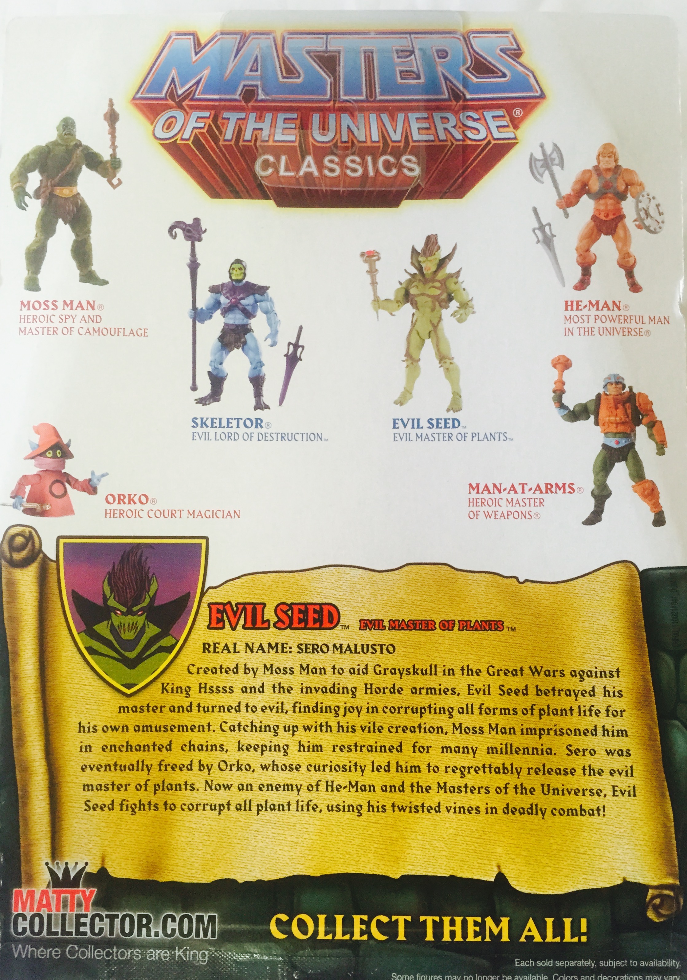
Evilseed gets a new “real name” and bio, photographed here for you, oh Hub City Geeks.  But I’m just throwing away the package.  Notably, the bio says that Moss Man created Evilseed.  A good story.  But I prefer the Mike Young version that this figure is based on.

IMG_7113

Removing Evilseed from the package isn’t difficult.  He did have some rubber bands, and the vine-whip accessory had to be wrangled out of the blister.  But other than that, it was all good.  Notably, there was no “smell” associated with this figure.  (If you will recall, Moss Man” had a very strong pine scent.)

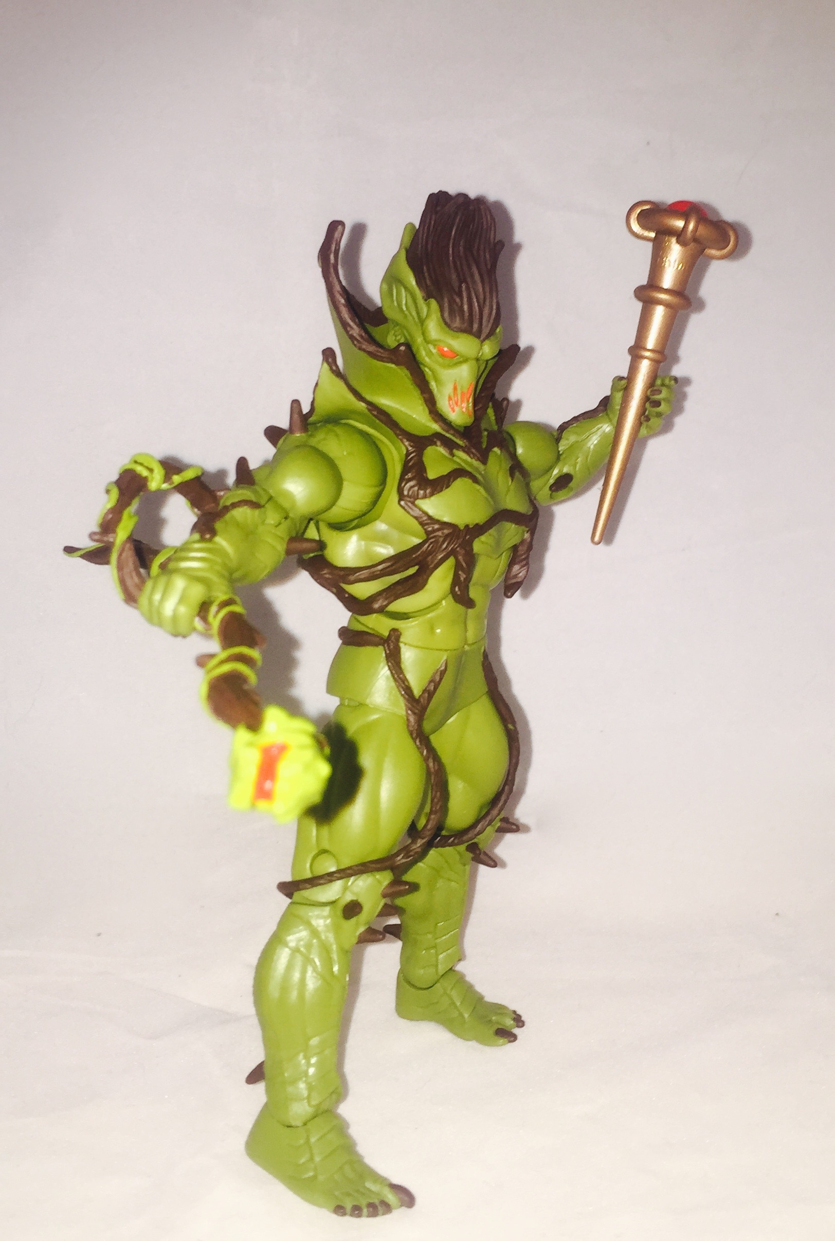
Here he is in the first pose I made for him.

IMG_7114

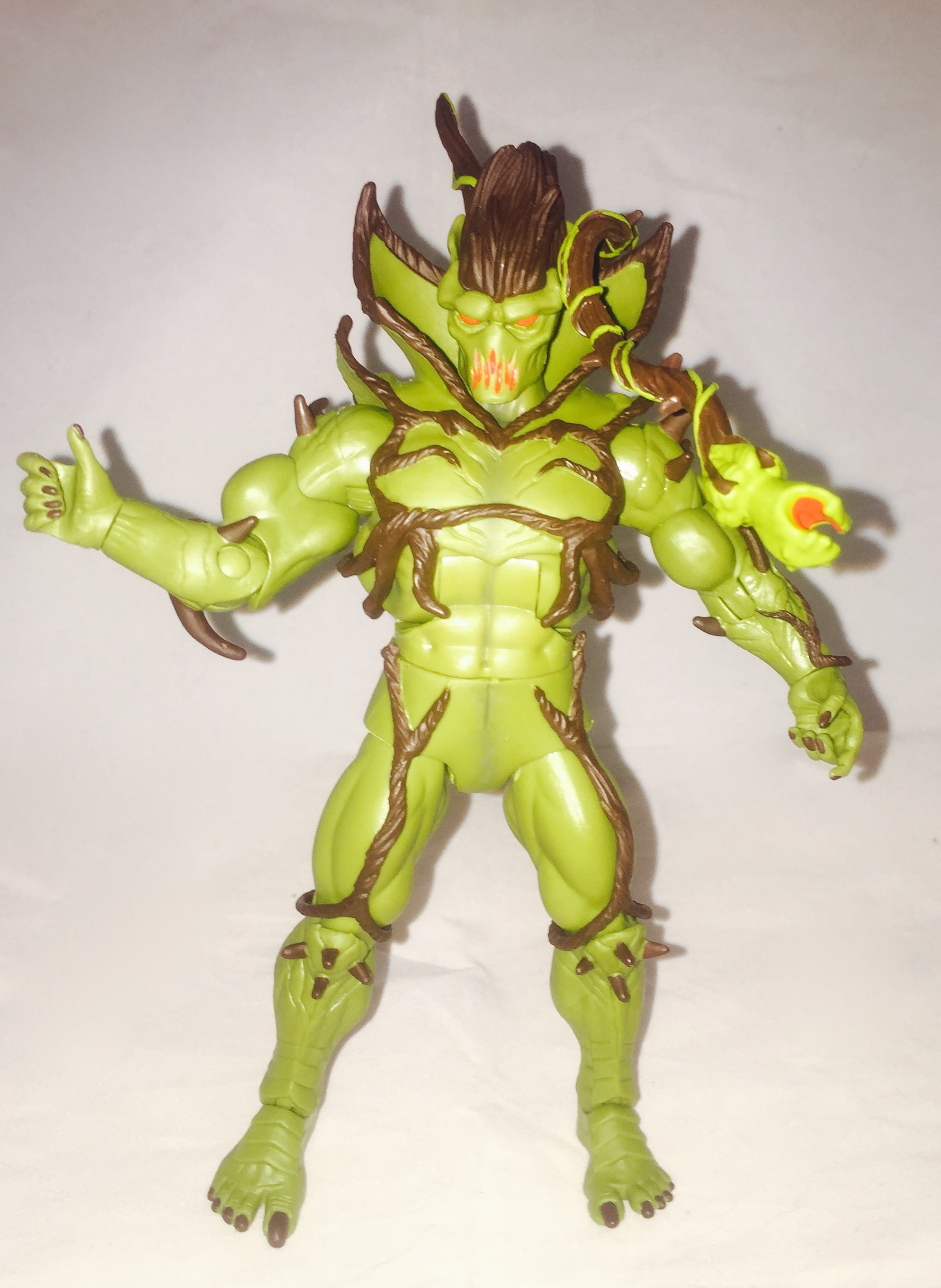
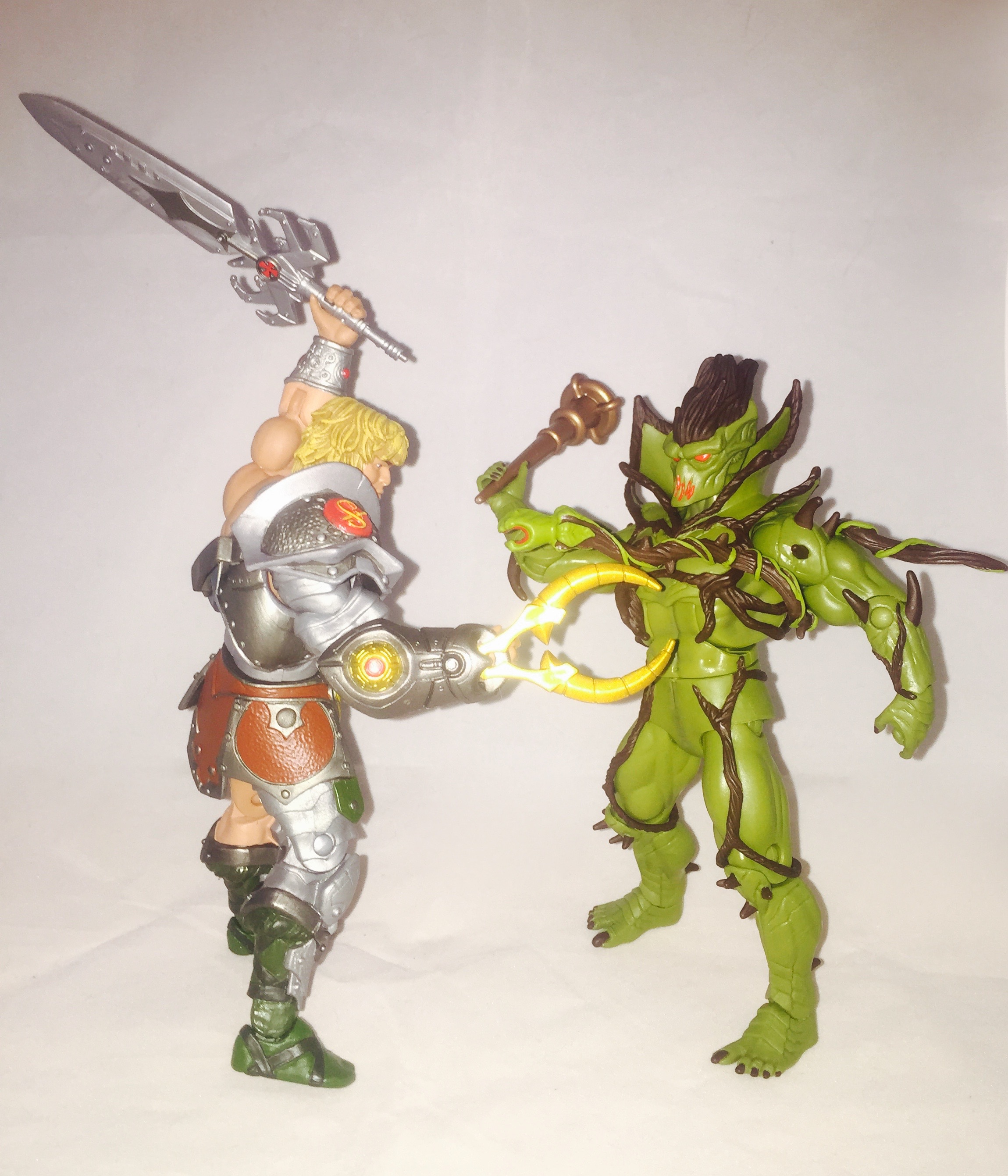
Evilseed has a terrific sculpt.  When I first saw this revealed, I knew I had to get one to go with my Moss Man.  The Four Horsemen hit a homerun every time!  Check out all of the little scaly looking parts.  Check out the thorns and vines.  I went back and watched “Orko’s Garden,” “Council of Evil” part 1 & 2, and “The Last Stand” today to check my facts.  I have ready other reviews, and there is some criticism of this version being too bulked up.  In the MYP cartoon, his IS skinner at the torso and waist, but the entire upper body looks almost perfect.  The thicker torso here is welcome, if you ask me.  While they could have used some amalgamation of Lizard Man’s parts, I think this was the way to go.  It doesn’t look wrong at all.  Maybe he’s been working out?

Evilseed has that terrific sculpt, and also the standard articulation that all of the other MOTUC figures have.  Rocker joint ankles, hinged knees, ball jointed shoulders, waist twist, ab crunch, ball jointed shoulders, bicep swivels, hinged elbows, a swivel wrist, and a ball jointed head that can rotate freely and be swapped out.

The cool new addition to the articulation is the way the vines look on the legs.  They are made of a more rubbery material, and are a continuation of the waist piece.  These come down and loop around the knees, which means Evilseed has both loose vines on his knees and articulation there!

IMG_7118

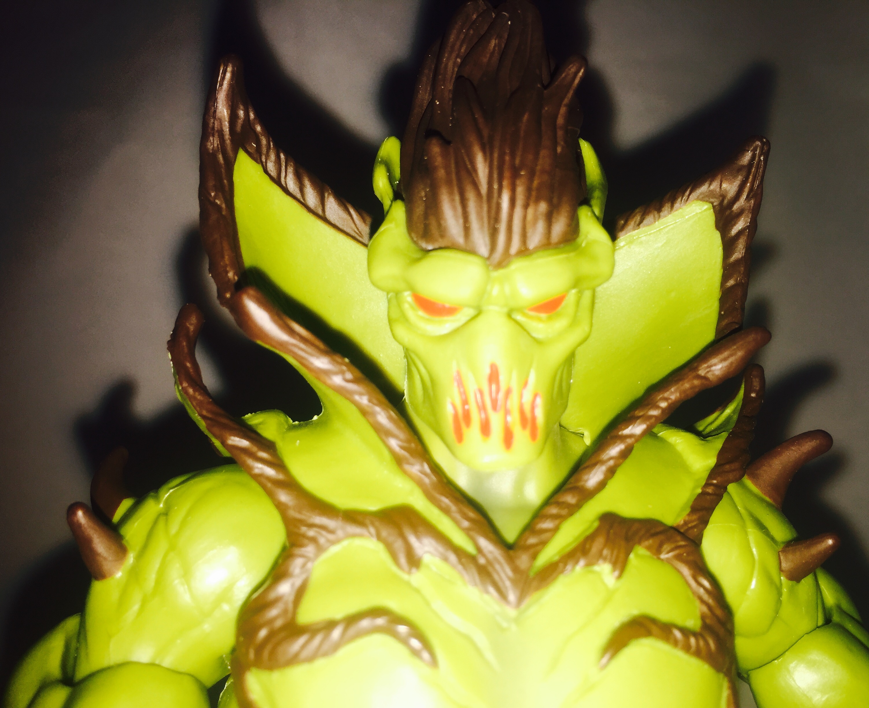
How about this face!  If he had a mother….

For real, this is one of the most evil faces ever sculpted for MOTUC.  Evilseed’s overall green color is a stark and EVIL contrast to this sinister eyes and mouth, which are bright red in color.  This is the only red on the figure…everyghing else is green, black, or brown.  This highlights the evil human nature of the figure, and even makes him appear alien.  Where his hair should be, we have this bunch of creepy looking vines/grass/seaweed.

IMG_7117

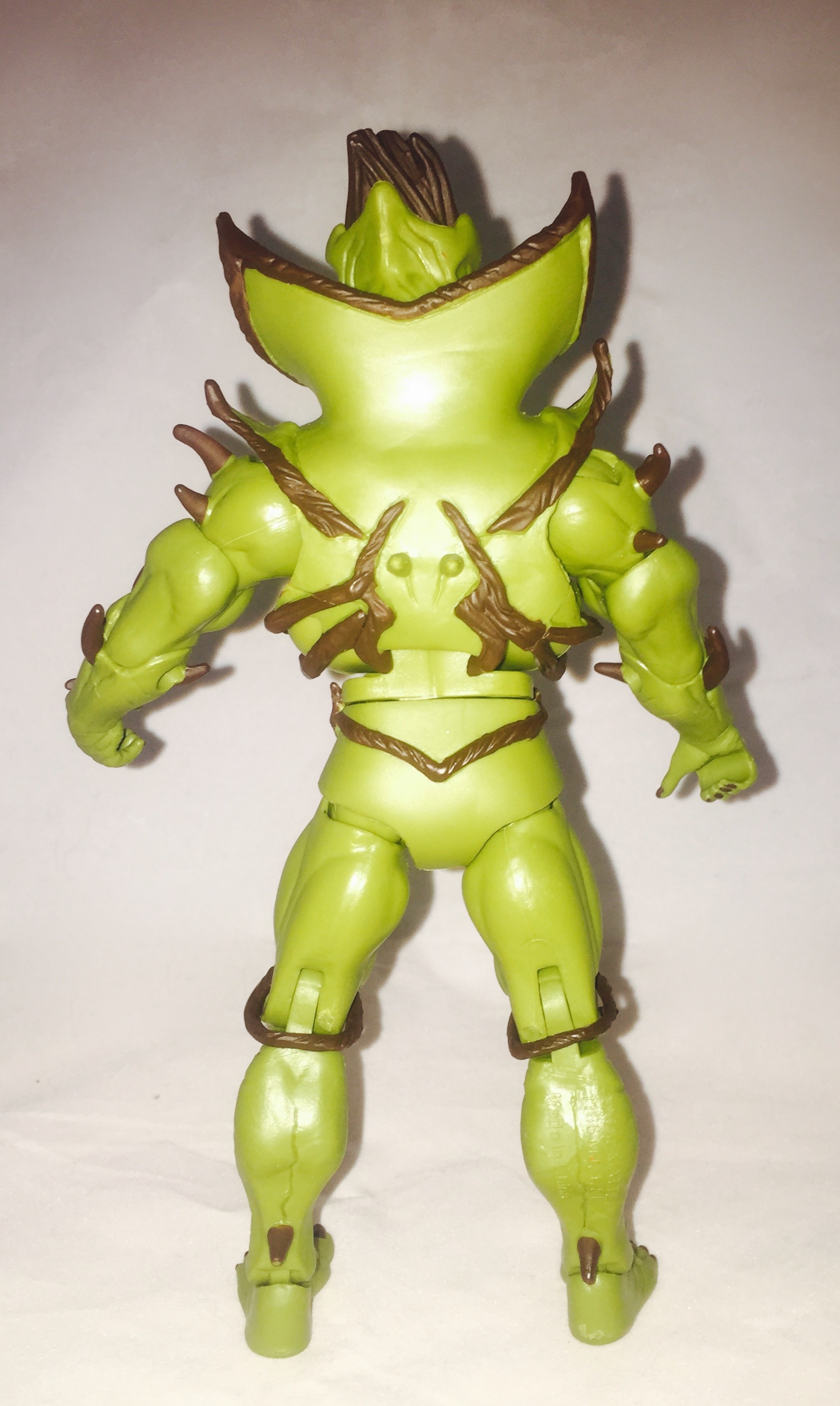
The torso is evidently just the same sort of Torso that He-Man or most of the others have.  But this time there is non-removable armor sculpted with he specific viney details demanded of Evilseed.  There is a very striking collar that comes up beside his head on both sides, giving him a plant/vampire look.  You can see the vine details on his back, and also two mysterious green thorns in the middle of his back.

IMG_7116

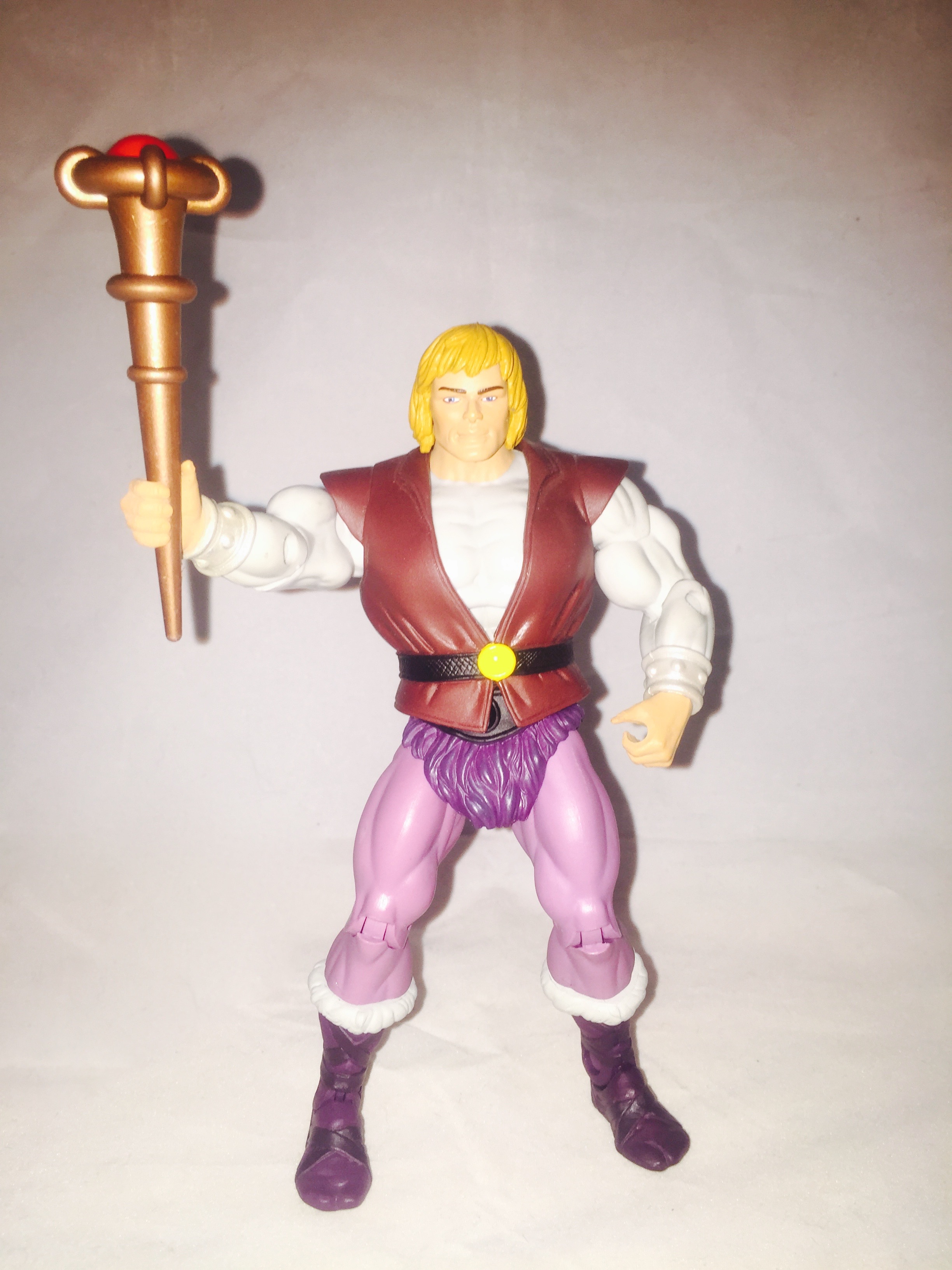
One of Evilseed’s two accessories is “The Scepter of Power.”  My research tells me that this Filmation artifact was in the episode, “The Magic Falls.”  I don’t personally own this episode on DVD.  I started to watch it on YouTube, when I discovered that all of those videos appear to be playing at too fast a clip, giving a chipmunk effect to most of the music and voices.  It was unbearable to me.  And As a music teacher, the difference in key created by the effect was just too jarring. Anyways, Evilseed looks really good with the Scepter of Power.  It is supposed to be for King Randor, but since I am not a fan of “Throne Room Randor” and, nor the Burger King version of the regular Randor, I decided to settle on letting Prince Adam hold it.  (He would inherit it anyway, right?)

IMG_7130

Not bad at all.

IMG_7119 IMG_7120

The other accessory is this vine-whip creature.  You can position it almost anywhere on his body.  I think I might try and order more of these!  I think he should have come with more of them.  Watching the MYP version made me realize how ridiculous and over-exaggerated the vines that Evilseed controlled were.  But it worked really well in that cartoon.  Evilseed even made T-Rex sorts of plants, and hydra plants also.  He also would use them to transport around on…Mattel could have given us an interchanging waist so we could display him as seen transporting around on a “trunk” of vines!

In getting this figure, one of my aims was display him in battle with Moss Man.  Here is my first attempt!

IMG_7123

Even with the “plant god” head on, Moss Man appears to be from a different line entirely.  Both are green, but the flocking on Moss Man blurs his details.

IMG_7124

Evilseed looks pretty good with Moss Man’s weapon, but the seed-bag armor with knife doesn’t fit properly across Evilseed because of the collar piece of the armor.  It fits loosely around his waist, which is something I do with Moss Man sometimes.

It might be better to use it to imprison him…

IMG_7127

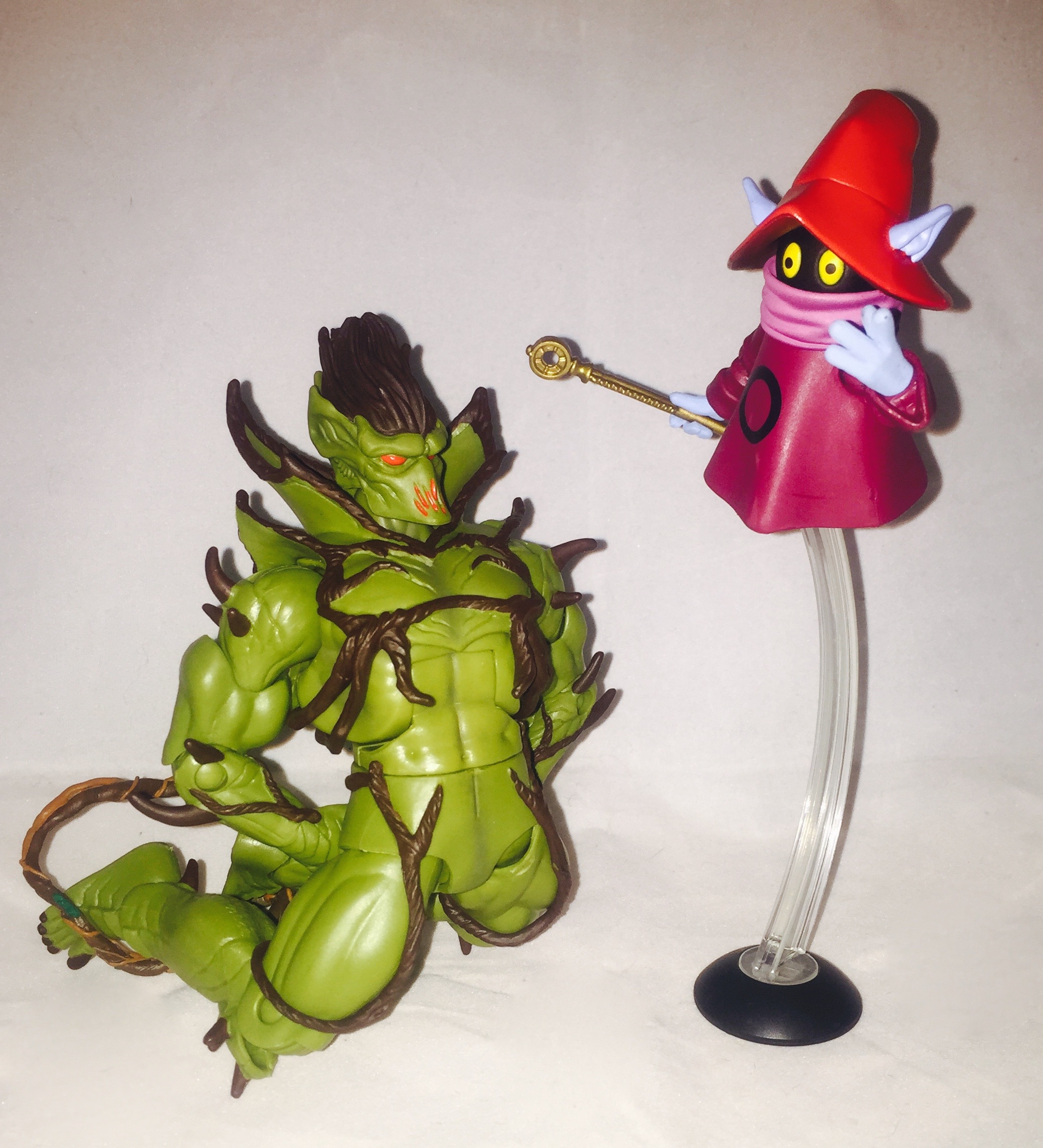
Heheh…looks like Orko is going to set him free…

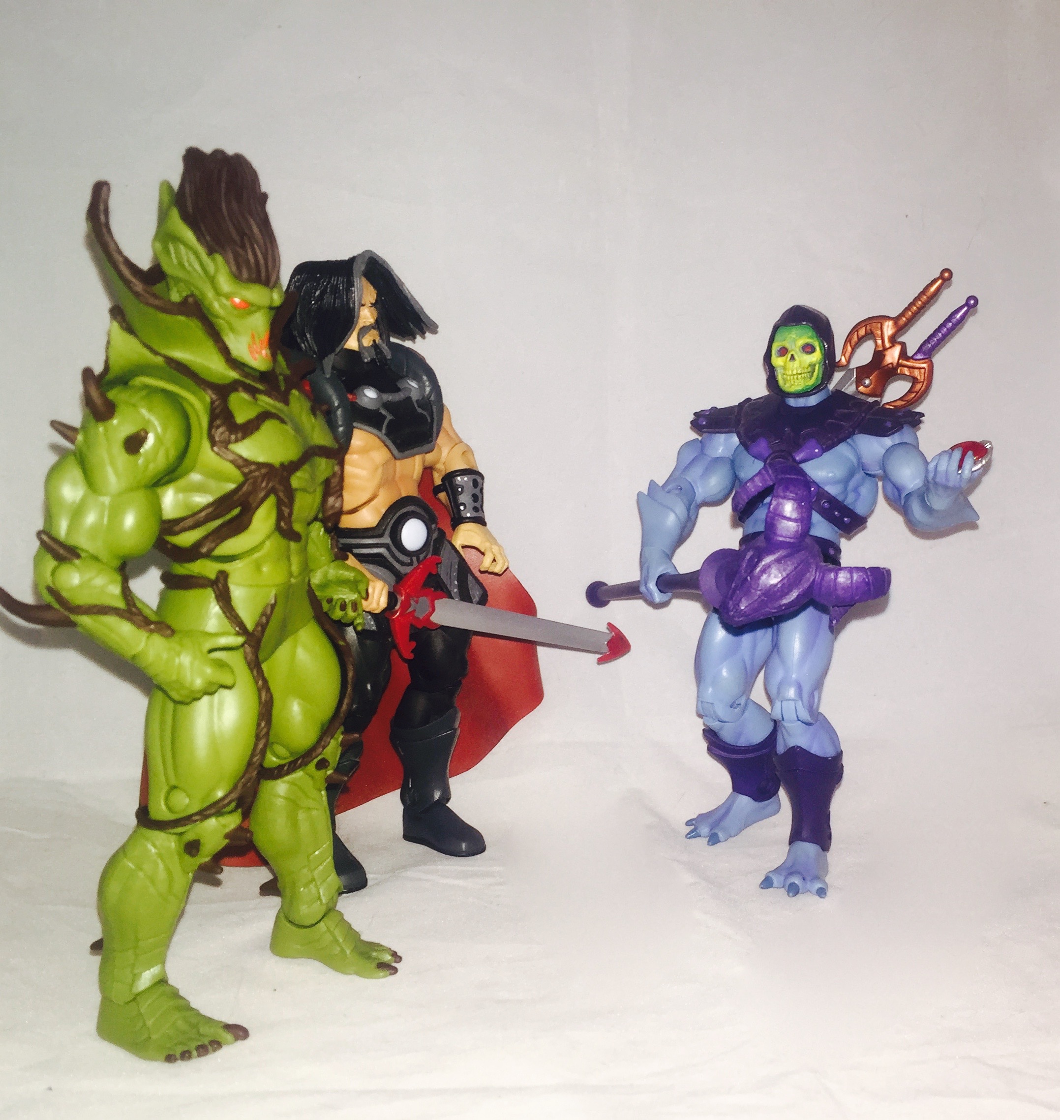
Evilseed was a part of Skeletor’s Council of Evil…We can compare Evilseed to Count Marzo and Skeletor by reenacting a scene from the cartoon.

IMG_7128

IMG_7121

IMG_7122

SpartanNerd Rating of Masters of the Universe Classics Evilseed.

Evilseed has terrific sculpting.  He is highly articulated, even specifically for his figure.  (With the vines around his knees.)  His paint looks good, and there was no “pee plastic” smell like I detected from King Hsss and Snake Armor He-Man.  He comes with two accessories…the only complaint I can level is I wish we had MORE vines.  But this can be easily done.

So I give MOTUC Evilseed a 5/5!  I am not the least bit disappointed in this figure.  Every detail matches my specifications!  There are some people who complain that this isn’t Filmation’s “turnip head” version.  But I don’t even like that version…it was even a reason I might not subscribe to that little add-on sub.  This 200x version looks evil, not goofy.  He is ready for battle…ready to kick some plants!

The SpartanNerd gives Masters of the Universe Classics Evilseed a 5/5.  Do you agree or disagree?  Let me know in the comments!

SpartanNerd and SpartanTeen Review…Neo Zeon Mobile Suit MSN-06S Sinanju “Ver-Ka” (Titanium Finish)

IMG_6762

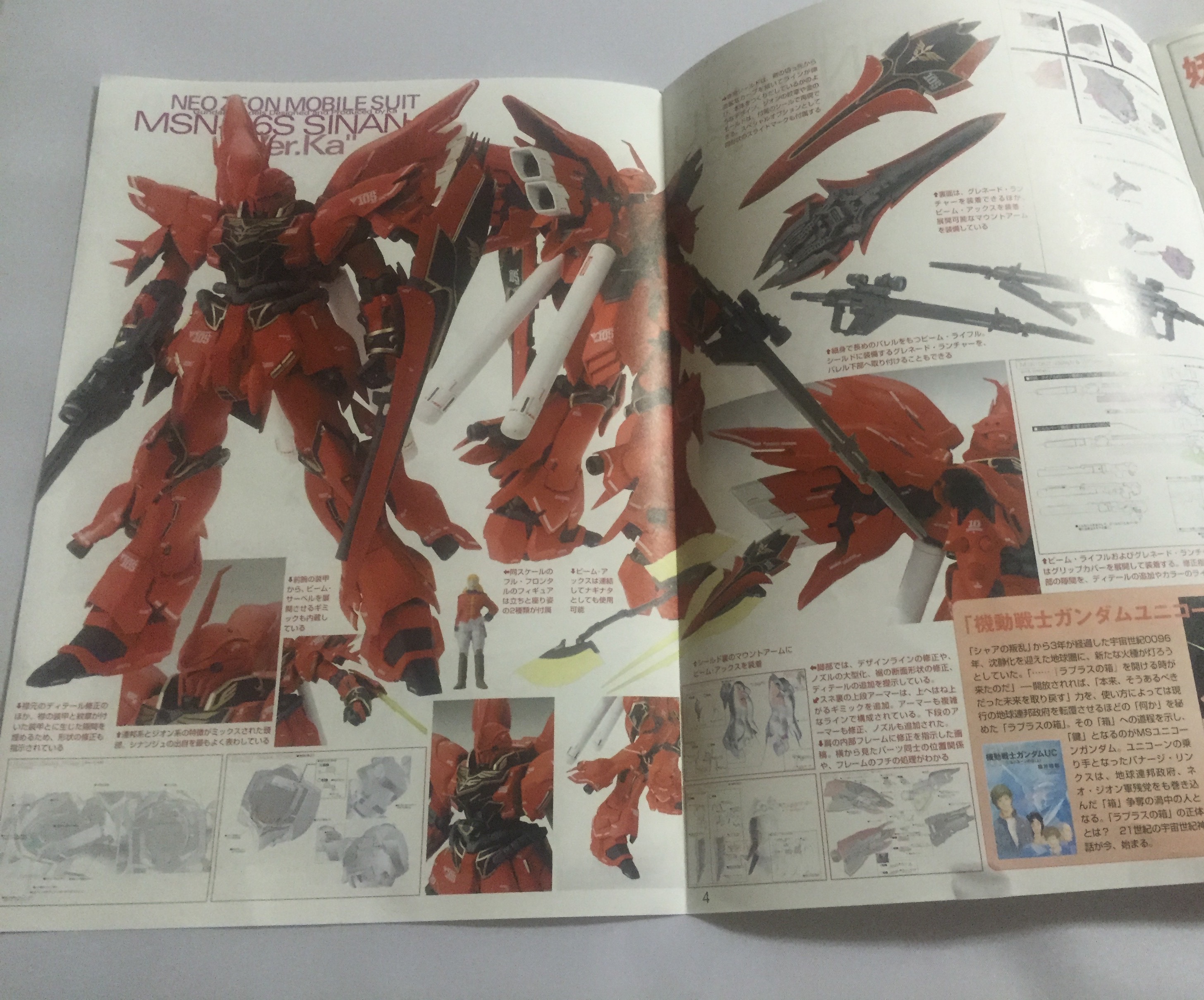
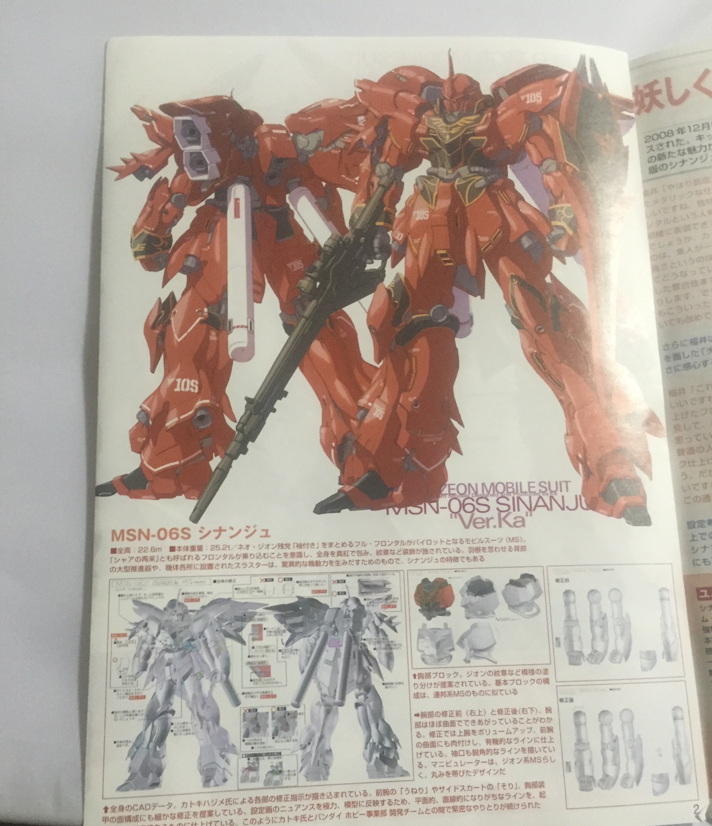
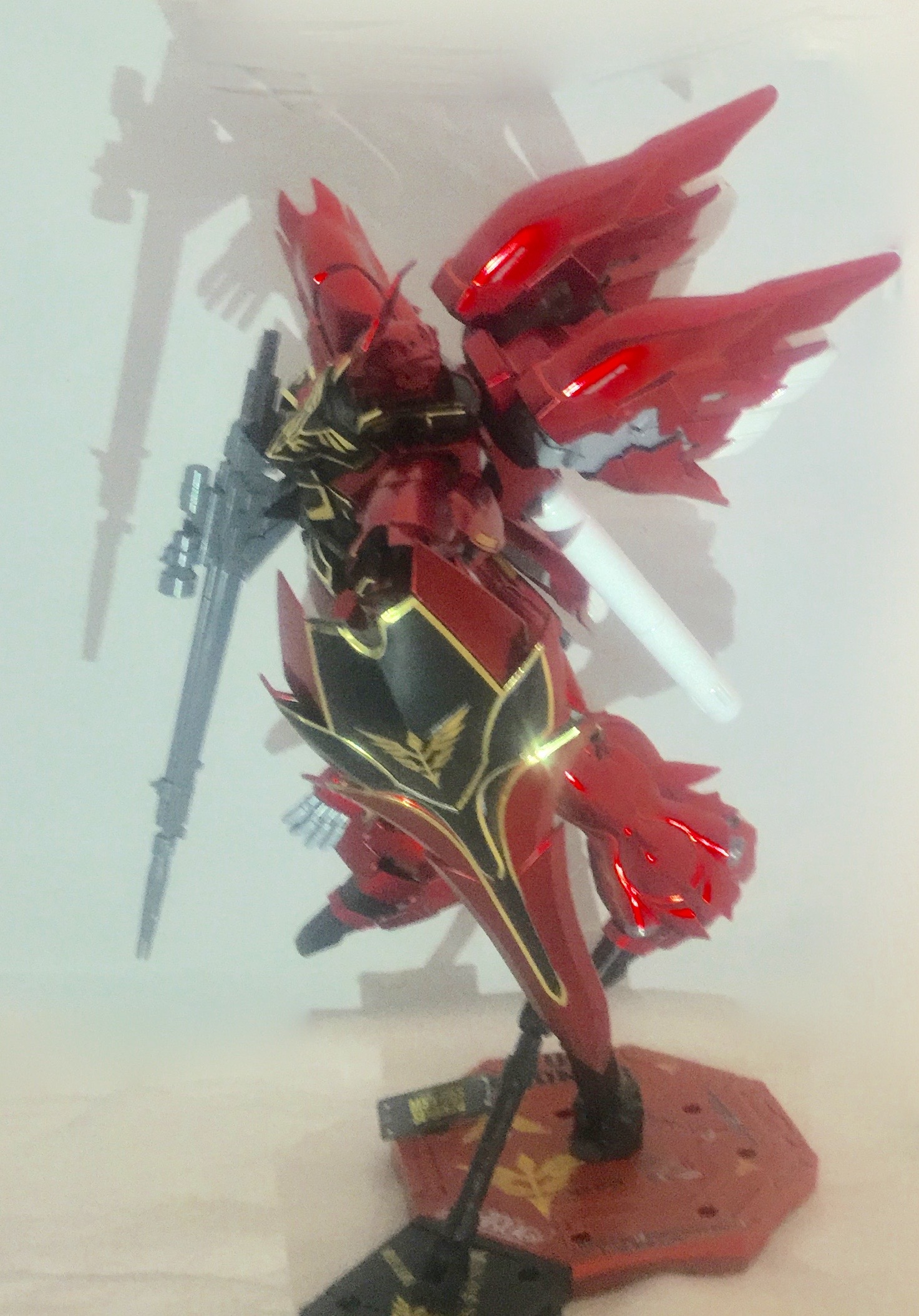
Of all of the Gundams we have reviewed, the Sinanju is the most impressive.  In several ways.  This Gundam has a “titanium finish,” basically vac-metal plastic.  It makes it shine!  Combine this effect with the size of the figure at Master Grade 1/100 scale and the many accessories and even an additional stand, and you have an incredible item.  Above is the box.  And longtime readers know that the SpartanNerd really likes his foil!

This item cost $140, and we purchased the stand for an additional $20.  (The stand is usable with most if not all Gundams, but is detailed specifically for Sinanju Ver-Ka.)  This is a special edition, with the vac-metal.  The normal Ver-Ka would cost around $80.

IMG_6763 IMG_6765 IMG_6764

The box is almost entirely in Japanese.  As well as the instructions.  This is commonplace for basically every Gundam we have built.

IMG_6767 IMG_6769 IMG_6770 IMG_6771

Above is the instructions for the decals and stickers.  The SpartanTeen used the regular sticker decals, rather than the water-slide decals.

I am going to show the Gundam in pieces, sort of.  There is so much here I had to “cull down” the amount of photos.

IMG_6666

The head really shows the small details.  The two “holes” on the side of the mask are meant to be vulcan cannons!  You can see the vac-metal and the plain gray plastic.  The crimson color goes well with the flat gray.  There is an eye detail that can’t really be seen because of the size and impressiveness of the rest of the head.

IMG_6749

Here is the backpack, showing all of its details in 3X faster mode.  (The legs also have details for “3x faster mode.”)  The backpack was the only truly “stupid problem.”  The backpack WOULD NOT attach to the figure as it was supposed to.  It works by a little slot mechanism that seemed to be obstructed by excessive plastic.  We solved the problem with some super-glue.  We checked other reviews of the figure, and found that ours seems to be an exception rather than the rule.

IMG_6774

Here the Sinanju stands, unarmed, and without his backpack.  It is very articulated.  The fingers all move like human fingers.  The arms move like a humans, the legs move like a humans.  It is a “super-articulated” design.  The shoulder armor and knee armor move to accommodate the most articulation.

The stickers are very much a foil item, and the Gundam doesn’t look right without those details.  All of the gold pictured here is a reflection of the flash of my camera!  That is how shiny it is!

The feet are on a rocker joint, and divided into toe and heel sections.

IMG_6775

The cockpit opens, revealing Char Aznable inside.  The cockpit is surrounded by yellow “psycho-frame” components.  The Gundam came with two different pilots.  One to stand beside on display, and one to stay in the cockpit.  The SpartanTeen (nor the SpartanNerd) can paint the tiny details required….We would if we could.  But that is a little out of our skill level at this point.

IMG_6759

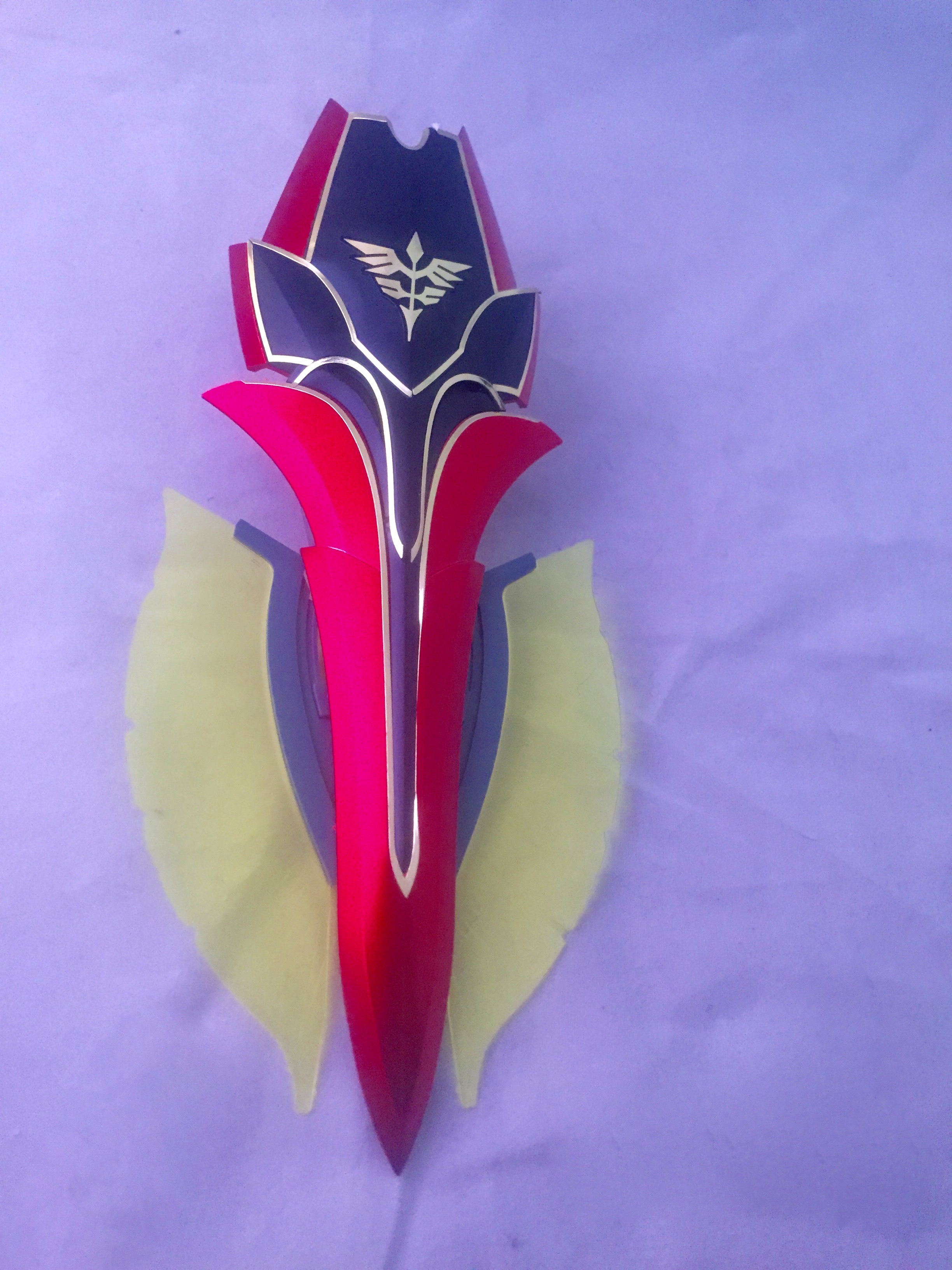
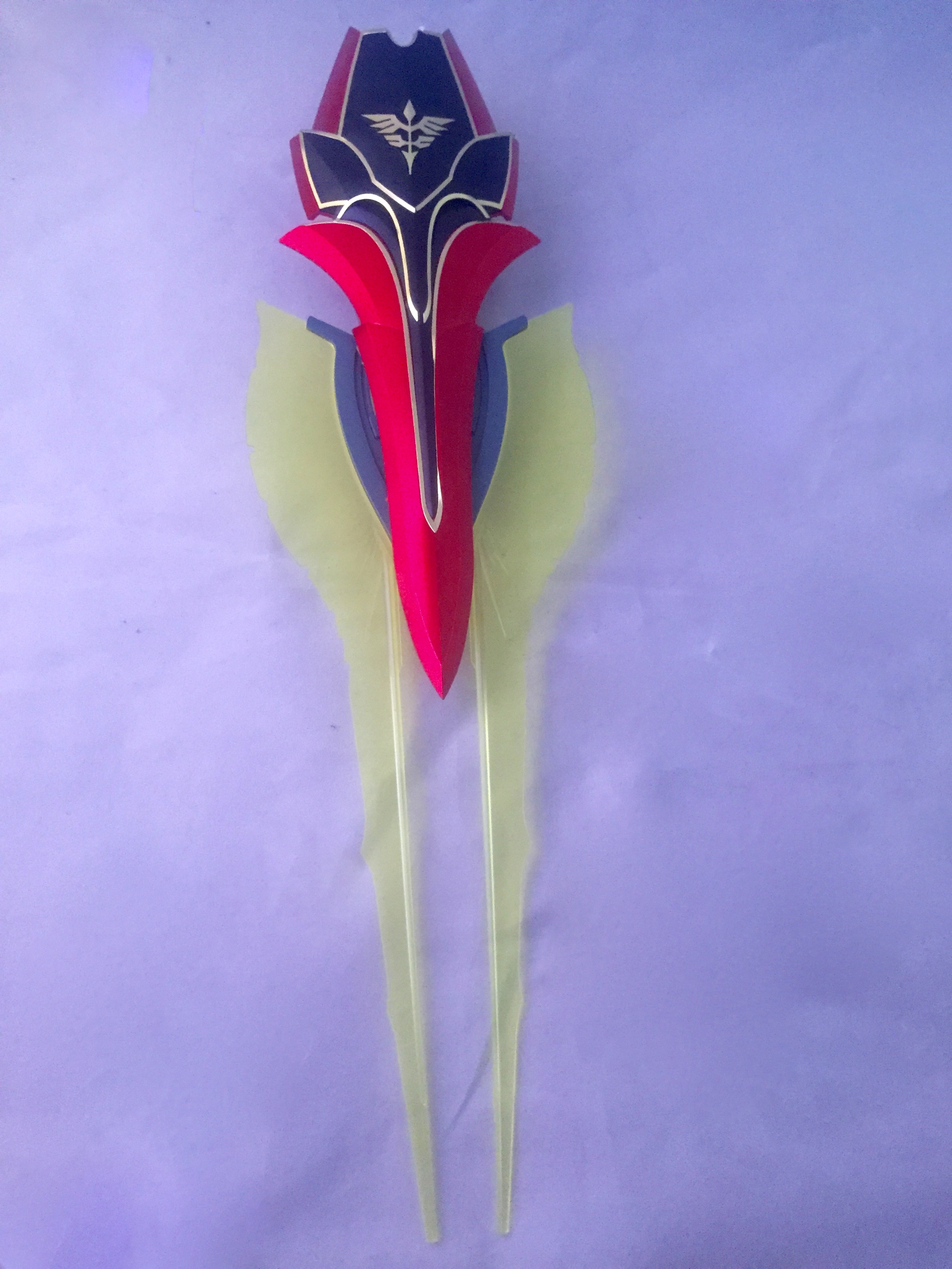
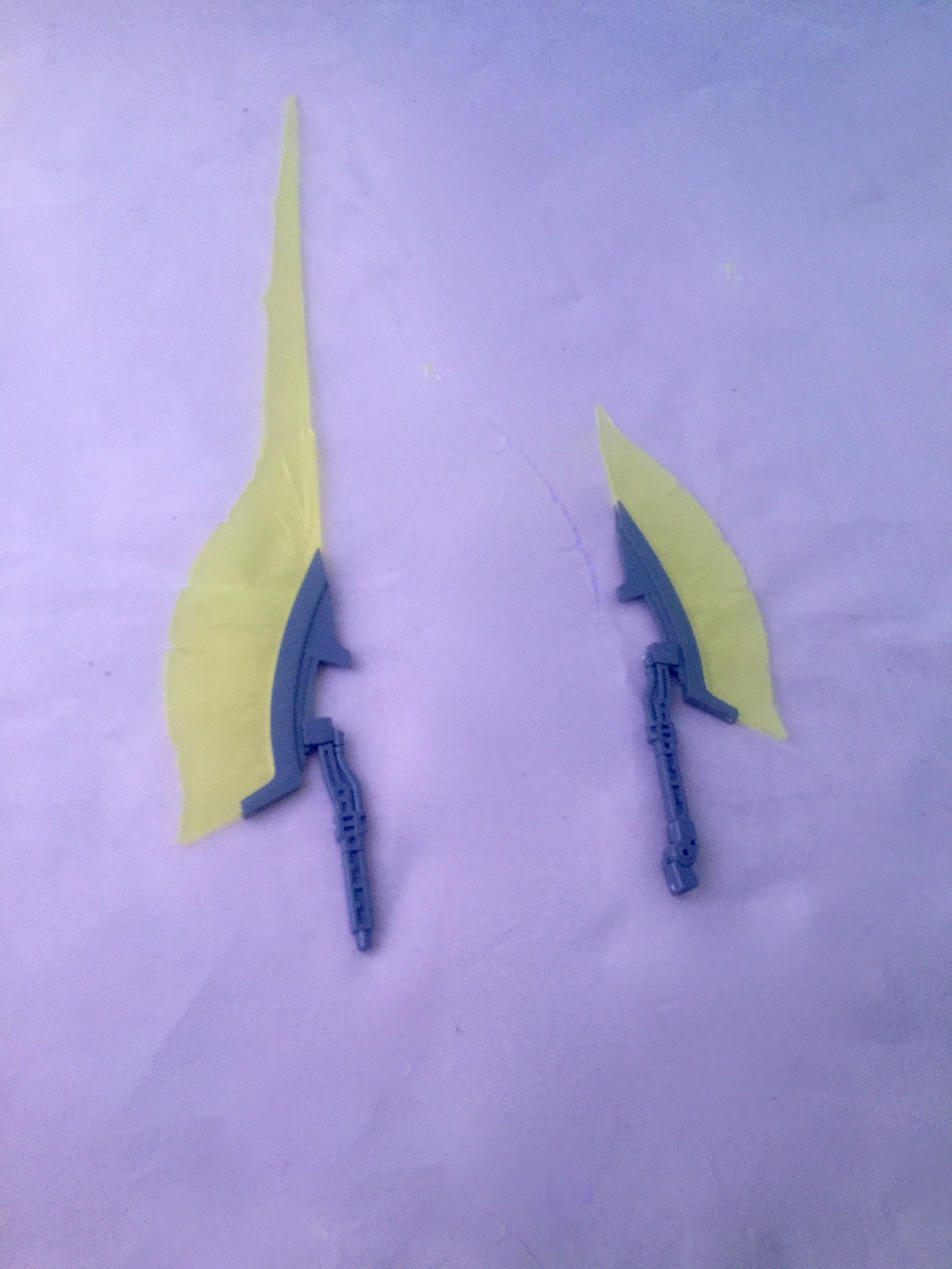
Here are most of the accessories.  I say most, because, the Grenade Launcher/Shotgun wasn’t ready at the time of the review.  Notice the “beam-effect” parts.  These are interchangeable with the axe, and with the shield.

IMG_6756 IMG_6755 IMG_6754 IMG_6758 IMG_6757

You can see, this opens up an incredible array of display options!  The shield is very large and impressive.  The SpartanTeen doesn’t prefer the axe.  (This is more of a SpartanNerd thing.  See He-Man!)

IMG_6753

The beam saber isn’t a lightsaber at all.  The beam effect is detailed and rippled, rather than being a straight lazer sword.  It did come with two beam effects, we just wanted the readers to see the hilt disarmed as well as armed.

IMG_6751

The gun has expandable options as well.  The scope can move, and you can add parts from the shotgun/grenade launcher.  (Not pictured.)  Notable, the shield has a place to store the shotgun/grenade launcher.

IMG_6804

Here is the Sinanju standing on his own.  The backpack adds a lot of weight, causing some balance issue, but not much.  Notable, it was easy not to have the legs snapped all the way in.  They kept coming off until the SpartanTeen figured out how to fully snap them in.  (Sorry, the lighting system took accidental damage, and so this picture and all the rest are using flash only

.IMG_6802

IMG_6797IMG_6799

Here is the Sinanju holding the shield an on his custom stand.  The stand is a separate item, and will be reviewed later.  But the stand is the perfect way to display this incredible investment.

IMG_6837

As we have done in the past, we are now going to give this Gundam a grade!

Here is our criteria, each item getting a score.  We would like to say ahead of time, this Gundam is almost perfect!

Each item gets a score…
1 Too wrong
2 not right enough
3 could be better
4 pretty good, but…
5 perfect
Construction
Was it difficult considering the level it is supposed to be?  4
Stupid problems?   3  (cables around the legs, and backpack had to be glued.)
Instructions easy to read?  5
Diagrams clear?   5
Stickers? Paint    5
Articulation
stands easily?    5
moves without falling apart    5
posable/interchangeable hands    5
lots of articulation points     5
Dynamic poses    5
Accessories
Weapons     5
holds weapons/appropriate weapons      4  (some problem holding the gun and shields.)
Stand   5  (available as a separate item.)
expansions    5  (see above)
Weapon storage   5
playability
durable     4
photogenic    5
holds weapons?    5
Reasonable Facimile to media representation    5
Aesthetics    5   (that shiny plastic is incredible!)
Figure-specific features
morph/ transform/ change form    5
action feature    3
LED lights   1
Diarama     5
Pilot included?  Does he fit in the cockpit or is he in scale or not.    5
To tabulate the score, we add up all of the values, and then come up with an average.
The SpartanTeen and SpartanNerd Gundam Evaluation Checklist says that the Sinanju receives a 4.92.  So far the only Gundam coming in higher is Char’s Zaku II-S (2.0), which had a score of 5.2.
What do you think?  Leave us some feedback in the comments!

SpartanNerd Project…Earl Norem Poses

IMG_6319

I had this crazy idea.  Really more of a dream.  I could get each person who is interviewed in the Masters of the Universe Art Book  to sign their article.  Or maybe a piece of art.  I know it never would happen…I am not a well traveled person.  But it was a fine thought.

But not soon after the book was published, one of the greatest artists of Masters of the Universe passed away.  Earl Norem.  I wrote my thoughts right here on the SpartanNerd Blog.  (Link)

To help illustrate my love for Norem’s work, I thought I would attempt to emulate it with the incredible Masters of the Universe Classics figures.  So here is my attempt at “The Sunbird Legacy.”

A few Caveats have to apply.

  • The figures have one expression.  Some have alternate heads.  But you still have a limitation.
  • The hair can be wrong.
  • Norem didn’t always paint the weapons the same way.
  • I don’t have the diorama piece.  As this stuff becomes more available to me, I will see about photographing some of it.

I chose this picture because I thought it was one of the most do-able.  My favorite is the one with He-Man on a lion and Skeletor leading an elephant army, with the space battle among the meteors a close second.  But you’ll see.

IMG_6320

I tried the Snake Armor He-Man head.  But it doesn’t look as good as the original.  In the picture, Skeletor’s sword is more of a scimitar.  The closest I had available is Draego Man’s sword.  The Havoc Staff is bigger than the one in the painting.  This proves to be the biggest problem.  I felt like the pose above was too…boring.  Not capturing the motion of Norem’s work.

IMG_6323

This photo is closer to Earl Norem.  Still not perfect.  It is really hard to get Skeletor to balance like this.  If you look at the Norem at length…(as I have,) you can see that He-Man and Skeletor have very parallel hips.  He-Man’s figure can’t quite stress his head back or hold his shield at quite the same angle, and still keep balance.  (He-Man has weak ankles.)

The colors are pretty good.  The white background is about as good as I could do.  I applied a filter to mute it a little.

So, Hub City Geeks.  What do you think about my new venture?  Can you do better?  Send me your pics, and let me know in the comments!

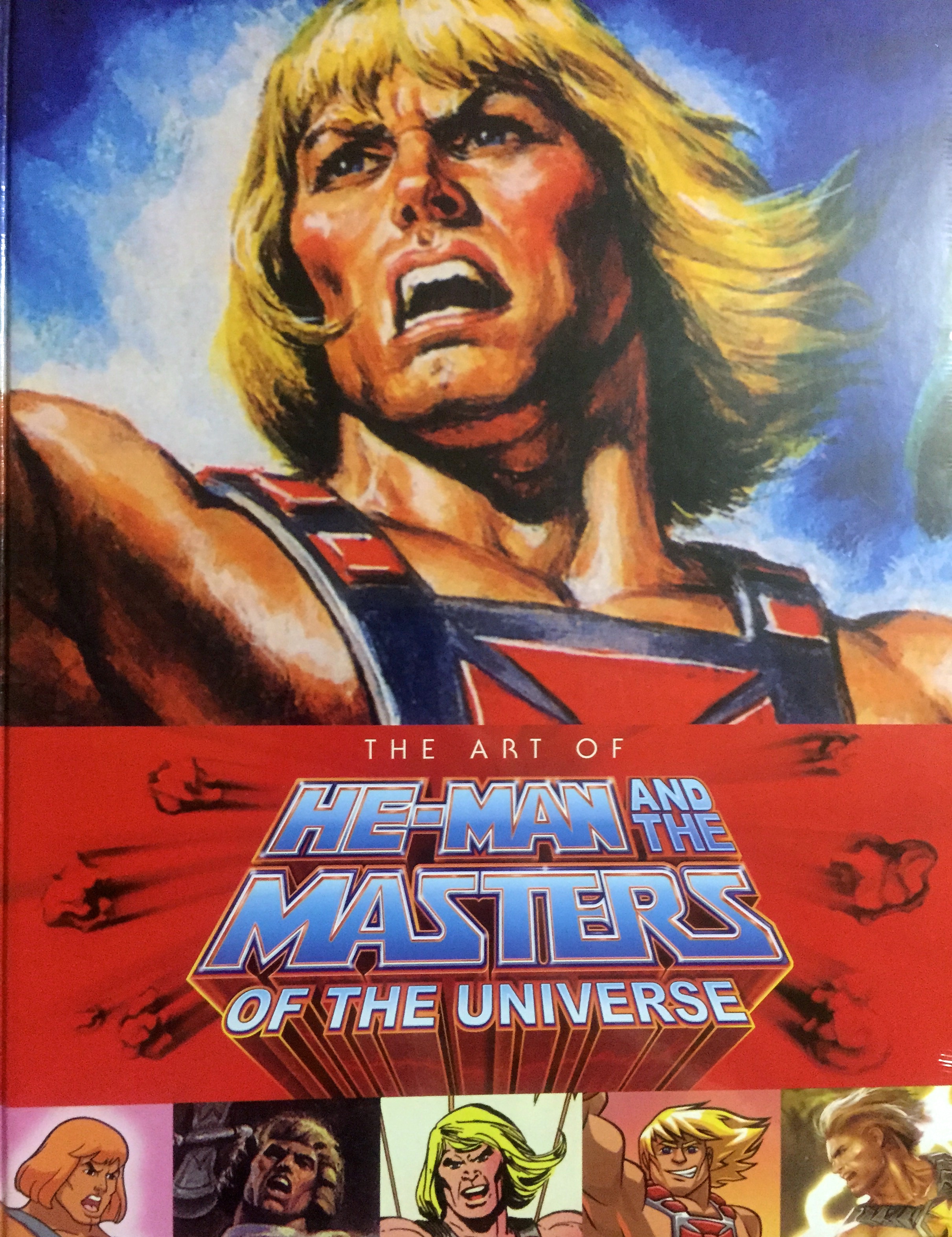
SpartanNerd Review…He-Man and the Masters of the Universe Art Book

This product is AMAZING!!!  I can’t recommend it enough!  I never purchased an art book before for myself, but the SpartanKid has Mega Man Star Force Official Complete Works.   I think that is fine…but the He-Man book blows that away!

(Many thanks to Daniel at the Tangled Web in Spartanburg South Carolina for giving me a discount!  What a great store!)

Obviously, I can’t just take a bunch of photos of each page.  (I wonder how long it would be until Dark Horse/Mattel sent me an order to take them down?)  Instead, I will summarize why I think this book is great, and include just a few pics.

IMG_6009

IMG_6010

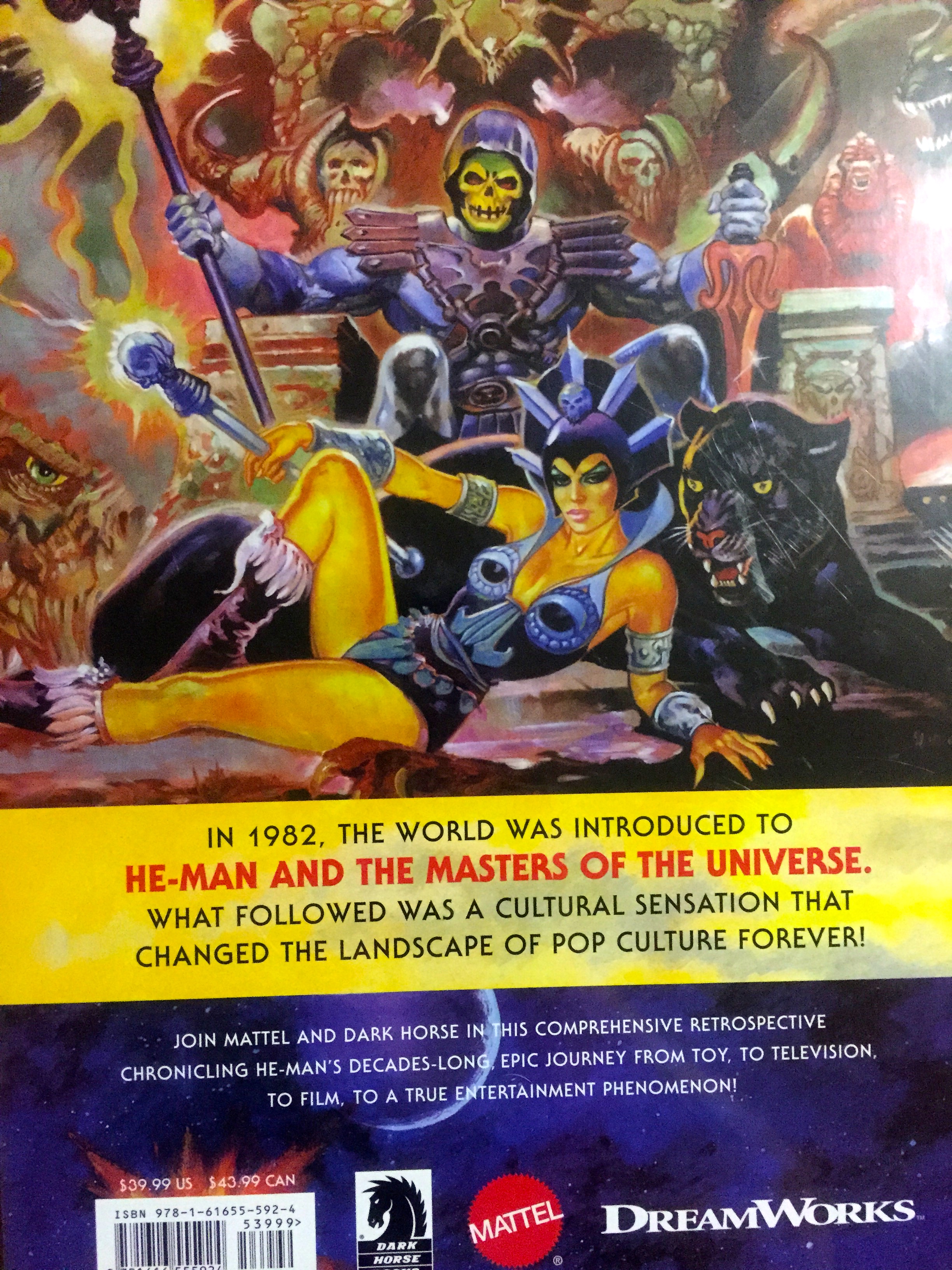
The front and the back cover are the least spectacular parts of the book.  Why does DreamWorks have a credit?  Barely mentioned here is the Power and Honor Foundation, who owns/houses/curates the art!  (I believe Emiliano Santalucia and James Eatock have a lot to do with this organization.)

IMG_6015

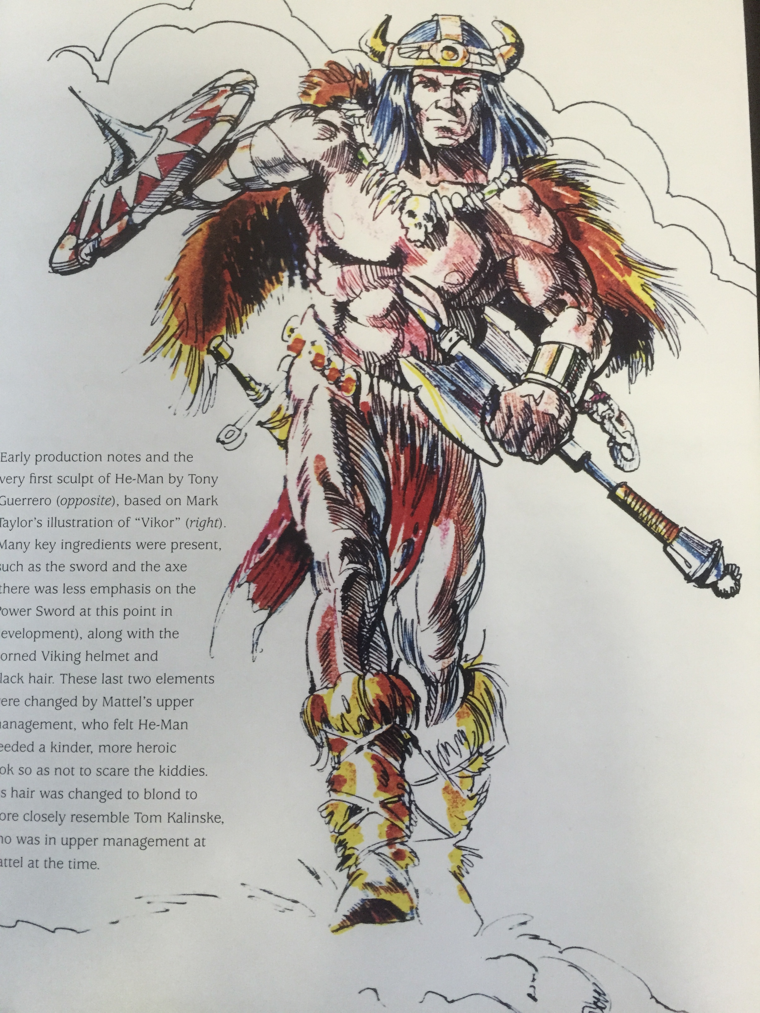
There are several document scans as well as scans of early work.  This book serves as a great visual documentary.  Most everyone has seen this image, that “Vikor” was eventually modeled after.  The original He-Man!

IMG_6016
IMG_6017

You get a piece of reproduction cell art!  And you can put the image over different Filmation backgrounds!

IMG_6018

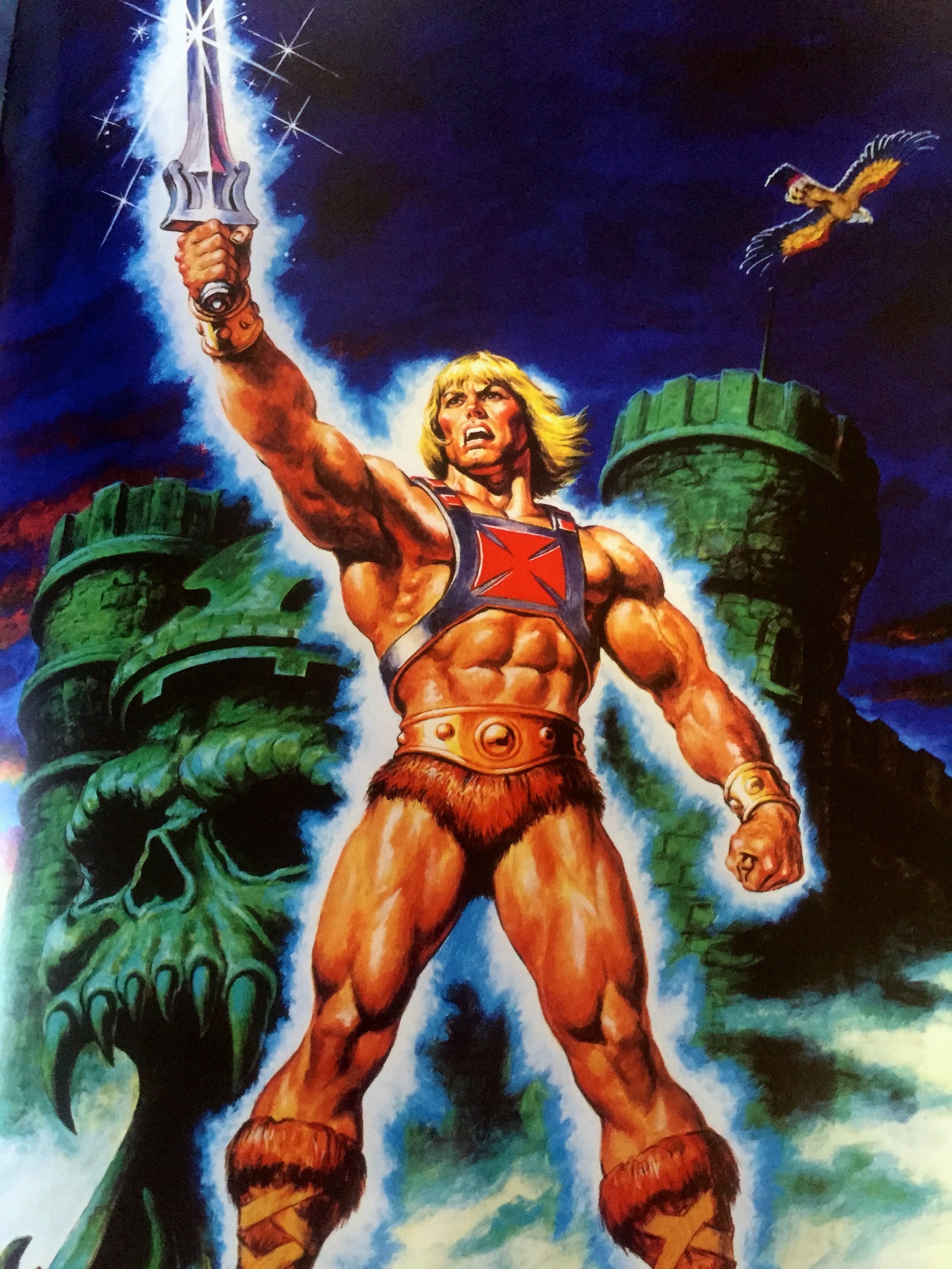
No one will ever deny that Earl Norem was the GREATEST MOTU ARTIST!  This book has several prints of Norem’s work.  This one is my LEAST favorite, and it is amazing!  The more I look at Norem;s work, the more details I notice!

IMG_6019

Here is another Norem.  There are several pieces of movie art.  And that is surprising to me.  Rights to stuff that deals with that movie always seems to be a point of contention.

IMG_6020

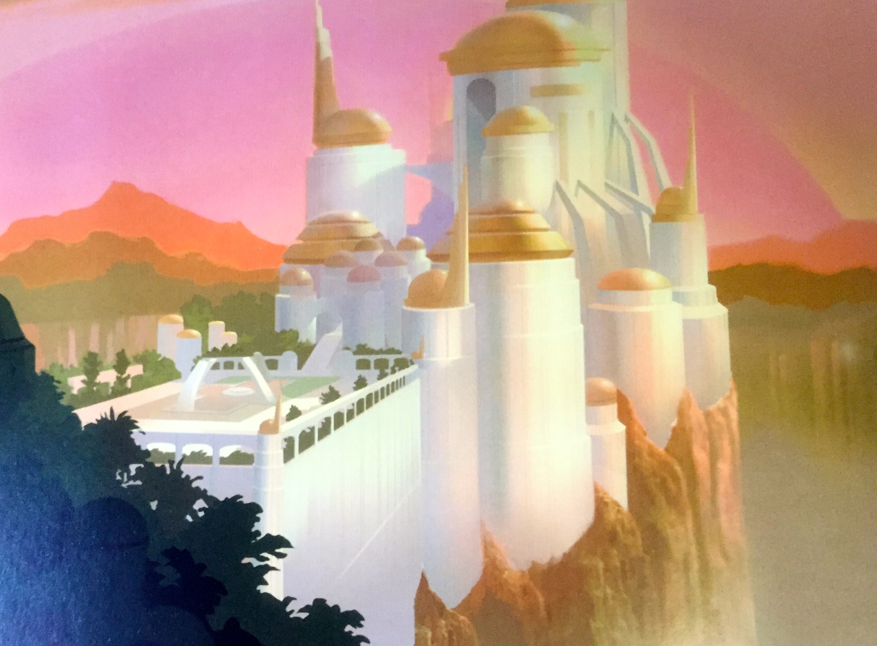
Unsurprising, there is lots of 200x art.  Here is Eternos Palace from the show.

IMG_6021

I have this art card.  I really like it!  I think it came with a DVD or something.  I have had it taped to my office wall before. The art book lets you see it extra large!

IMG_6022

The MOTUC Castle Grayskull Box art by Rudy Obrero is preserved here.  It folds out to reveal the entire MOTUC classics card back cross-sell art.  (Up to the point of printing, of course!)

IMG_6023

Something I never thought I would own…the MOTUC maps!  Only Masters of the Universe Classics subscribers received these, or people who purchased certain products.  (Castle Grayskull comes to mind.)  Every map is presented in this book!

IMG_6024

The book takes you all the way from Mark Taylor and Roger Sweet to the modern age of comics!  SpartanNerd readers know I love the new comics!  Here is one of the covers they presented in the book.  There are several other pieces of modern DC comics art as well!

The last part of the book was looking ahead, concept art, etc.  I wonder how much of this is DreamWorks.  (That is who is working on the current movie project, right?)  At least we already know that the gold plated Battle Cat armor is being used in He-Man and the Eternity War storyline.  But what about Skeletor at the bottom?

IMG_6025
IMG_6026

The book takes you on a grand trip through the history, present, and future of Masters of the Universe.  I neglected to show you…

New Adventures art

Pre-Ternia art

Princess of Power art

An early Beast Man (too similar to Chewbacca)!

MV Creations work (Looks like Emiliano and Val put there differences aside for this project)

Sculptures

And oh so much more.  If you like Masters of the Universe, this is the book for you!

Can I say anything negative about the book?  I wish it had the full art of Norem’s He-Man and Skeletor’s epic fight, where Skeletor commands elephants and He-Man is riding a lion!  This is the first piece of art you see when you get past the gift-wrap print that is found on the hard-cover backing.  But it is partial.  (That is one of my favorite Earl Norem paintings!)

The other thing is…and maybe I’m wrong.  But the book is 400+ pages.  And the pages are HEAVY WEIGHT.  I am concerned that the book may fall apart over time with lots of use.

I give the Mattel/Dark Horse/Dreamworks He-Man and the Masters of the Universe Art Book a solid 5/5!  Hopefully the Power and Honor Foundation will be able to continue putting out books like this in the future!

SpartanNerd…Cool Idea- Photograph Toys with a Black Light!

Just some fun I had today…something really substantial forthcoming, however, oh Hub City Geeks!

IMG_5978

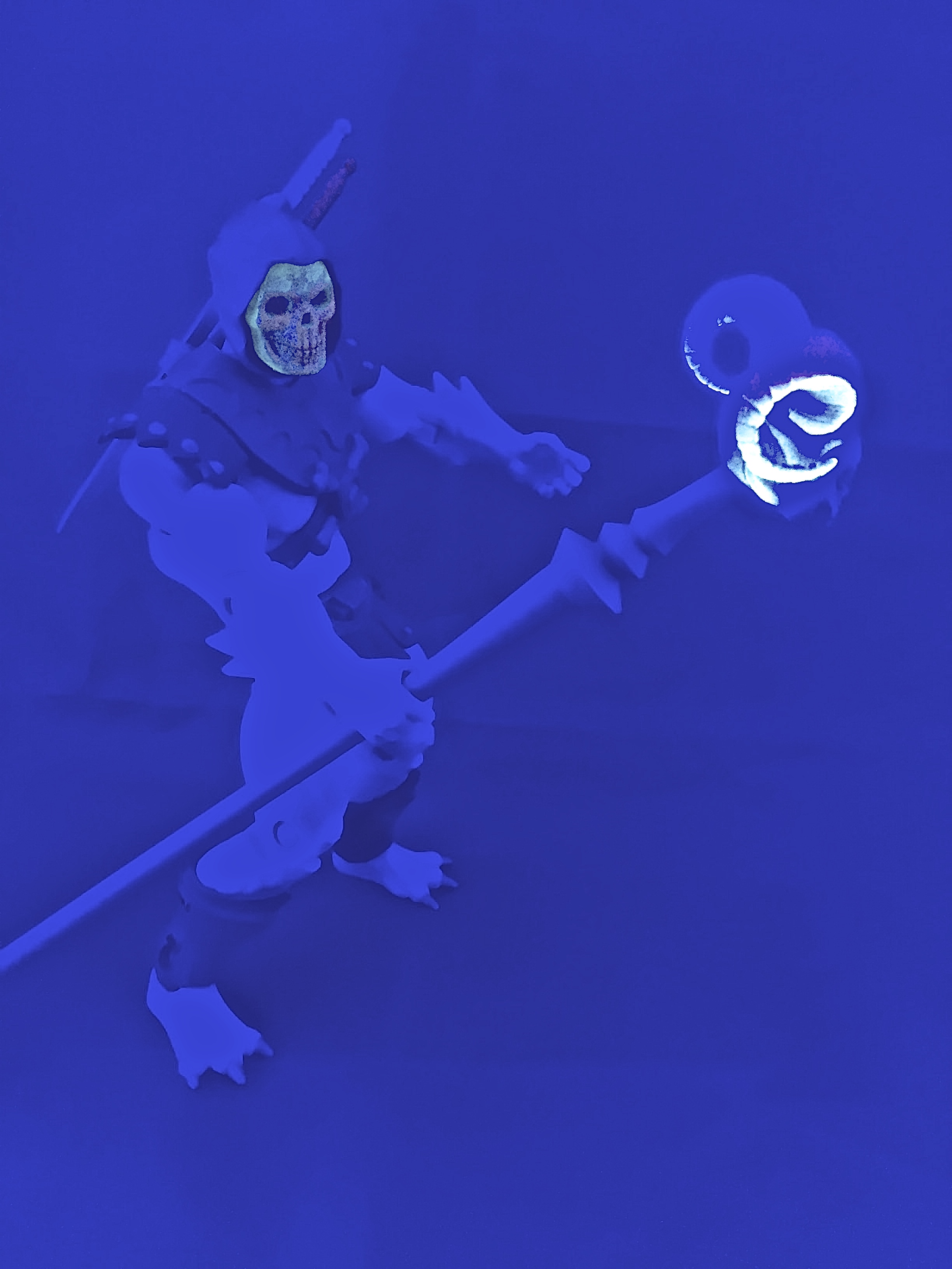
Skeletor is just about my favorite subject to photograph.  With a black light, his face looks extra gruesome.

I thought it would be cool to put the Havoc Staff that came with the Faceless One in the black light.  It isn’t that apparent in the pic below, but the pink translucent details on the “powered up” part of the staff changed bone white!

IMG_5979

IMG_5970

Here is Modulock wearing the alternate Beast Man armor.  The unusual and unexpected thing is the plastic on the torso and visible in his joints at the knees and elbows glow a different color in the black light!  I noticed this with Draego Man too.  (Not pictured)

IMG_5973

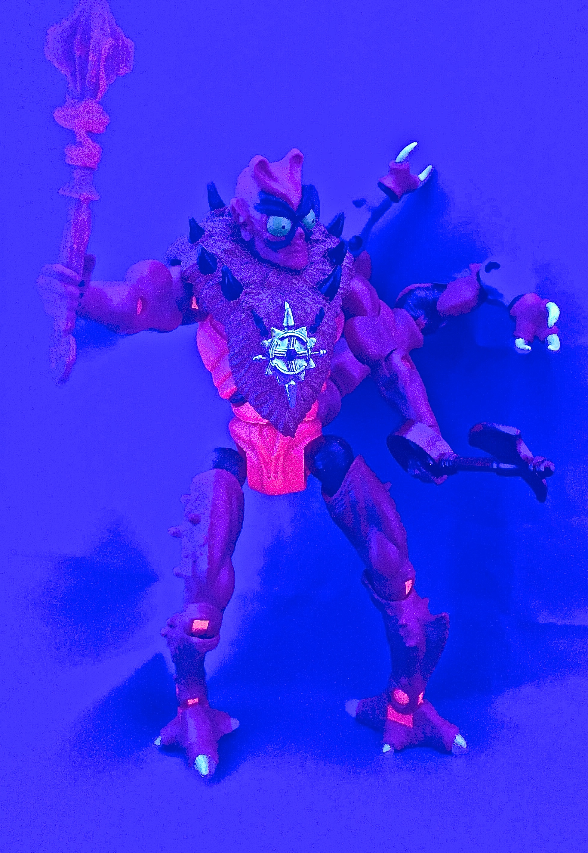
I’ve never thought that the vintage Mantenna was a very menacing looking figure.  (This is my original toy from the 1980’s.)  Placing a blacklight on him changes this.  The red details become that salmon-isn color, which contrasts to the blue parts of his body that disappear in the blacklight somewhat.  His eyeball paint is about gone, but because of this it makes that weird thing that is his mouth seem extra creepy!

IMG_5975

The cool thing about Grimlock isis weapons.  They look translucent amber in person.  In the blacklight, though they pp like the science fiction things they should pop like.

IMG_5999

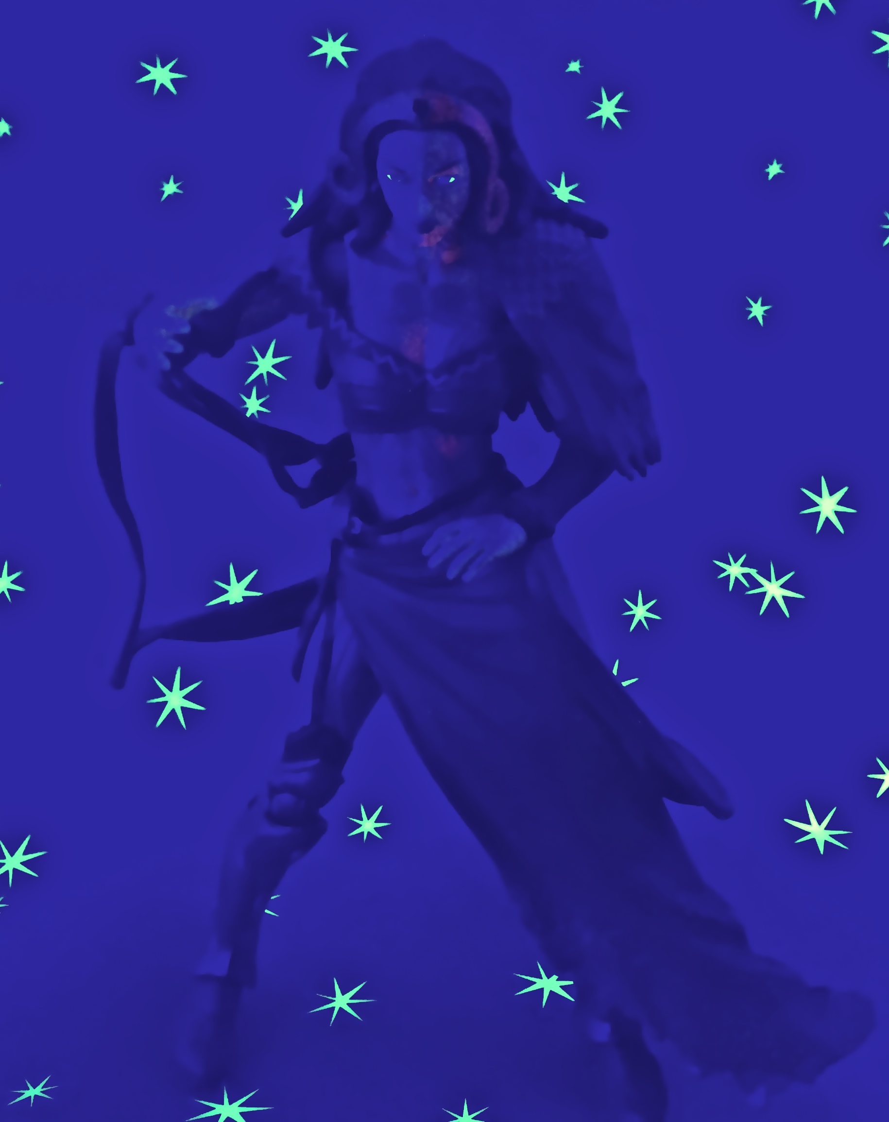
Last but not least, LILIANA!  The cool thing about this pic is as I was editing it with iPhoto, I was playing with the sharpness controls.  Lilliana almost disappeared when the control was at 0.  As you moved the slider, she would slowly appear or disappear!  Just like magic!  Because her substantially exposed skin is “flesh-tone”, and her clothes are all purple, this caused the disappearing effect.  I wish I had a modded Liliana card with this picture on it!