SSKUR’GE (Cosmic Legions Whiplash Tribute figure)

Whiplash is the only villain in modern form for Masters of the Universe that I feel I am really missing, besides maybe Modulok and Screech. That MASTERVERSE figures are very affordable and generally excellent, and plentiful unlike the superior Masters of the Universe Classics figures has allowed me to have a goal and complete that goal. Reclaim all of the figures I had as a kid. So to me Webstor isn’t important. Jitsu and Ninjor, not important. I didn’t have these. I like the Evil Horde, and will get some of them, but I don’t have the same connection to them as I do Skeletor’s friends. I’m ready for them to release some MASTERVERSE Snake Men. There are also a lot of holes to fill in the Heroic slot for me.

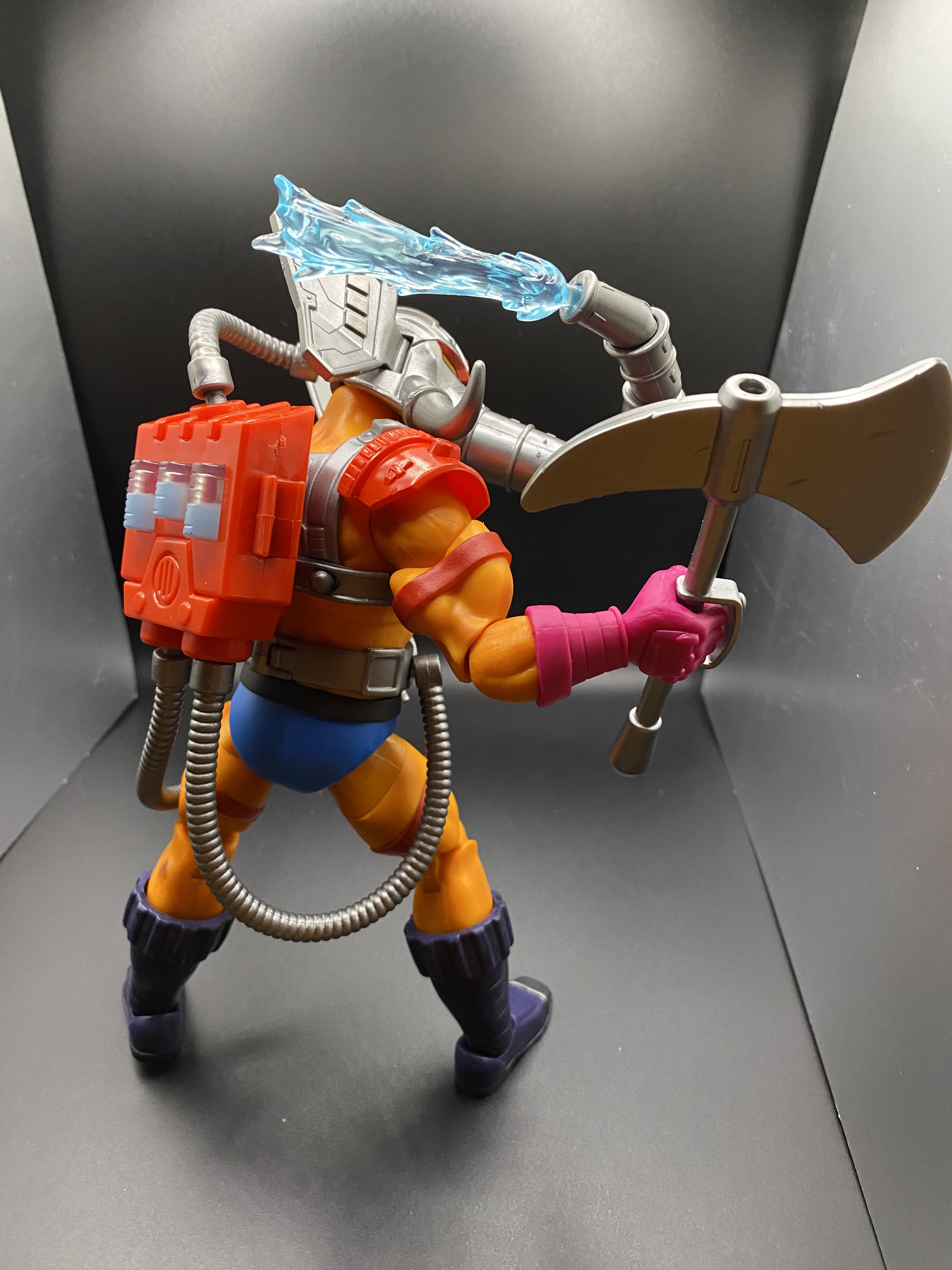
The MASTERVERSE Whiplash figure Mattel has put out just isn’t that great. I haven’t seen it in person, but the pictures I have seen of it just don’t do it for me. Like most MASTERVERSE figures he is too lanky, and I believe Whiplash should be bulkier if anything. The head seems too small and kind of wrong. And the weapons and stuff seem off too. The secondary market price is around $40, and I just figure eventually they will come out with a better one. (I have seen a sealed Classics Whiplash for $200. PASS!)

But then there is this…I saw it at Toy Federation in Greer, SC. (Maybe that is more like Taylors or Simpsonville?). (Excellent store. I can spend hours in there and would if I lived closer!)

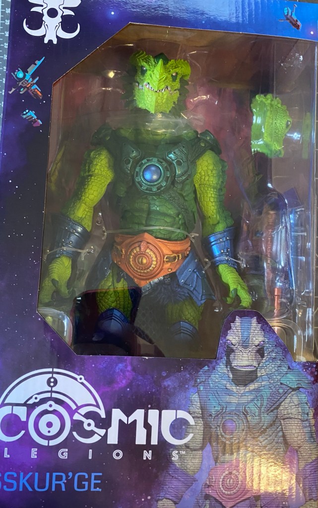
So this is SSKUR’GE. A Cosmic Legions figure (and my first one!). In case you didn’t figure out from the context clues, Cosmic Legions is the science fiction version of Mythic Legions. You can see a cross sell from the back of the packaging below.

You can see that there are some other Masters of the Universe tributes in this line. Slush Head and Man-E-Faces.
Because this is my first Cosmic Legions figure, I wanted to show off the packaging a little more. Check out the font of SSKUR’GE’s name below.

This little story lets us know that SSKUR’GE is a bounty hunter, and as I read this and the story online about him, I get the feeling that he is kind of like The Skuxxoid from The Transformers.

Outpost Zaxxius is apparently the name of the set that SSKUR’GE was released in.

So what the Four Horsemen studios are doing is kind of one-upping Mattel. They have their own IP, but are doing their figures in tribute colors to the Masters of the Universe. Case in point, I ordered Anthophilees immediately when I saw him. (Maybe get him by Christmas next year. (Sigh.). Anthophilees is the strongest example of them all (Buzz-Off tribute), but here SSKUR’GE is very strong in the Whiplash hole. He really only has one weakness…neither head looks like Whiplash.

(If you want to see another example I have of the Four Horsemen tributing a figure, check out my review of Demistros, the Skeletor tribute.)

When you get him out of the box, this is what you get. You have to attach the tail…

So to accomplish this, you have to take your brand new $75 giant figure and separate the torso from the waist. This was not easy. And then you have some soft goods for furry shorts (not furry shorts), which complicates getting it back together correctly. I am never removing this tail again, or swapping the parts of this figure, so at least I won’t have to do it again. (In case you don’t know, Mythic Legions and Cosmic Legions are entirely parts swappable in their own scale. The scale of this figure is Ogre scale.) I made good use of the hair dryer.

If you watch these little turntable clips, you can hear my birds chirping in the background!

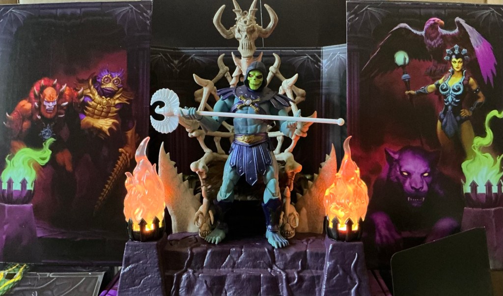
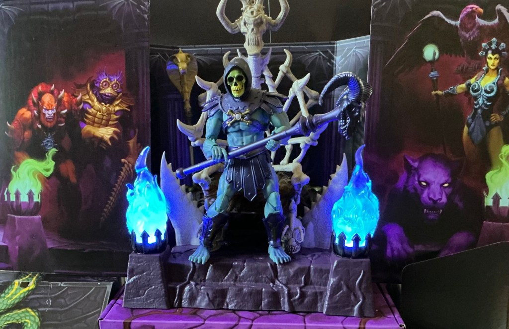
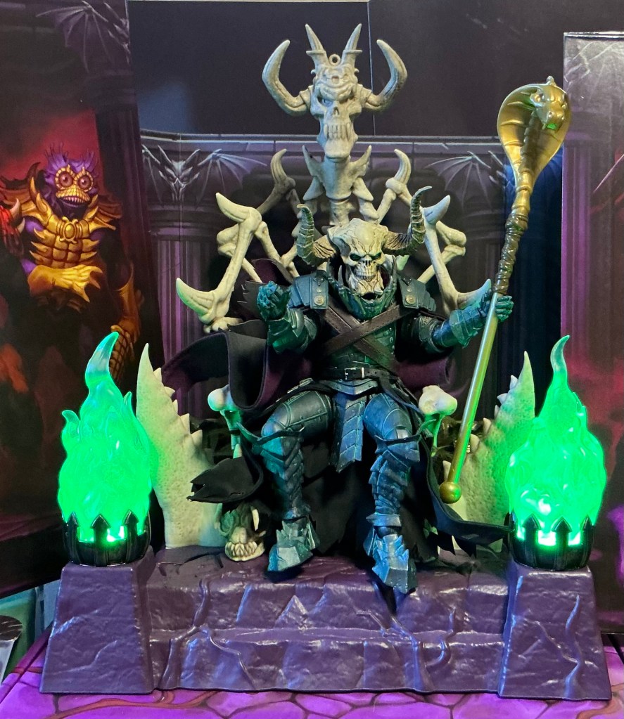
Here I am showing you the figure assembled and everything you get in the box, and also including the inside of the box as the diorama. (He is standing on the box for Skeletor’s Throne)

In the box, you get

  • SSKUR’GE figure, who is “ogre scale” and of the apparently new “dragon” buck.
  • Two heads, one dragon “default” and the other alien.
  • Four alternate hands, two of which are fists
  • A large spear with a mace head
  • A scythe and trident intended to combine into one weapon.

THE SCULPT

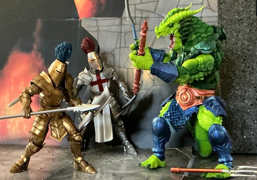
The Four Horsemen are just the gold standard. That’s it. They have built these lines on this quality pop-art form. Think about it, did you need Mythic Legions or Cosmic Legions in your life until you saw them? There is no cartoon or comic book. No video game. Just the toys. They have created a line of generic fantasy that is positively KILLING IT. They made it for the Elden Ring fans and Dungeons and Dragons crowd. They made it so it goes with Masters of the Universe, or in this case also Star Wars or Transformers.

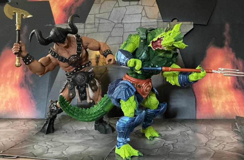
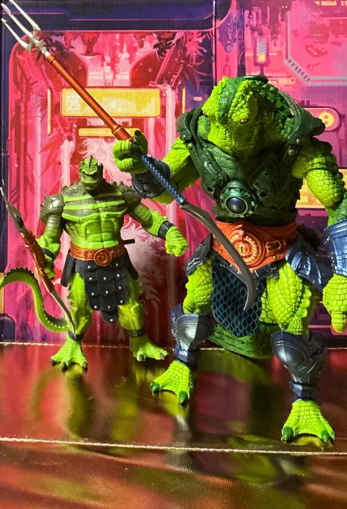
We have seen elements of this sculpt before in MOTUC Draego Man. I don’t have that figure any more, but I went back and looked at some pictures. They have truly advanced their ideas. Draego Man as a figure appears to be much stiffer and have less character. You don’t see the joints right off like you did in the old MOTUC days, and that has something to do with it.Here SSKUR’GE (I really like typing that name) has similar scales and toothy, horned elements. (This exact same sculpt with different paint is available as Mythic Legions Araccagor.)

I don’t know if you can tell, but I don’t care too much for that alien head. To me it looks like some kind of sad duck. The reason I almost punted on this figure is that neither head really looks like Whiplash…But…

PICTURED: Mythic Legions Balthor the Tower Ogre, armed with Animal Warriors of the Kingdom’s gold axe. And SSKUR’GE armed with the scythe and trident spear.
PICTURED: Same as above, but this time Balthor is throwing a Skeleton Legion Builder figure at SSKUR’GE, who is ready to to use the Whiplash tail. Notice the plugs on the back of the harness…I haven’t removed it, but likely one day we will get some wings.

PAINT

(Continued from …But…). The green and blue paint apps on this just overrides the weakness of the head sculpt when you put him with the other MASTERVERSE villains.

PICTURED: MASTERVERSE New Eternia Two-Bad and Cosmic Legions SSKUR’GE. Don’t these two just “seem” to go together?

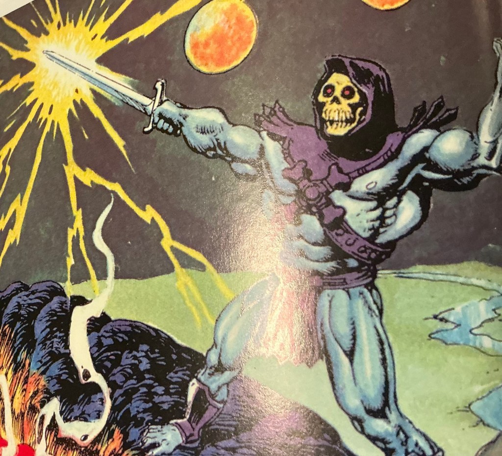
The green is intentially two-tone Whiplash colored. The lighter green highlights his face and underside parts like hands, and the darker represents armor on his back. Not only do I get Whiplash vibes, but also Killer Croc vibes.

The armor pieces like the bracers and the waist pieces have a metallic sheen that I really like. That soft goods loin cloth is a kind of felt with fancy stripes. I can’t tell if the metal ring on his back is actually metal or plastic, but it is painted in the same color as the shiny parts of green on the harness. There is a pop of gold on his belt.

ACCESSORIES

Oh boy. Here is a weak part.

So the long pole mace that he comes with has the same handle as the weapon that came with my other ogre scale figure. Can’t the Horsemen give us something different? This time it is painted in gold or brass. And what even is a mace like this?

The other two weapons are designed to fit together in tribute to what Whiplash came with in the 200x line. The problem is, the handles are for a different scale of a figure.

PICTURED: Comparison Time! I don’t’ have a vintage Whiplash, but I picked up a loose 200x Whiplash the day before I decided to go back to Toy Federation. To me, everything is similar except the head sculpt.
PICTURED: SSKUR’GE fights against a Legion Builder gold knight (review coming soon) and also Mythic Legions Sir Godfrey (I think I have the name correct.) My point is that the trident and scythe don’t fit on the other pole.

But wait…there’s more…(facepalm)

These weapon pieces would be better if they could fit together on the pole pieces that came with the mace. But they don’t. I tried jamming them together…it just wasn’t really meant to happen. And it would be far cooler if it would work.

SPARTANNERD RATING OF COSMIC LEGIONS SSKUR’GE

I’ve said it before and want to re-iterate. As an adult collector, I have a job. Sometimes I have two. I have real life responsibilities, and this side hobby is pure escapism. It is escapism from the constant bad news. The constant political news. The constant culture wars. Getting this was an alternative to buying new Magic the Gathering cards, or a new video game, or going out to eat somewhere, or going to the movies. The nostalgia factor here is a key part of it. But also, like I said above, the Four Horsemen have created things that you didn’t know you wanted until you saw it. Kind of like Steve Jobs/Apple did with the iPad I am typing on right now. I happened to be going through the area where the Toy Federation is two days in a row. I walked around with the box on the first day, but then bought the 200x version instead. When I went home, it was nagging at me. So the next day when I was in town I went ahead and grabbed it.

SSKUR’GE here checks every box. Can I chalk up the head sculpt not being like Whiplash as a weakness? Not for this product. Both head sculpt options are sculpted and painted terrifically, just neither looks like Whiplash, which at a certain point the Horsemen probably aren’t allowed to do anyway.

I do think the accessories are the weakest point, and believe the Horsemen could have given us a proper scaled trident but cut the corners here. On the other hand, both parts of the weapon have good paint. Still not sure how practical a mace on a long pole would be. But it does look cool, and will be modular with other weapons in ogre scale for the line. And it isn’t like he can’t hold the trident…it is very loose. But this weapon is in scale for the other Mythic Legions that I have so it has additional use.

I couldn’t be happier with this figure. It is one of the best that I purchased over the summer. 5/5. I MIGHT look into getting a proper Whiplash head sculpt on the customizers market. Or maybe I will wait and see if Mattel comes out with a better MASTERVERSE Whiplash. But if they do, it won’t be as awesome as SSKUR’GE. And when assembled with all the bad guys, he really completes the picture.

My “bad guy” collection. Everyone’s here (Except Modulok and Screech). One Day I might update this to be a better pic with a proper diorama backdrop.

So SpartanNerd’s rating of Cosmic Legions SSKUR’GE Whiplash is 5/5. Do you agree or disagree, oh Hub City Geeks? Let me know in the comments!

Skeletor’s Throne

Skeletor’s throne…

I remember watching the Filmation show as a kid, and wondering why we didn’t get this throne with Snake Mountain. It was clearly awesome, and Grayskull came with a chair. What was the deal? I didn’t ponder too much, though. I was just a kid!

As an adult fan, who was watching the 200x Mike Young production show, I noticed Skeletor’s throne was massive. Ridiculous, actually. Such were the times of the early 2000’s, when Dragon Ball Z and similar were the flavor.

With Masters of the Universe Classics, people were making custom bone-thrones for their figures to sit on. These looked so cool, but the ones for sale required a wait time, and you talk about something pricey too.

And then…and OFFICIAL Classics throne for Skeletor came with the Super7 Snake Mountain. The very final MOTUC product. And at that price tag ($700?) no way did it feel the SpartanNerd was ever going to have this thing. And people weren’t selling the pieces off of the gigantic Super7 thing.

BUT…a little tease. The MEGA Snake Mountain came with one! (Sigh)

So to actually have this MASTERVERSE Skeletor with a throne is pretty incredible. Watch the video below to see my unboxing and packaging commentary.

UNBOXING (Also includes Movie Beast Man, review soon)

I took the box cutter to that top box and got the art pieces off to take pictures. This is great stuff!

REVIEW OF SKELETOR

Here is everything you get in the box

  • Skeletor figure
  • Alternate hands…one punching the other open.
  • The Havoc Staff
  • Armor with cape attachment
  • Removable hood

Maybe this next photo will explain this a little more

Skeletor getting ready for…church…

This is exactly the same figure we got with New Eternia Skeletor (Viking). It just has different, arguably better paint. But this head is different. And as far as I know, this is the first non-hooded, bare-boned Skeletor head. The New Adventures design had techno parts. There is also an articulated jaw.

I hear a prominent fan criticizing this head sculpt as appearing to be a chimpanzee skull. And then taking a hair dryer to it. DON’T DO IT! This is by design. Go back and read some of those early Alcala mini comics. I always felt that some of those Skeletor designs of his had that protruding top mouth part, and it looks very chimp-y. But that was how he drew it.

The only criticism I have here then is the one I have gradually gotten from the other New Eternia Skeletor. His left leg is loose at the boot cut and thigh cut. And they didn’t fix it for this offering…his is already loose and he has some trouble standing on two feet.

INTERLUDE

Mattel seemed to celebrate this product just a little bit. Check out the covers of this month’s comic!

So I decided to make a photo of the green cover using the figure. I had the SpartanWife paint his nails. I am not showing this, but when I removed his battle harness, there was purple “bleed” left on his back. It was faint, but it looks like I am seeing some of these kinds of issues recently.

The photo turned out pretty good. I took off the armor and hood, laid the figure on some “green glass”. And placed a green gel in front. I shone a flashlight on it and the surprise imperfections in the gel plastic film made the image extra good.

REVIEW OF SKELETOR’S THRONE.

It didn’t take long for me to assemble it. The diorama card was the hardest part…I had to cut some of the tabs off of the bottom. They come with a design that isn’t supposed to disassemble once put together. But that didn’t suit my storage needs.

But as I stepped back and took a look at it…Then back at the instructions and some promo images…The skull head on top is TOO TALL. We are led to believe the back wall is taller than the chair. NOPE.

So you can see, I had to put some black cardstock from other packaging up behind the head to get proper photos.

You can see the furry seat cushion, and this is a solution to a problem. If you have been following the SpartanNerd blog, then you know that King Conan’s throne can’t be properly sat in by MASTERVERSE figures, making me worry about this. That seat cushion disguises the awkwardness of their butt not being perpendicular to the chair. Cool solution, Mattel! There are also foot pegs on the platform under the chair, so you can peg him in for even more stability.

Here is some more description. Look near He-Man’s feet. Two alien insect skulls with antennae. There are these mandibular halves with teeth coming up beside the throne…this must be the jawbones of wyvyrns. And no way around it…that is a demon skull on top.

…Let’s be real for a minute. Why did Bob Jones University types protest He-Man and the Masters of the Universe as being demonic back in the 1980’s?…

On the back side of the throne there are two stands made of cobra snakes where you can place the Havoc Staff and the Staff of Ka. These are rubbery, and press down and spring back to shape when you load the weapons for display.

Skeletor SHOULD HAVE come with a Staff of Zoar. That has to be what Mattel was going for with the lighting effect. Orange for Zoar, green for Ka, and blue for Havoc. Each a type of magic presented on the Revolution cartoon. But you can give him the Sorceress’s staff. It is too small, but it works.

I swapped the head for this New Eternia (Viking) alternate head. This has been my main Skeletor head, until now…

At first I thought the lighting effect was broken on mine. I put some batteries from the junk drawer in, so I swapped them with new ones from the store, and it still wasn’t working right. I would hit the switch, and it would turn on orange. But it wouldn’t change colors. I walked away for a day to think about it.

I recently had a QC issue with Mattel regarding Sy-Klone. (Review yet to come!) Essentially, they listened to my complaint and offered me a Mekanek to replace him (complimentary) or my money back. I didn’t want to go through this again with the much larger and more expensive Havoc Throne. I didn’t want them to say I was defrauding them or something. I thought…”I can fix this. And if I can’t, I’ll call them then.” So I got to work. I removed the bottom screws, and that was it…it worked! I put them back in loosely and haven’t had any trouble since. Evidently the screws were too tight or something. If you have trouble with yours, try my fix.

You can watch the lighting effect by clicking this link

LINK TO VIDEO OF LIGHTING EFFECT.

You can see I went ahead and cut up the box so I could make a larger display. Evil Lyn, Beast Man, Mer-Man, Panthor, and Screech look on as Skeletor charges his Havoc magic.
Here is Mythic Legions (NOT!) Demistros sitting on the bone throne, energizing the Staff of Ka. His giant devil head looks like it might be a brother to the one on the top of the chair.
And here’s Black Falcon, holding the Staff of Zoar which would surely be his weapon of choice.

SPARTANNERD RATING OF NEW ETERNIA SKELETOR AND HAVOC THRONE

I have to take this objectively. Subjectively, I am really, really happy to have this thing. I have basically all of the bad guys now, and this throne pulls them together on display. (I don’t have Screech or Panthor. My Whiplash is a compromise. Review coming soon!)

Anyway. Objectively.

Skeletor’s new head with an articulated jaw and removable hood is excellent. His new purple and gold paint details are also very good on the battle harness and cape armor. This is also metallic purple paint on the Havoc Staff that matches his armor. This figure didn’t come with any other new accessories, and is in fact exactly like the New Eternia (Viking) Skeletor that we already had, take away the Viking skull and classic head. The packaging is nice, and is slightly different than what is on the cover box, featuring the battle harness instead of the cape armor (I didn’t point that out in the video.)

I gave the original New Eternia Skeletor a 4/5, taking off a point for loose leg joints. It is the same here with this “new” New Eternia Skeletor. 4/5. He has the same leg problems. The new paint and the head with removable hood are very good upgrades, however.

Objectively, about the Havoc Throne. I have to set aside my love for this item and instead point out the strengths and weaknesses.

It is very well done. Easy to assemble. Nice packaging that falls short in the tallness category (see what I did there!) But the artwork on it is wonderful. The furry seat cushion is a novel design that solves the problem of figures sitting awkward, and really any 6-inch figure sits nice on it. Super7 Ultimates!. Mythic Legions. Very nice! The Staff of Ka is a little bit thick, and we are used to seeing it smaller, say for instance in Teela’s hand.

If I am messing with this, I never leave the LED fire lights off. I mean, clear fire is fine. But the colors add much depth, and if you turn off the lights, a real evil atmosphere can be created.

I am giving this throne a 5/5. Sure, I did have to take a screwdriver to it, but I can’t say if that will be everyone’s experience. Maybe mine was an exception. I DO wish the diorama was taller than the skull head. But the packaging is so nice otherwise that it kind of cancels that out. The throne can be stored in that box, or you can use it to display the throne with Skeletor kind of as a statue.

So 4/5 for Skeletor and 5/5 for the throne. What do you think, Hub City Geeks? Am I justified in this rating? Let me know in the comments!

MASTERVERSE New Eternia Faker- SpartanNerd Unboxing and Review

I picked up Faker on Prime Day, the same day I ordered New Eternia Battle Armor He-Man. There is a long and convoluted story about me finally getting Faker, but it began when I realized I wanted to complete the “my” collection…that is, the Masters of the Universe toys I had as a kid. On looking into it, Faker was recently sold out pretty much everywhere. But they had that MASTERVERSE Revelation version, that wasn’t blue. It wasn’t “classic” or “nostalgic.” That one can be had even now for really inexpensive…like as cheap as Bounty Hunters Teela and Andra. Eventually I settled that I would look in “diverse markets.” Those outside of BigBadToyStore, Eternainment Earth, or Amazon. And I found one! For the reasonable price of $13. I got my order right in. And it was delivered by UPS. TO SOMEONE ELSE’S HOUSE!!!

What even happened? I got the Shopify notification, went to the tracking page, and saw where it was delivered to the “correct address,” only the picture posted of the delivery wasn’t the right place.

Two months later, on Prime Day, I got it for $35. And I am happy with it. This left me with a need to get Whiplash…(My solution coming soon!)

PACKAGING

You can see the packaging for New Eternia Faker above. It is that boring blue “sporty” packaging on the front. But you can clearly see what you are getting. This version of Faker is NOT my version exactly. The version from the vintage days had orange armor, not pink. I almost didn’t notice, however! The reason being, I have the MEGA version of the Battle Bones, and it comes with this color scheme of Faker. It made it work for me, and I don’t dislike the pink. On research, the pink colored armor was what was on some Faker toys from outside of America. (Link to Battleramblog.com)

The back has more incredible artwork. I don’t know who this artist is, but it looks really beautiful. Notable that Faker’s hair is more reddish pink rather than natural brown as shown on the artwork. In the background you can see New Eternia “Viking” Skeletor in the shadows, sending Faker out. The little story helps us see the plot of New Eternia seems to revolve around Skeletor stealing the power of Grayskull and harnessing it through Faker, which is an awesome idea!

The cross-sell images show off New Eternia Mer-Man, which I have reviewed already. Grizzlor…who isn’t actually furry, Buzz-Off, and Faker of course. Buzz-Off…I ordered the new Cosmic Legions figure just a few days ago…The Four Horsemen’s “KO” Buzz-Off looks to be incredible! This is what Mattel gets for not giving us enough available product. Would I have bought Buzz-Off and Faker at Wal-Mart? You bet! But I have never seen them.

One more little comment. We are getting YET ANOTHER Mer-Man. (Revealed at the SD COMIC CON 2024). This will be the third one.

The back of the packaging is its redeeming quality. Let’s have a look at the figure.

FIGURE REVIEW

Here’s what you get.

  • Faker Figure with pink “Skeletor” armor
  • Two alternate hands, one punching and the other slapping.
  • A battle axe with unusual orange “slime.” Even as I type this, I don’t know what that is about.
  • A purple power sword.

Not much to this set. But have a look at the design. The paint is beautiful Smurf blue. The boots and furry shorts are a deep purple with black straps and a black belt with silver details. There are gunmetal colored bracers on his wrists. That pink armor really pops in contrast to this color scheme.

PICTURED: MASTERVERSE New Eternia Faker and Thunder Punch He-Man. Part of my logic on this picture is the thunder punch is melting the axe. What is your reason for the orange on the axe?

Faker’s head sculpt is exactly the same as Thunder Punch He-Man’s. Only he has blue skin and reddish brown hair and blank techno-eyes. I don’t much like this sculpt on He-Man, but it looks great on Faker. It brings out some kind of Frankenstein vibe.

You can see that there is a strap on the back of the harness that can hold the purple power sword. (Wasn’t purple power some kind of cleaning product?)

ACCESSORIES

Once again…what’s up with that axe?

But the purple techno power sword…here is something awesome!

PICTURED: MASTERVERSE New Eternia Faker and Skeletor. Skeletor is holding the sword from the 1987 movie.

I didn’t know about this detail until I opened the box. I didn’t realize how much I would like this thing. Having Faker stand beside Skeletor like this reminds me of…Robot Chicken!

PICTURED: MASTERVERSE New Eternia Trap Jaw and Faker. MASTERVERSE Revelation Tri-Klops, wearing Mattel Creations Vikor “tank” armor. I’ve had this Soundwave for awhile. Not sure of the model.

If you remove Faker’s pink armor, you can see another sculpted detail. That’s right…not a sticker! Faker’s robotic insides can be seen and worked on by Trap Jaw and Tri-Klops! (Maybe this is his problem?). Notice in the picture above, I have a small Soundwave transformer in Tri-Klops hand, while Trap Jaw attempts to put a cassette tape in Faker’s chest. But we all know…(That’s Lazer Beak or somebody like that!)

SPARTANNERD’S RATING OF MASTERVERSE NEW ETERNIA FAKER

The only thing I wish about this figure is that it had more accessories. It seems like a lot of the New Eternia designs take some risks in tastefully updating a character…case in point Beast Man. But here, they played it pretty safe.

I wonder if Revelation Faker’s orange armor will work with New Eternia Faker? I’m not going to risk that by falling in a trap like I did with the Battle Armor He-Man figure. I am happy with the pink armor just fine.

The sculpt is good. The paint is excellent. Of course his articulation works very well, and his joints are tight…no trouble standing.

I am rating MASTERVERSE New Eternia Faker 4/5. He is great looking and fun. What’s up with that wierd battle axe, and why couldn’t we have more accessories?

Do you agree or disagree, Hub City Geeks? Let me know in the comments!

Action Figure Showdown-MASTERVERSE Battle Armor He-Man (He-Men?)

I began comparing figures with one another way back with Demistros and Black Falcon. Then I did the three kings. And now, two versions of the same character. Or are they?

One of my thoughts was “It looks like Revolution version only has a single damage mark option, while the older New Eternia version has two. Oh I get it! They are encouraging you to buy both for interchangeable pieces.” Well, keep reading to see how that works out.

MASTERVERSE Revolution Battle Armor He-Man

PACKAGING

The packaging of this features terrific artwork. Once again, this newer “transformers” style packaging really works for me. You can see the figure inside, along with his main accessory. It’s a good drawing, but you can clearly see that the figure’s head sculpt has fatter jowels and smaller hair. Also featured on the cover are the Eternian Guards, who no doubt if they are ever released will have the same armor design. I almost predict this as a reveal at the SDCC this week. (Nope. Skelcons and Horde troopers!) Link to Pixel Dan video.

The back of the box features something I don’t like so much. This is a photoshopped picture of the action figure posed in an artwork setting. The shadow beasts ARE cool though.

We are treated to the “selfie cam” image. But also we can see the other ways of displaying He-Man with this set. We get a traditional harness and a no-scratch plate and a one-scratch plate. The cross sell on the bottom…I have all of these except for the Tri-Klops, which I deem pointless. We already have a MASTERVERSE revelation Tri-Klops that was pretty good. I have seen this one on the shelf, and the sculpting is more detailed and better all around. But it is still just Tri-Klops. Mekanek is excellent, and King Keldor is … OK.

There is some side-art

We get a picture of Andra. Now the story on the back and in the show is that Andra, as Man-At-Arms, designed this battle armor and gave it to He-Man for extra protection because he didn’t have the sword. (Gwildor and Orko were working on it).

About Andra…she is a fine character, and I get why they promoted her to importance. Lots of reasons. But she is a character that won’t sell. I am saying this because I have seen upwards of 30 of them on clearance between two different Target stores, one dedicated toy store, Wal-Mart, and Ollie’s. The bounty hunter looks really cool. But given a choice between Andra and someone more nostalgic, me and the vast majority of MOTU fans will choose even the worst vintage character over her. Maybe this is my two-cents, but evidence is evidence. She is regularly marked down on BigBadToyStore also. She’s not moving for under $13, which is likely what they paid for her wholesale.

Overall, this packaging really isn’t as good as some of the other more recent packaging, and I hope they don’t move to that photoshop design instead of the terrific art that is for instance on the back of Clawful’s packaging.

FIGURE

Here’s what you get in the box.

  • He-Man figure
  • Chrome battle axe
  • Two interchangeable chest plates
  • Alternate traditional battle harness with the “H” symbol
  • Two punching fists
  • Should I count the bracer? OK.

So how does it work?

The armor is of hard shell design. It goes together with clips on the side. You don’t have to remove the armor to swap chest plates. (An improvement over the MOTUC version.)

Here I have He-Man holding a triangular guitar pick. (Rhombo pick). This is what I use to pry the chest plate off. You could use any “spudger” to do this same thing.

The classic power harness looks great, but there is no loop on the back to store the axe or a sword. Well, there is no sword anyway. You can see that this is easily the best battle axe, and is a reason for purchasing this figure almost by itself. He changed into battle armor mode by fist-bumping his chest if I remember correctly. Unfortunately, his muscles are too big on the figure to do this.

Here are a couple of reenactment scenes from the Revolution show.

He-Man crowns Keldor the king. OOF.
King Keldor sent He-Man away to take the fight to Snake Mountain. He slyly mentioned to someone else when asked where his crown was…”I left it at home.” PICTURED: MASTERVERSE Revolution Battle Armor He-Man holding King Keldor’s crown, looking confused standing in front of MASTERVERSE New Eternia Skeletor’s throne. (Review coming soon!)
Because I don’t have Prince Adam, mid-transformation face-plant will have to do. OOF. PICTURED: MASTERVERSE Revolution Battle Armor He-Man and Masters of the Universe Classics Battle Cat, both without armor.

MASTERVERSE New Eternia Battle Armor He-Man

PACKAGING

New- Eternia Battle Armor He-Man came in the decidedly worse old-style MASTERVERSE packaging. But you can see everything clearly. And we are treated to the 40th anniversary symbol.

Now THIS IS COOL ARTWORK!

A very barbarian image of He-Man, this version with the obvious beard I haven’t mentioned yet, fighting a skeleton guy and some kind of orc. He stands over them, furry shorts and boots engaged, ready to mete vengeance with his battle axe! His right hand open about to grip for a powerful swing.

The cross sell oddly features a brown beard on He-Man. I never have needed a Sun-Man (another character that is shoved at us.) I just passed on Jitsu yesterday in Columbia, SC. And He-Ro…meh.

Side art…( the other side is just block letter title)

FIGURE

Here’s what you get….

  • Battle-Armor He-Man figure
  • Shoulder pauldron
  • Plate armor belt
  • Two armor plates, one undamaged, the other two- scratched
  • A right hand fist and open left hand
  • Power sword
  • Battle axe
  • Shield with vehicle detail
  • Boot strap knife

This is an impressive accessory list!

The head sculpt…he doesn’t look as grizzled as the artwork.

SO HOW DOES THIS GUY WORK? (SpartanNerd shaking his head)

Very unsightly. Why? Mattel, we can do better.

Where to begin. Before trying to remove the armor, it is already clear they sculpted and painted his belly. But he is slimmer than Revolution, but really you can’t display this figure without the armor.

To swap plates, you remove the front armor. The back is sculpted on and not removable. There are these holes in his chest, where pegs on the back of the plates go. Awkward, and stupid. There is some circuitry design….just. Why?

Also, the boot knife fits in an indention awkwardly. (This is a different boot knife than 1987 Movie He-Man came with.)

I removed the belt armor for this one. Like Mekanek, He-Man’s shield celebrates a vehicle we probably won’t get for MASTERVERSE. This time Dragon Walker I believe. You can store the sword behind the shield, but there is no scabbard or loop. The shield pegs into a hole just like on the wrist bracer. The pauldron goes on with a snapping loop.

So for me, it’s the head sculpt that is the only redeeming factor of the paint and sculpt. Where did the beard “come from”? Masters of the Universe Classics had a “King He-Man” figure, who was more wizened, and grizzled. That figure featured a beard. I have neglected the slight scratch of red paint on his face. BLOOD. (I own a copy of DC comics He-Man: The Eternity War #6 which features King He-Man on the cover.)

PICTURED: MASTERVERSE New Eternia Battle Armor He-Man on Super7 Utlimates! King Conan’s throne. He-Man is wearing MASTERVERSE Revolution King Keldor’s crown, and holding MASTERVERSE New Eternia Thunder-Punch He-Man’s sword. (It’s gold…more “kingly.”

I think Mattel might have been going for a Mythic Legions or a Christopher Helmsworth look as this bearded version seems younger and more spritely.

Here is a kind of re-make of the artwork on the back. It actually isn’t possible to one-for-one that artwork. He-Man came with opposite hands.

COMPARISON

Both of these figures have strengths and weaknesses. Revolution has a more modern design, while New Eternia was one of the earliest figures. Mattel has had time to improve. This has something to do with the cheap, cheap price I was able to pay for New Eternia.

New Eternia really updated the design. Giving He-Man a beard was almost worth the whole figure. But throw in the other armor pieces (Pauldron, Girdle) and all of the accessories. This makes New Eternia more fun. I haven’t spoken much about it, but the hip armor plates have the button-on belt and after removing it I had to use the hair dryer to get it back on.

Revolution has a decidedly worse head sculpt. He doesn’t look like the cartoon. Maybe I’m stupid, but he resembles Shaggy from Scooby Doo, with blond hair. At least to me. I appreciate that the armor is shinier than New Eternia’s. And that battle axe is hands down the best painted one we’ve seen. But it is small. (Savage He-Man has a huge axe.)

The biggest problem for me with New Eternia is the design of the armor…how it removes and how you swap the plates. It is INCOMPATIBLE with Revolution Battle Armor He-Man. I wanted both figures, and it would have been a nice bonus to have interchangeable pieces, but Mattel just decided not to give us that.

SpartanNerd’s Rating of both MASTERVERSE Battle Armor He-Man (He-Men?)

Revolution gets 2/5. I find him to be kind of bland. The pop of chrome paint is most of his redeeming factor. That head just doesn’t do it for me. Why didn’t we get proper armor plates? He didn’t come with a sword or anything else. We could have done away with the bracer even and gotten plates to accurately represent the vintage switching look. Additionally, this armor makes him appear overweight. As a Masters of the Universe/ Transformers/ GI Joe guy, I value escapism. He-Man having a gut hits too close to home for me.

I am reluctantly giving 3/5 for New Eternia. He doesn’t look bland at all! Everything about him would be awesome if his whole torso-buck wasn’t sacrificed to make the armor work. I don’t like the way this was executed, period. What were they thinking? I feel like this buck was throw-away also. Who else could use it? Back then I bet they were thinking Battle Armor Skeletor, maybe Faker, maybe Eternian Guards. I’m willing to bet there was such negative feedback they scrapped it.

Soon there will be a New Eternia Battle Armor Skeletor released, and let me say, the preview images look AWESOME! I’m thinking that will take design cues from Revolution He-Man.

Hub-City Geeks…I did this so you don’t have to. Don’t go into purchasing both versions thinking you can swap them. It won’t work. I actually wanted both versions…I saw Revolution on sale at Wal-Mart in Westgate for $21, and New Eternia was marked down on Prime Day. I have like $32 worth here and feel I have my value. But as it is, Mattel needs to do better to give us better Battle Armor He-Man in the future.

TRANSFORMERS #10 FEATURES A LETTER BY THE SPARTANNERD!

Below is what I sent in to “The Matrix of Lettership” in reference to Transformers #8 after I was moved by the character development. This was an issue about grief. This letter was printed in issue #10.

Dear Matrix of Lettership,

I have been reading comics for years and years.  I barely remember not reading comics (I am 45.). But I’ve never written in.  This is my first time.

When I saw advertisements for the Energon Universe reboot…I was very excited.  But Transformers now stands a head taller than all other comics in recent memory.  I mean…since Flashpoint and The New 52.  Since McFarlane’s Spider-Man and Spawn 1-100.  And it works better than the comic book versions before it for some good reasons…you are bringing real life to these characters.  Every one introduced so far has some reason for you to care about what happens to them.  From Megatron in the hands of Cobra Commander to Soundwave taking revenge against Starscream for kicking Ravage.

But issue #8 is plumbing some even deeper depths.  There is real grief from Carly and Spike.  And it all weighs so heavy on Optimus.  I wonder if personal experiences from the writers are going into this character development?  I know it spoke to me because I have had some intense grief in the past few years.  But one panel in particular stuck out.  I felt like this small panel should have been a cover.  (Can it be?  Is there a way?)  Optimus sits beside Jetfire, who is barely alive and evidently on his way out.  He says “I cannot see the stars anymore.” And “Don’t leave!  It’s so dark.  Please…”. 

Yes.  We all read it.  But for me, it struck a nerve.  I have sat beside too many dying saints who just needed or would have wanted someone to be there.  You mentioned the issue was very hard to write and you didn’t know why.  I think I know.  There was so much conscience in this work.  From this touching panel to SkyWarp changing his mind to Thundercracker wishing to spare the humans.

I think the last book that got to me like this was Action Comics #13 WAY BACK in the New 52 (The Krypton issue.)  The moment between Optimus and Jetfire also reminded me of “I don’t feel so good Mr. Stark!”  And we all sit there feeling so many emotions as Tom Holland/Peter Parker fades away.  It weighed that much.  And full disclosure, I never have been that big of a fan of Jetfire.  (Loved the Revenge of the Fallen version). You made me care.  Mission accomplished!

Here is the printed response I received from The Matrix of Lettership

Thanks so much for recognizing myself in the pages, [SpartanNerd], and for recognizing the struggle! By no means do I try to put my actual feelings into TF, but we all have things we go through that influence how we feel about the world, and it’s my personal opinion that storytelling is very bland and one note without this individual human perspective. I’m hoping that TRANSFORMERS is a little like a reader taking some “DWJ goggles” and seeing what the filter does to the world around them. I’m trying my best to put myself in the worlds’ shoes, and what better way to do that than with Optimus friggin Prime? Maybe that’s embarrassing to say out loud. OH WELL.

NOTES AND THOUGHTS (for the benefit of friends who don’t regularly read SpartanNerd.Com)

What happened?

Comic books traditionally have a “letters page” at the end, where readers can write the creators and provide feedback and ask questions. Transformers has named their letters page “The Matrix of Lettership” which is a riff on the “Matrix of Leadership” item that Optimus Prime has installed in his chest. (Also, in case you don’t know…this item is a symbolic totem offering the wisdom of the past to the chosen leader who has it…It is a great honor to have it then!) Usually the feedback offered by fans is positive, but sometimes constructive criticism is offered. I have no idea how many letters were sent in to Transformers, but I bet they get a ton. (Letters nowadays means e-mails). But I CAN say that it seems like every issue of Transformers on this Image/Skybound run has gone to reprints. I’ll be getting every variant cover I can now of issue #10 since I am published out there to readers of Transformers comics.

I am very blessed to have my letter printed. The topic of grief is one that I am soon to be leading church devotions in. I read this issue right as I was being called to do that, so it hit the right notes for me.

What am I talking about in my letter? What does the response mean?

On announcing to Facebook and to others about my letter being published, I was unaware that people outside of comics wouldn’t know exactly what I was talking about, pretty much at all. For instance a librarian that I know didn’t realize it. My wife’s aunt didn’t. So here is some explanation.

Transformers- This was a toyline by Hasbro in the 1980’s of vehicles that transformed into robots. There were two teams…The Autobots and the Decepticons. The battle between the two sides was on a syndicated cartoon show modeled after what Mattel did with He-Man and the Masters of the Universe. Optimus Prime was the Autobot leader and is the enduring symbol of the franchise. Other notable transformers are Megatron, Starscream, Soundwave, Bumblebee, and for purposes of this letter, Jetfire. (Transformers is the American adaptation of the Japanese “Giant Robot” genre. So they are an offshoot of Gundam.)

The SpartanNerd can list on one hand how many of these toys he owned as a kid. They were so expensive I didn’t have many. He-Man figures were $5, while Transformers were usually more like $20, except for the mini-cars. Mini-cars were the same size as Hot Wheels and featured simple transformations. These were about $5 each, but a Hot Wheels was less than a dollar, so…The point is, I didn’t have many, and most of the ones I had were Decepticons. These were Schrapnel (Insecticon), Weird Wolf (Headmaster), Scattershot (a part of Computron), and Shockwave. Eventually one of my brothers got Powermaster Optimus Prime for Christmas. It seems like one of us might have had Ratchet.

There was an iconic and tragic Transformers movie where Optimus Prime was killed and the show “jumped the shark” in my opinion then and now. Transformers regained popularity in the 2000’s when Micheal Bay began to make live-action movies using CGI. Modern Transformers toys aren’t as solid as the classics from the 1980’s, but they seem to be more categorically affordable. (I don’t have any of these, but my children did. Modern collectors versions are BONKERS AWESOME.)

The Letters.

Flashpoint and New 52 were DC Comics “reboots” within the past 15 years. Flashpoint truly re-mixed the classic characters like Superman, Batman, Wonder Woman, and Aquaman. The New 52 is basically where the story continued after “The Flashpoint.” (It’s kind of the same story they have going on now.)

In my letter I referenced the New 52 Action Comics #13 and made a typo…that should have been the “Krypto” issue, not “Krypton.” Cut me some slack…it was 11:30 PM! This is the issue that Krypto gets locked in the phantom zone while the planet explodes. But he is like an angel watching Clark Kent grow up. Until eventually they learn to use the Phantom Zone (this story was maybe ten years ago…I don’t remember the details,) but Krypto jumps out ready to play. The way the story was written was very emotional, and unexpected. It was a fresh take on what was sometimes a corny character.

Spawn issues 1-100…this was Todd McFarlane’s comic book character after he left Marvel. The first 100 issues are what most Spawn fans consider the best story. This still is an ongoing story, but most fans believe the best days are behind it way back in those issues. I have read these 100 issues many times. I also like an offshoot book, Spawn: The Dark Ages. All around, Spawn is kind of a combination of Batman, Ghost Rider, Hobgoblin, Spider-Man. This was a comic written for an adult audience…it left the trappings and restraints of usual super-hero comics behind in favor of “extreme” art, violence, and language. It also handled religious and social issues as “comedy” in the sense of Dante’s Inferno.

Jetfire– I remember watching the Transformers cartoon as a kid and realizing that Jetfire was a Decepticon who turned Autobot. I felt it was some kind of brainwashing or something. I mean…I was young, so this was how I understood it. the Transformers movie sequel Revenge of the Fallen portrayed him in a military museum disguised as a plane, dormant from lack of energon. He scans a more modern Blackbird to transform into when Sam activates him with his shard of the Allspark. My father thought this was hilarious on account of the writers made Jetfire into an old senile man with gas. (We watched this movie together in the theater, a rare treat as an adult and a good memory of my dad laughing). Upon hearing the state of the war, he switches sides from Decepticon to Autobot right there in front of us. But Jetfire eventually saves the day, sacrificing his spark and parts to revive Optimus Prime, making the two of them combiners at least temporarily.

In the Energon Universe, which is essentially what we used to call Transformers vs. GI JOE, Jetfire is the first Transformer we saw in Void Rivals #1. And then he re-appears in Transformers #8 depleted of energon and essentially dying. And this is the component of the story I was addressing when I wrote in. There is grief and introspection from most of the characters in this issue, not just about Jetfire, but the human characters Carly and Spike have also lost loved ones, and Spike is in a wheelchair for getting involved in the Autobot/Decepticon affairs.

DWJ goggles…this is Daniel Warren Johnson, the writer of the current Image “Skybound” Transformers comic. He is saying he hopes to portray the fantasy world of Transformers to the real modern world in a way that he sees it. He said something else in this letters column (not in response to me), that has me worried. He said “Why am I working so hard on licensed characters.” He also responded to someone else’s letter that there wouldn’t be any spinoff series while he was the writer. I certainly hope he doesn’t go anywhere! He is doing a great job of bringing alot of soul to this book! (Image has a history of taking pride in original characters. They are a mainstream “indy” publisher if such a thing can exist.)

Complaint

I have had this one for a few issues. They have printed the letters in light pink on white paper. My failing eyes gave me a lot of trouble reading this. It seems like some other Energon Universe letters had yellow on white. Come on guys!

Final Thoughts

I truly find it an honor to have my letter published. This book has been great, and the Energon Universe is new and exciting. I like how it was put in a recent GI Joe comic’s letter section…the Energon Universe is comparable to Marvel’s Ultimate comics of the early 2000’s. It is a re-thinking of Transformers and GI Joe. Void Rivals is space opera, that is beginning to trickle down into Transformers, which is a contextual story, and GI Joe is effected by it on a human military level. If you like Transformers and GI Joe, you should jump into this new universe. There is an ongoing GI Joe story not in the Energon universe…don’t get confused! The Energon Universe GI Joe books have been named after main characters so far. Duke, Cobra Commander, Scarlett, and Destro. I recommend all of these as a great place to jump in to what I hope is a universe that lasts a LONG TIME.

MASTERVERSE New Eternia Snout Spout- SpartanNerd Unboxing and Review

For unboxing and initial review of the packaging for Snout Spout and Vykron , click here.

INITIAL THOUGHTS

Snout Spout is one of them characters. Yep.

So I have owned every version of Snout Spout ever released EXCEPT for the 200x Staction, which looks totally awesome! I picked up the Masters of the Universe Classics version at Big Lots that time that a bunch of Matty Collector stuff landed there…But I sold that when I did my mass sell off of MOTUC figures. (I am really starting to regret that. It wouldn’t be so bad if Mattel would support MEGA a little more). As a vintage character, I remember using that squirting action feature all the time. The Classics version didn’t have that, but came with the awesome Jaws of Life weapon. I didn’t get that “Heads pack” with the awesome 200x design.

When Mattel Creations listed Snout Spout for $33 a few months ago, I thought about it. Wouldn’t they just eventually mark it down? It did look cool, but did I like the character that much? Remember, I picked up the Classics version for $20…that was really a steal and a deal that will probably never come back up. the MASTERVERSE version didn’t look quite as fierce as the 200x version, but it didn’t look like a Dumbo either as the vintage one and stock MOTUC one did. I finally decided to when I saw Vykron on a Mattel Creations sale and thought, “what else should I get” while I was on vacation. Not getting Motherboard at $65 of Dark-lyn. Snout Spout was the winner.

So what did I think of it when I had it in hand…keep reading to see the SpartanNerd’s review, and also his first ever Special Effects Toy Photography!

ADDITIONAL PACKAGING REVIEW

When you open the box, you get to see a poster of the same artwork on the cover. BUT the other side features (EXCITEMENT!!)

YEP. SNAKE MEN! Now there is no reason to have snake men here. Snout Spout (presented as a firefighter) doesn’t have much to do with them. Mattel will have to do some explaining. He does look cool standing between King Hiss and the lady (Lady Slither?). But more importantly, this art seems to point to Snake Men coming soon to MASTERVERSE!

Snout Spout was tied in just like Vykron. No blister bubble. One thing that is an improvement on the package is the smooth black poster finish on the cardboard. But the way the trunk is wrapped…it makes it look like he was injured.

You can open the little box, which doubles as a stand, to see the rest of the items.

FIGURE REVIEW

Here is everything you get.

  • Snout Spout figure. He has a power harness and belt that is removable.
  • Fire fighter’s axe
  • Backpack
  • Three hoses
  • Alternate fist hands
  • Water blast effect

A good bit of items! And look how impressive he looks! This orange and pink and metallic purple, silver, and bright red. It all works so well!

Those eyes use “Light Piping.” And this is kind of a bummer. Mattel tries to play it up as great, but it would be better if there was some kind of battery. When you don’t have a light right overhead, you get the “dead eyes” look.

So the hoses can be attached all over the place. You can connect them from the bottom of the backpack to the power harness. You can connect the shorter one from the top of the backpack to the back of his head. You can connect one to the bottom of the axe to make it into a nozzle. You can use your imagination! You can also attach the water effext to the power harness to make it seem like he sprung a leak. Or you can put it on the end of the axe.

Speaking of imagination, the SpartanNerd is a middle school chorus teacher…one of the things that almost kept me from purchasing this was the belt. What might a middle school student (especially a boy) say about that pressure gauge?

The hose nose (this is Snout Spout’s alternate name). His real name…Jaxston. Awesome! This nose is very posable, made of several hard plastic joints. Not foam. Not rubber with wire. This was done right!

ACCESSORIES

I really already talked about them, didn’t I!

But not including the Jaws of Life…that is a missed opportunity. Now I realize that item was roughly an homage to The Four Horsemen…it was in the shape of their symbol. Still…we have Clamp Champ. There could have been some parts re-use.

The axe is pretty cool. It looks kind of dinged up and used. There could be more paint apps.

REAL SPECIAL EFFECTS PHOTOGRAPHY!

This is my first time. I watched of few YouTube videos, especially about adding explosions and fire to GI Joe Classified and Star Wars Black Series figures. I knew there would be plenty, and I could apply those here.

I took a trip to the Dollar General Market to find some dollhouse pieces or something to destroy. It would have to be really cheap. Would you believe the only thing they had was an off-brand Barbie doll house that was $25! No way. Not for this project. So I went back home, and took the to box cutter to some Amazon boxes. And some spray paint…

You can see what I did if you watch this video! Snout Spout to the Rescue video.

Here are some of the pics I got when I lit it all up!

PICTURED: New Eternia MASTERVERSE Snout Spout rescuing MASTERVERSE Revelation Evil-Lyn, who is dressed in Tri-Klops’ robe as “Eternian Winch.”

I did two special effects videos… the fire and a snow one for the barbarians. But the fire one was truly a blast! No, this Snout Spout can’t really squirt water. But he looks great fighting fire!

SPARTANNERD’S RATING OF MATTEL CREATIONS MASTERVERSE NEW ETERNIA SNOUT SPOUT

Not kidding. Snout Spout turned out to be one of the coolest figures I almost punted on. I’m glad I didn’t! He looks impressive. So tall and heroic. He is taller than anyone else besides Mekanek with all the pieces. At first I thought this torso was a re-use of 40th anniversary He-Man, but it can’t be because the neck is different and larger. It is similar size to Beast Man, but isn’t the same either. The only re-used parts I see are the pauldrons, which are Vykron’s but with all red. The head sculpt doesn’t look like the 200x, but it also doesn’t look like the sad elephant from the vintage line. Those are huge feet…he stands very stable for what is a heavy build and big head. The trunk is very posable.

The light-piping isn’t very great, some kind of electronic design would be better. I am considering modding this with some LED’s. I seem to be living dangerously lately. The Jaws of Life would have been a good include. But the many options for display, plus the bonus promise of snake men over-rides these weaknesses. Snout Spout is one of the best figures I own now! I highly recommend him. 5/5!