MASTERVERSE New Etheria Hordak- SpartanNerd Unboxing and Review.

See the video review here

I grew up with two younger brothers (There is another even younger that I was as adult when he came along). Anyways, when it came to Masters of the Universe I was the leader with the most love, and so I took on the heroic characters almost exclusively. My oldest brother naturally took Skeletor’s guys, and third in line took on the Horde. Which wasn’t to say that I didn’t have any bad guys. I certainly did, with Evil-Lyn, Modulok/Multi-Bot, and Mosquitor to name a few. Oh yeah. Mantenna.

Just the same, we shared them all. So I played with Hordak plenty. And then there is the controversial thing for little boys at the time…She-Ra. Hordak was She-Ra’s version of Skeletor on that show. The only time I played with She-Ra was with my cousins, and it was like…Who are the evil characters? Catra, the “Jealous Beauty?” Not violent enough for my masculine tastes!

I picked up New Etheria Hordak (not a spelling error) when I ordered NE Teela and NE Kobra Khan. Does he do justice to the second-rate bad guys? (Yeah I always prefer Skeletor’s team) Keep reading!

PACKAGING

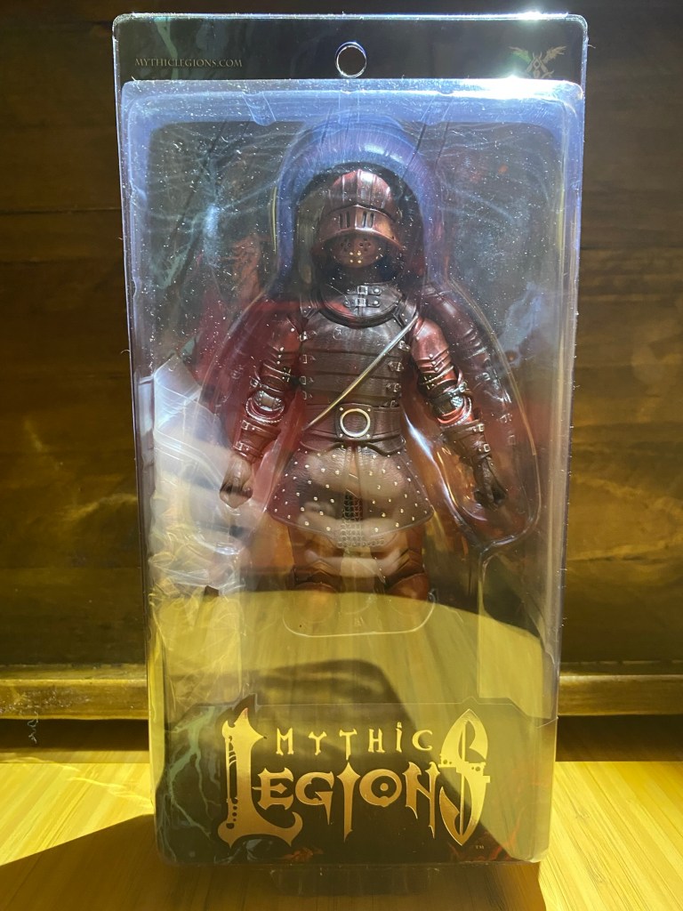
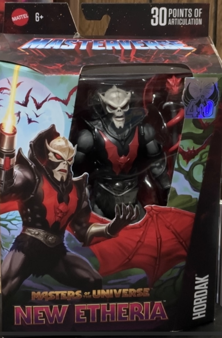
Hordak came in the typical MASTERVERSE packaging, with a very strong bat motif all over it. No other characters are depicted in the art this time, but the Fright Zone is the setting of this artwork you can see the figure clearly in the window, with a magic staff and pet on his left side. The image depicts hordak with the iconic cannon arm. In the corner is a foil sticker that tells us that this Hordak is a part of the She-Ra 40-year anniversary.

This time the wraparound on one side doesn’t show us anything but more bats, but there is a reference image on the other side, typical of MASTERVERSE for those who like to file the figures on a shelf or something…GI Joe Classified does this with a number system.

NEW ETHERIA HORDAK SIDE OF PACKAGE

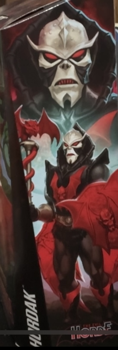
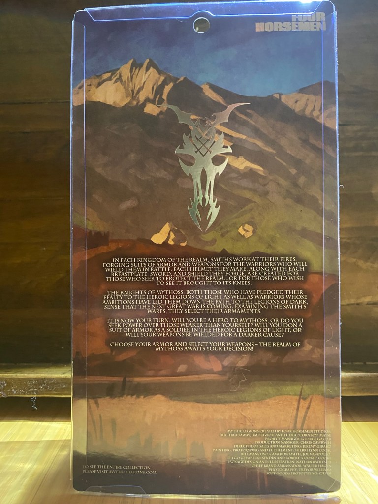
On the back you have a photoshop image of the figure at the Fright Zone and cross-sell images for this wave on the bottom, notably ignoring New Eternia Moss Man. (I have reviewed Teela already, and Kobra Kahn is coming soon).

NEW ETHERIA HORDAK BACK OF PACKAGE.

This bio tells us that Hordak is what devastated New Eternia, and is now moving on to Etheria.

I rather liked it better when he was banished to Despondos, a dimension where Etheria was pulled into.

WHAT DO WE GET IN THE PACKAGE?

Hordak is Cold Slither’s biggest fan! Notice the Roast Gooble CDs. The SpartanNerd last had music published on this CD. A new release, “PREACH!”, has been sent to the publishers! The first album in fifteen years.

Cold Slither Review was video only.

Here’s what you get:

  • New Etheria Hordak figure
  • Bat Wings
  • Cannon hand
  • Bat shield
  • Staff with a creature
  • Technically there is an arm band and two bracers also.

The big story here is the wings. They peg into holes on the back of the armor. And you really have maximum posability with these. They are molded in thin red plastic, with what may be gloss paint over the bones. Or maybe I’m imagining that. They look really batty.

And the battiness of this figure is what makes it awesome, but also kind of a complaint. Can you be TOO much of a bat? This guy out-bats Batman!

The paint on the figure is exactly perfect for Hordak. The Hordak I remember playing with as a kid was these colors. I know some people prefer a more blue-black-white color scheme from the cartoon, but this was awesome enough for me in the 1980s and it is for me today as well. There is a big red bat on his front armor, and some painted on his boots also.

As a kid I remember debating with my friends what exactly was Hordak. I said alien. One friend said robot. Another said vampire. I thought the vampire explanation was crazy, but this is what Mattel has went with in the past few iterations. In DC comics, he was a cosmic vampire, draining the life force of entire civilizations, and had made Zodac’s Galactic protector force (basically Green Lanterns) his enemies. Pitting both factions against each other having them fight to the death, he absorbed Zodac’s life force last…it was revealed he was his brother! A surprise twist. In the end he seemed to share a lot of cues with Emperor Palpatine.

The Kevin Smith show depicts him as a non-magic user but a people abuser just the same…another kind of vampire. His Motherboard virus basically enslaves everyone, and the way he manipulated Skeletor could easily be seen as vampiric.

The Masters of the Universe classics figure had something up on this guy because the “hood” was a separate part. In this MASTERVERSE figure his armor is all one piece.

I don’t have that MOTUC Hordak anymore, but I do have MOTUC Despara who is practically a girl Hordak figure. New Etheria Hordak wasn’t four horsemen sculpted and you can tell it, but it is cool to have both to display together.

ACCESSORIES

I decided the wings weren’t really accessories…more like a part of the figure. The Bat Shield has similar paint, and let me say I think both the wings and the shield could have more painted details. If that is indeed gloss red painted over the bony pieces, they could have chose a different shade or something. And if it isn’t paint then it should be. Your best bet to get the shield in his hand is to remove the hand and the bracer, then place the hand back on. So you see why I kind of counted the bracers as an accessory. The bracers are nicely painted in silver with the bat motif, and while I’m at it he does have an armband on his bicep that also has a bat.

You remove a hand to peg the cannon hand in. This one doesn’t have a bat motif, and looks good on Roboto and also on Trap Jaw. Notable that their accessories also peg into Horde’s wrist, and this is Mattel taking full advantage of what they should have done in the 1980’s.

Hordak’s arm cannon looks great on Roboto. Roboto’s paint sprayer…

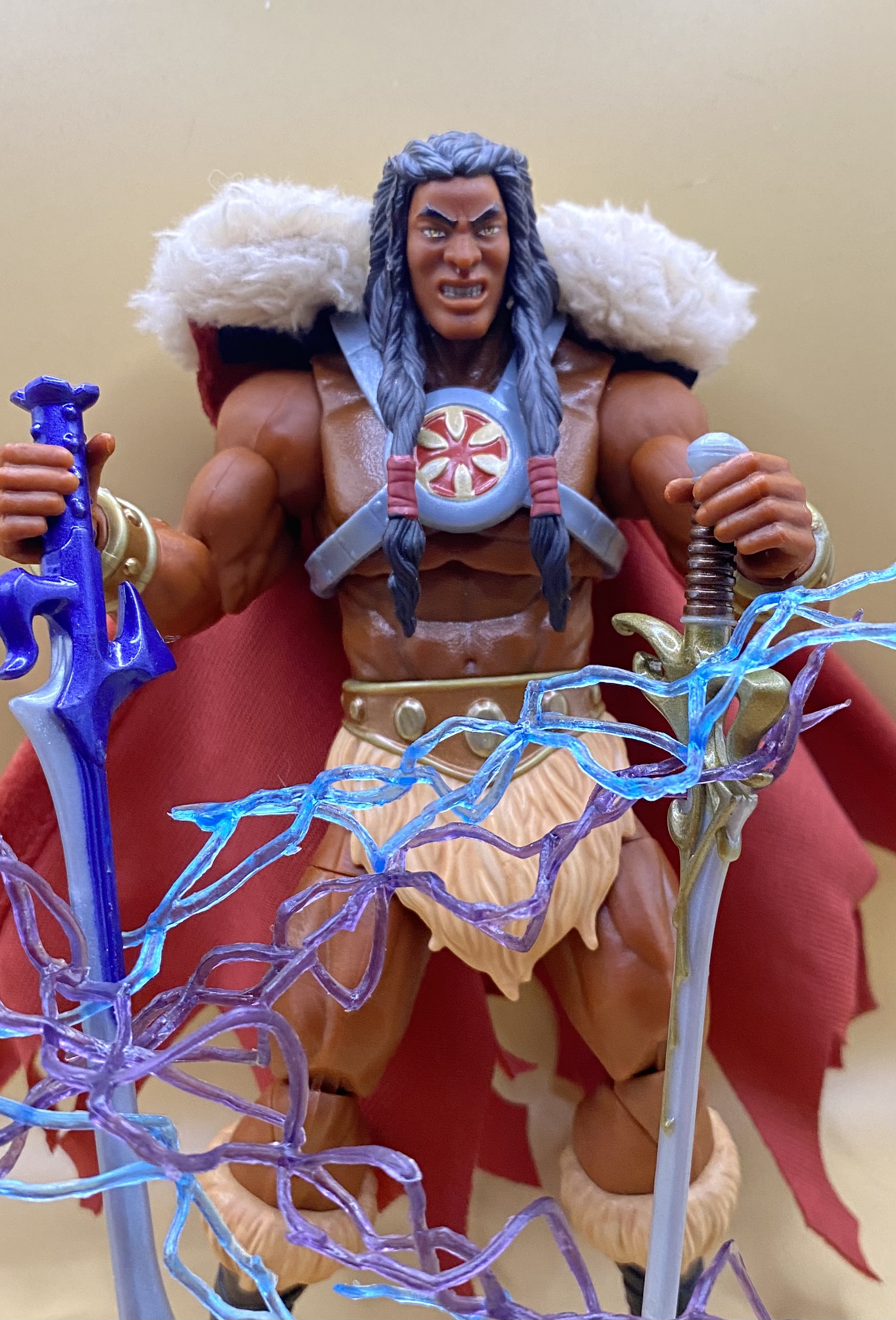
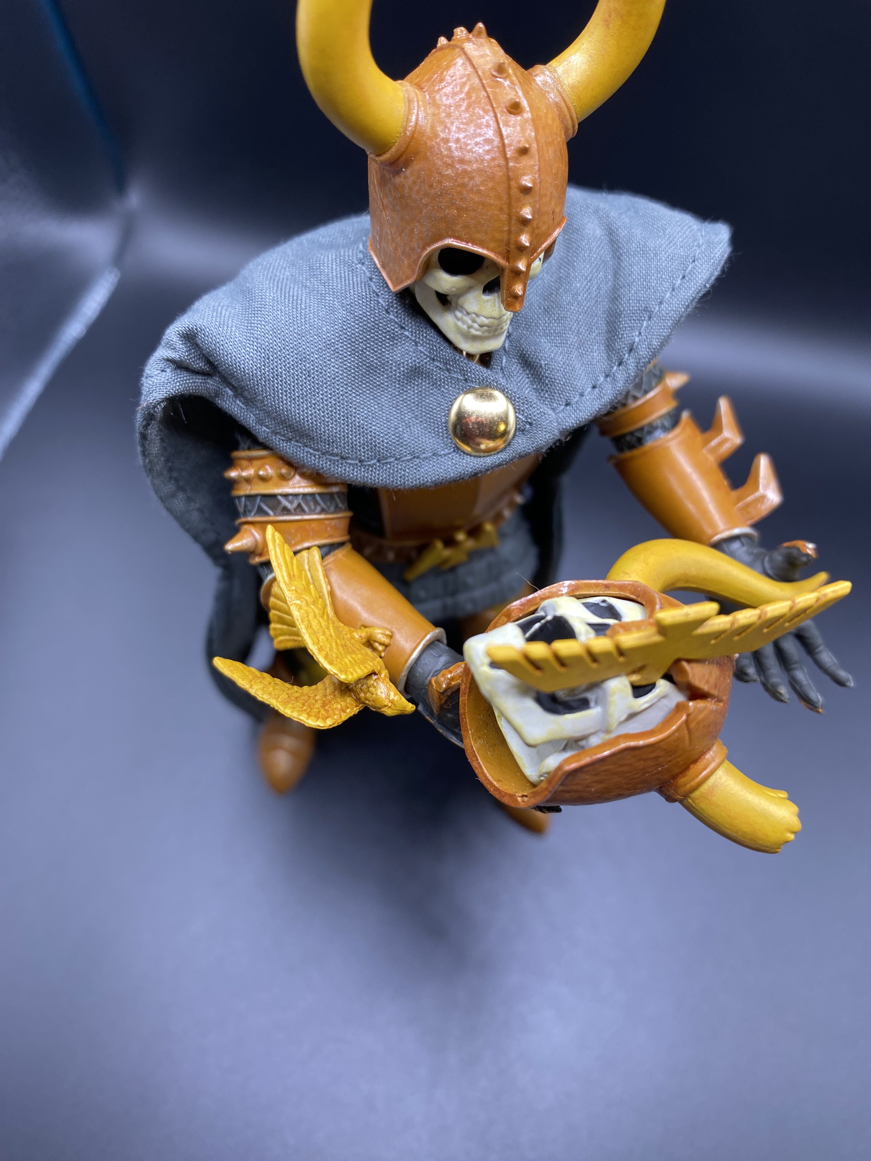
And now…about the staff and the creature. Hordak was always depicted as having a pet. Imp…was this little pig with wings…probably a demon. This animal on the staff is NOT Imp. It is a skull similar to the Havoc Staff, but it has bat wing (of course) but also a snake tail. It is a rubbery piece that can be put on other figures or wrapped around arms or pencils or whatever. The staff has a peg on it, and the pet has a hole to keep in on the top. You can use the staff as a perch for a bird, however. I don’t remember the vintage toy having a staff. Maybe it did? I do know it came with a crossbow…most of the Horde members had a crossbow, most of them with a bat motif. Nowadays Hordak doesn’t seem to look right without having a staff of some kind. I think this might be because of the Classics version or something.

PICTURED: MASTERVERSE New Etheria Hordak with Masters of the Universe Classics Temple of Darkness Zoar.

SPARTANNERD RATING OF MASTERVERSE NEW ETHERIA HORDAK

HORDAK gets a point for this terrific sculpt. Mattel needs to bring this A-Game to most MASTERVERSE figures. There are a lot of re-used parts, and I suspect the way that they make figures nowadays is different than back in the Masters of the Universe Classics days. Like, maybe they have a computer that can mock up and produce molds and tools faster or something. The worse detail is the wings, which could have more sculpted details.

His paint is great. The gray, black, and red details are accented by the white face that could either be some kind of bone or what I used to believe a tribal mask. There is a pop of chrome on the arm cannon, and there is glossy paint on the bottom of his boots, with matte paint on most of the figure…but all of the red is glossy.

His articulation is usual. Which is pretty excellent actually. Hordak has double-jointed knees and elbows. He has a head swivel on a ball joint. Boot cuts, thigh cuts, hyper-articulated ankles, swivel and hinged wrists, and I’b bet underneath that armor there is a torso cut. Add the wings…and Hordak is one of the best figures for poses in the line.

He comes with all the accessories listed above, PLUS his bracers are removable and he has a removable Horde bicep wrap. Like I said, the wings are weakly sculpted and painted. Not so much as weakly sculpted, but they are sadly very symmetrical, which makes them seem more like a cheap detail. I’m not subtracting a point, but if one were subtracted it would be because of lack of paint on the wings or shield.

PICTURED: MASTERVERSE New Etheria Hordak usurps the Havoc Throne from Skeletor, and takes over his undead empire. Hordak is armed with the blast effect from New Eternia Thunder Punch He-Man, and New Eternia Skeletor is knocked to the ground with various Mythic Legions skeletons. There are also three grim reapers here, with MASTERVERSE Revelation Scare Glo, Mythic Legions Maxxilius the Harvester, and Marvel Legends Lady Death. And Panthor looking cute with a leg bone.

The “feels point.” Hordak gets this for me because of who he is. And he is a toy I used to play with a lot as a child, and watch on cartoons and read in mini comics even until today. I felt very burned when the 200x series ended the way it did, where we didn’t get a full story arc for Hordak. (It is said that Skeletor would have kicked his butt and took over.)

So the SpartanNerd rates MASTERVERSE New Etheria Hordak a 5/5. Do you agree or disagree, Hub City Geeks? Let me know in the comments! Also be sure to go over to YouTube to like and subscribe to my content. There you will find this review in a different form, as well as other recent reviews of MASTERVERSE, Mythic Legions, and other 6”/7” figures. (Six-Seven)

GAMECOCKS Knights- “Kitbash Bros.”SpartanNerd figure reviews and customization project

Way back. WAY back….WAY BACK in February (2025) there was this magical event called “The SCMEA Conference.” (Happens every year.)

I took this couple of days of staying in Columbia South Carolina to do a bevy of figure reviews. I reviewed MASTERVERSE New Eternia Evil-Lyn, the Mythic Legions Ninian Infantry snake warrior guys, and the MASTERVERSE Skelcon. But I also began this project, that I eventually named “Kitbash Bros.” I wanted to wait until football season to release the review, so here we are on this season opening Labor Day weekend of 2025.

The Four Horsemen Studios had just released their wave of Legion Builder knights figures. These were a lot of the same knight over and over in different colorways. Most of them. (These are still on sale on their store…you should go take a look). Truly most of them are the same figure. There seems to be an “evil” and a “heroic” type, with some varying helmets. But the striking thing is the different colors. But then there was the Red Leather knight. He was different. And when I saw him, I knew it was time to get crafty.

I had been collecting knights, along with skeletons, barbarians, and apparently non-mythic legions females. (It’s true. My uncles should make fun of me for all of the Evil-lyn, Teela, Sorceress figures, etc). So I had Sir Godfrey and also a Gold Knight. And also the Xylernian Guard, more of an archer but still similar. When I got Sir Godfrey, with his “Knight Templar” motif, I noticed a dark version…”the Dark Knight Templar.” What’s more, he was far cheaper than Godfrey. But I decided to hold off.

But Red Leather Knight…Dark Knight Templar…SCMEA Convention in COLUMBIA South Carolina, home of the Fighting Gamecocks…FOREVER TO THEE. See where I was heading? I could in theory combine the pieces of the two knights and make an ultimate “Gamecocks Knight!” (There was a proper “Gothitropolis Ravens” rooster kind of in Gamecocks color. But who has that? A true mascot figure.)

(The Gothitropolis Ravens are dream figures…I felt priced out and this was one of the reasons why it took me so long to get into Mythic Legions)

I said “began” at the beginning of this post. Keep reading to see how this turned out.

(Post Structure: Dark Knight Templar review first, Red Leather Legion Builder next, then Kitbash Bros)

DARK TEMPLAR PACKAGING

The Dark Knight Templar came in the usually collector-friendly packaging. You can see the figure inside very well. (I am in a hotel room, where I have made a photography table out of the end table and a book light that was attached to the bed…I did the same thing with Evil-Lyn and others that I reviewed in this room). Perhaps notable is I don’t think sourcehorsemen is a website anymore, showing the age of this figure. (I believe this was among the first figures labeled “Mythic Legions,” so Gen 2 knight after the ravens)

The back has this image. And I don’t think I have seen this image before. It shows all the guys who came out in the wave kind of lined up in a battle formation. And there were eight figures in that wave…impressive. The only one I think I have seen is the goblin guy. Maybe the bearded guy on the bottom. The ones I have seen are probably re-issues (All Stars waves)

Here is everything you get.

  • Black Knight Templar figure
  • Halberd weapon in two parts (pole and axe)
  • Shield with the Templar Cross in black and white
  • Shoulder pauldrons of a smaller variety than usual
  • A regular knight’s sword, with a scabbard
  • a leather weapons strap.
  • Also notable…those “wings” on the helmet are removable.

So this figure works exactly like Sir Godfrey. But he has those wings on the helmet. (fins? horns?)

This was my first time with the halberd…a weapon that I would see again. This time it was in chrome. The pauldrons snapped right into place with little effort. So that’s unexpected.

BUT…the scabbard. Such a rare accessory. I was excited to see this! But sadly, the connector on the back of it came off with the tiniest of effort to get it on the weapons strap. BOO! But this would prove to be the only real problem with the figure.

Sculpt and paint. Great! (1 point)

Accessories. Great! (1 point)

Articulation. Very nice (1 point)

Stupid problems– easily broken scabbard. (no point. BOO!)

The Feels. I am going hold this point until the project is over. The purpose after all is to make a Gamecocks Knight! (? Point). But as a standalone figure he seems like he would work well in Elden Ring.

RED LEATHER KNIGHT PACKAGING

Once again, classic Mythic Legions packaging. BUT…this time we have foil lettering. NICE!

The back notably doesn’t have a cross-sell on it. Instead we get what I think is the same image that came with the Heroic Magic Effects, but with a foil Four Horsemen Studios mascot on there. There is a bio on the back. And basically “choose your armor and select your weapons”…is the cross-sell. They want you to go buy a whole mess of these guys. (You can buy the whole set for $450 or individuals for around $45)

I have installed the pauldrons, the belt, and the weapons strap already.

Here is everything you get

  • Red Leather Knight Legion Builder
  • A pair of pauldrons
  • A weapon strap (the usual)
  • A belt with leather strips
  • A shield
  • A mace that has two options for a head
  • A sword with scabbard
  • An epic sword
  • a pair of fists.

So let’s characterize this figure as the newest knights build, maybe gen 3, as opposed to the dark Knight Templar which seems to be pretty old. These pauldrons went in easier than any other mythic legions I have, including the Ninian Infantry. Right away, this was noticeable. The sculpt and paint on this are remarkable, especially since the price was fairly low. Every rivet has a gold paint hit. He is a little more glossy than I expected…I consider this to be ok, but maybe it takes away from the idea of “leather” a little bit. The head is the same knight’s head that came with Father Christmas, and I think this is the first figure to use it. I mean…look how awesome he looks. And this is without discussing the accessories.

The shield…Let’s just say this shield puts the MASTERVERSE shields to shame. It is the same shield that came with the Undead of Vikenfell, only in gold and gray. Why are there two swords? One normal knight sword, and the other epic “greatsword?” The weapons strap has a gold buckle paired on it (yay!) and the leather belt has more leather bits hanging down. If you played Skyrim you know you can use leather bits like this to improve your armor. The mace has the same head that came with the mace the Ninian Infantry had, but this time with gray and silver “enamel (wrong word?)”. The alternate is a classic iron ball with studs. So there are paint hits on every stud on the figure, and studs on the weapon. So is this guy a … stud… (Don’t ask me!)

Sculpt and paint. Great! (1 point)

Accessories. Great! (1 point)

Articulation. Very nice (1 point)

Stupid problems– Well, I was extra careful with that scabbard. But it is the exact same piece I assure you and has the same stupid problem. BUT. I am aware of it and had no breakage. So I won’t mark down on this one.

The Feels. I am going hold this point until the project is over. The purpose after all is to make a Gamecocks Knight! (? Point). Same comment as above…he seems like he would belong in Elden Ring.

THE PROCESS OF CUSTOMIZING

After I took the photos above, I got to work customizing. And I went ahead and got out the hotel hair dryer. (I didn’t want any incidents like happened with The Monkey King.)

I sat in the floor of the hotel room with all of the pieces disassembled. Right away it is obvious that the Red Leather Knight is more easily modular than the Dark Knight Templar. I don’t know how many years separate these two guys, but the Legion Builder seems to want you to take him apart and re-arrange him, while the other more legendary figure seems to fight you. I didn’t need the hairdryer on the Red Leather Knight, but I had to use it over and over on the dark knight templar. And then…as I began to re-assemble them how I wanted, Dark Knight Templar did NOT want to play well. I had to use the hairdryer again and again. And I was starting to get tired. So I put it in a box and took it home to work on over the next weekend.

…ONE WEEK LATER…(I hoped to do this quickly. Oh well!)

I got them together how I wanted, but they still weren’t “Gamecocky” enough. So I went to the store and got some magnets (no sports stickers at Dollar General Market?) and adapted one for the blank shield that came with the gold knight. Some time during the COVID crisis, I built a Master Grade Epyon Ver Ka model, and used glossy reddish-purplish paint. I used some of this. And so I now present (you probably already saw it as the lead image to this post)

TWO GAMECOCKS KNIGHTS!

I hit the Dark Knight Templar helmet with some … let’s call it “garnet” highlights on the wings and on the cross of the helmet. (Sir Godfrey has a gold cross in the same way). I’ve swapped legs pieces, shoes pieces, and arms pieces to even it out, and they both appear now to play for the Fighting Gamecocks!

And so, in memory of when Carolina defeated Clemson on November 30, 2024, with a score of 17-14, and also in honor of todays (August 31, 2025) win over Virginia Tech at the 2025 season opener, (24-11)…

SEE WHAT I DID HERE?

PICTURED: Garnet and Black vs. Orange. Kitbash bros and Cosmic Legions T.U.5.C.C Pilot vs. Cosmic Legions Wal-Torr the Mad, MASTERVERSE New Eternia Beast Man and Snout Spout.

SPARTANNERD RATING

Is it fair to rate my own project? No, what I am rating are the two action figures, and including whatever my project accomplishments were to “the feels” score.

Dark Knight Templar– This one gets 4/5, losing a point because of the broken scabbard. A scabbard is kind of a rare piece, and I was excited to see it, but so disappointed that it broke when I was just using it normally. The sculpt is great. The paint is dark and moody and great. Who doesn’t love the black knight? An iconic character re-imagined as Batman and also as Darth Vader. He did give me some problems with being a modular figure…all Mythic Legions are modular with swappable parts. But he fought against me. Just the same, I was able to get TWO Gamecocks Knights, so 4/5.

Red Leather Knight– This one gets all 5/5. Awesome paint for a Legion Builder…a figure meant to be bought as an army. Great accessories, though two swords is a head scratcher. I especially like the shield, and he looks very “football” really without even doing anything to him. Easy 5/5. And it was his parts that made the TWO Gamecocks Knights that are the KITBASH BROS.

Do you agree or disagree, Oh Hub City geeks? Let me know in the comments! Like and subscribe also the SpartanNerd YouTube Channel!

(Sorry for not many reviews lately…Summer Vacation is over an all that, but I have several things coming soon)

SSKUR’GE (Cosmic Legions Whiplash Tribute figure)

Whiplash is the only villain in modern form for Masters of the Universe that I feel I am really missing, besides maybe Modulok and Screech. That MASTERVERSE figures are very affordable and generally excellent, and plentiful unlike the superior Masters of the Universe Classics figures has allowed me to have a goal and complete that goal. Reclaim all of the figures I had as a kid. So to me Webstor isn’t important. Jitsu and Ninjor, not important. I didn’t have these. I like the Evil Horde, and will get some of them, but I don’t have the same connection to them as I do Skeletor’s friends. I’m ready for them to release some MASTERVERSE Snake Men. There are also a lot of holes to fill in the Heroic slot for me.

The MASTERVERSE Whiplash figure Mattel has put out just isn’t that great. I haven’t seen it in person, but the pictures I have seen of it just don’t do it for me. Like most MASTERVERSE figures he is too lanky, and I believe Whiplash should be bulkier if anything. The head seems too small and kind of wrong. And the weapons and stuff seem off too. The secondary market price is around $40, and I just figure eventually they will come out with a better one. (I have seen a sealed Classics Whiplash for $200. PASS!)

But then there is this…I saw it at Toy Federation in Greer, SC. (Maybe that is more like Taylors or Simpsonville?). (Excellent store. I can spend hours in there and would if I lived closer!)

So this is SSKUR’GE. A Cosmic Legions figure (and my first one!). In case you didn’t figure out from the context clues, Cosmic Legions is the science fiction version of Mythic Legions. You can see a cross sell from the back of the packaging below.

You can see that there are some other Masters of the Universe tributes in this line. Slush Head and Man-E-Faces.
Because this is my first Cosmic Legions figure, I wanted to show off the packaging a little more. Check out the font of SSKUR’GE’s name below.

This little story lets us know that SSKUR’GE is a bounty hunter, and as I read this and the story online about him, I get the feeling that he is kind of like The Skuxxoid from The Transformers.

Outpost Zaxxius is apparently the name of the set that SSKUR’GE was released in.

So what the Four Horsemen studios are doing is kind of one-upping Mattel. They have their own IP, but are doing their figures in tribute colors to the Masters of the Universe. Case in point, I ordered Anthophilees immediately when I saw him. (Maybe get him by Christmas next year. (Sigh.). Anthophilees is the strongest example of them all (Buzz-Off tribute), but here SSKUR’GE is very strong in the Whiplash hole. He really only has one weakness…neither head looks like Whiplash.

(If you want to see another example I have of the Four Horsemen tributing a figure, check out my review of Demistros, the Skeletor tribute.)

When you get him out of the box, this is what you get. You have to attach the tail…

So to accomplish this, you have to take your brand new $75 giant figure and separate the torso from the waist. This was not easy. And then you have some soft goods for furry shorts (not furry shorts), which complicates getting it back together correctly. I am never removing this tail again, or swapping the parts of this figure, so at least I won’t have to do it again. (In case you don’t know, Mythic Legions and Cosmic Legions are entirely parts swappable in their own scale. The scale of this figure is Ogre scale.) I made good use of the hair dryer.

If you watch these little turntable clips, you can hear my birds chirping in the background!

Here I am showing you the figure assembled and everything you get in the box, and also including the inside of the box as the diorama. (He is standing on the box for Skeletor’s Throne)

In the box, you get

  • SSKUR’GE figure, who is “ogre scale” and of the apparently new “dragon” buck.
  • Two heads, one dragon “default” and the other alien.
  • Four alternate hands, two of which are fists
  • A large spear with a mace head
  • A scythe and trident intended to combine into one weapon.

THE SCULPT

The Four Horsemen are just the gold standard. That’s it. They have built these lines on this quality pop-art form. Think about it, did you need Mythic Legions or Cosmic Legions in your life until you saw them? There is no cartoon or comic book. No video game. Just the toys. They have created a line of generic fantasy that is positively KILLING IT. They made it for the Elden Ring fans and Dungeons and Dragons crowd. They made it so it goes with Masters of the Universe, or in this case also Star Wars or Transformers.

We have seen elements of this sculpt before in MOTUC Draego Man. I don’t have that figure any more, but I went back and looked at some pictures. They have truly advanced their ideas. Draego Man as a figure appears to be much stiffer and have less character. You don’t see the joints right off like you did in the old MOTUC days, and that has something to do with it.Here SSKUR’GE (I really like typing that name) has similar scales and toothy, horned elements. (This exact same sculpt with different paint is available as Mythic Legions Araccagor.)

I don’t know if you can tell, but I don’t care too much for that alien head. To me it looks like some kind of sad duck. The reason I almost punted on this figure is that neither head really looks like Whiplash…But…

PICTURED: Mythic Legions Balthor the Tower Ogre, armed with Animal Warriors of the Kingdom’s gold axe. And SSKUR’GE armed with the scythe and trident spear.
PICTURED: Same as above, but this time Balthor is throwing a Skeleton Legion Builder figure at SSKUR’GE, who is ready to to use the Whiplash tail. Notice the plugs on the back of the harness…I haven’t removed it, but likely one day we will get some wings.

PAINT

(Continued from …But…). The green and blue paint apps on this just overrides the weakness of the head sculpt when you put him with the other MASTERVERSE villains.

PICTURED: MASTERVERSE New Eternia Two-Bad and Cosmic Legions SSKUR’GE. Don’t these two just “seem” to go together?

The green is intentially two-tone Whiplash colored. The lighter green highlights his face and underside parts like hands, and the darker represents armor on his back. Not only do I get Whiplash vibes, but also Killer Croc vibes.

The armor pieces like the bracers and the waist pieces have a metallic sheen that I really like. That soft goods loin cloth is a kind of felt with fancy stripes. I can’t tell if the metal ring on his back is actually metal or plastic, but it is painted in the same color as the shiny parts of green on the harness. There is a pop of gold on his belt.

ACCESSORIES

Oh boy. Here is a weak part.

So the long pole mace that he comes with has the same handle as the weapon that came with my other ogre scale figure. Can’t the Horsemen give us something different? This time it is painted in gold or brass. And what even is a mace like this?

The other two weapons are designed to fit together in tribute to what Whiplash came with in the 200x line. The problem is, the handles are for a different scale of a figure.

PICTURED: Comparison Time! I don’t’ have a vintage Whiplash, but I picked up a loose 200x Whiplash the day before I decided to go back to Toy Federation. To me, everything is similar except the head sculpt.
PICTURED: SSKUR’GE fights against a Legion Builder gold knight (review coming soon) and also Mythic Legions Sir Godfrey (I think I have the name correct.) My point is that the trident and scythe don’t fit on the other pole.

But wait…there’s more…(facepalm)

These weapon pieces would be better if they could fit together on the pole pieces that came with the mace. But they don’t. I tried jamming them together…it just wasn’t really meant to happen. And it would be far cooler if it would work.

SPARTANNERD RATING OF COSMIC LEGIONS SSKUR’GE

I’ve said it before and want to re-iterate. As an adult collector, I have a job. Sometimes I have two. I have real life responsibilities, and this side hobby is pure escapism. It is escapism from the constant bad news. The constant political news. The constant culture wars. Getting this was an alternative to buying new Magic the Gathering cards, or a new video game, or going out to eat somewhere, or going to the movies. The nostalgia factor here is a key part of it. But also, like I said above, the Four Horsemen have created things that you didn’t know you wanted until you saw it. Kind of like Steve Jobs/Apple did with the iPad I am typing on right now. I happened to be going through the area where the Toy Federation is two days in a row. I walked around with the box on the first day, but then bought the 200x version instead. When I went home, it was nagging at me. So the next day when I was in town I went ahead and grabbed it.

SSKUR’GE here checks every box. Can I chalk up the head sculpt not being like Whiplash as a weakness? Not for this product. Both head sculpt options are sculpted and painted terrifically, just neither looks like Whiplash, which at a certain point the Horsemen probably aren’t allowed to do anyway.

I do think the accessories are the weakest point, and believe the Horsemen could have given us a proper scaled trident but cut the corners here. On the other hand, both parts of the weapon have good paint. Still not sure how practical a mace on a long pole would be. But it does look cool, and will be modular with other weapons in ogre scale for the line. And it isn’t like he can’t hold the trident…it is very loose. But this weapon is in scale for the other Mythic Legions that I have so it has additional use.

I couldn’t be happier with this figure. It is one of the best that I purchased over the summer. 5/5. I MIGHT look into getting a proper Whiplash head sculpt on the customizers market. Or maybe I will wait and see if Mattel comes out with a better MASTERVERSE Whiplash. But if they do, it won’t be as awesome as SSKUR’GE. And when assembled with all the bad guys, he really completes the picture.

My “bad guy” collection. Everyone’s here (Except Modulok and Screech). One Day I might update this to be a better pic with a proper diorama backdrop.

So SpartanNerd’s rating of Cosmic Legions SSKUR’GE Whiplash is 5/5. Do you agree or disagree, oh Hub City Geeks? Let me know in the comments!

TRANSFORMERS #10 FEATURES A LETTER BY THE SPARTANNERD!

Below is what I sent in to “The Matrix of Lettership” in reference to Transformers #8 after I was moved by the character development. This was an issue about grief. This letter was printed in issue #10.

Dear Matrix of Lettership,

I have been reading comics for years and years.  I barely remember not reading comics (I am 45.). But I’ve never written in.  This is my first time.

When I saw advertisements for the Energon Universe reboot…I was very excited.  But Transformers now stands a head taller than all other comics in recent memory.  I mean…since Flashpoint and The New 52.  Since McFarlane’s Spider-Man and Spawn 1-100.  And it works better than the comic book versions before it for some good reasons…you are bringing real life to these characters.  Every one introduced so far has some reason for you to care about what happens to them.  From Megatron in the hands of Cobra Commander to Soundwave taking revenge against Starscream for kicking Ravage.

But issue #8 is plumbing some even deeper depths.  There is real grief from Carly and Spike.  And it all weighs so heavy on Optimus.  I wonder if personal experiences from the writers are going into this character development?  I know it spoke to me because I have had some intense grief in the past few years.  But one panel in particular stuck out.  I felt like this small panel should have been a cover.  (Can it be?  Is there a way?)  Optimus sits beside Jetfire, who is barely alive and evidently on his way out.  He says “I cannot see the stars anymore.” And “Don’t leave!  It’s so dark.  Please…”. 

Yes.  We all read it.  But for me, it struck a nerve.  I have sat beside too many dying saints who just needed or would have wanted someone to be there.  You mentioned the issue was very hard to write and you didn’t know why.  I think I know.  There was so much conscience in this work.  From this touching panel to SkyWarp changing his mind to Thundercracker wishing to spare the humans.

I think the last book that got to me like this was Action Comics #13 WAY BACK in the New 52 (The Krypton issue.)  The moment between Optimus and Jetfire also reminded me of “I don’t feel so good Mr. Stark!”  And we all sit there feeling so many emotions as Tom Holland/Peter Parker fades away.  It weighed that much.  And full disclosure, I never have been that big of a fan of Jetfire.  (Loved the Revenge of the Fallen version). You made me care.  Mission accomplished!

Here is the printed response I received from The Matrix of Lettership

Thanks so much for recognizing myself in the pages, [SpartanNerd], and for recognizing the struggle! By no means do I try to put my actual feelings into TF, but we all have things we go through that influence how we feel about the world, and it’s my personal opinion that storytelling is very bland and one note without this individual human perspective. I’m hoping that TRANSFORMERS is a little like a reader taking some “DWJ goggles” and seeing what the filter does to the world around them. I’m trying my best to put myself in the worlds’ shoes, and what better way to do that than with Optimus friggin Prime? Maybe that’s embarrassing to say out loud. OH WELL.

NOTES AND THOUGHTS (for the benefit of friends who don’t regularly read SpartanNerd.Com)

What happened?

Comic books traditionally have a “letters page” at the end, where readers can write the creators and provide feedback and ask questions. Transformers has named their letters page “The Matrix of Lettership” which is a riff on the “Matrix of Leadership” item that Optimus Prime has installed in his chest. (Also, in case you don’t know…this item is a symbolic totem offering the wisdom of the past to the chosen leader who has it…It is a great honor to have it then!) Usually the feedback offered by fans is positive, but sometimes constructive criticism is offered. I have no idea how many letters were sent in to Transformers, but I bet they get a ton. (Letters nowadays means e-mails). But I CAN say that it seems like every issue of Transformers on this Image/Skybound run has gone to reprints. I’ll be getting every variant cover I can now of issue #10 since I am published out there to readers of Transformers comics.

I am very blessed to have my letter printed. The topic of grief is one that I am soon to be leading church devotions in. I read this issue right as I was being called to do that, so it hit the right notes for me.

What am I talking about in my letter? What does the response mean?

On announcing to Facebook and to others about my letter being published, I was unaware that people outside of comics wouldn’t know exactly what I was talking about, pretty much at all. For instance a librarian that I know didn’t realize it. My wife’s aunt didn’t. So here is some explanation.

Transformers- This was a toyline by Hasbro in the 1980’s of vehicles that transformed into robots. There were two teams…The Autobots and the Decepticons. The battle between the two sides was on a syndicated cartoon show modeled after what Mattel did with He-Man and the Masters of the Universe. Optimus Prime was the Autobot leader and is the enduring symbol of the franchise. Other notable transformers are Megatron, Starscream, Soundwave, Bumblebee, and for purposes of this letter, Jetfire. (Transformers is the American adaptation of the Japanese “Giant Robot” genre. So they are an offshoot of Gundam.)

The SpartanNerd can list on one hand how many of these toys he owned as a kid. They were so expensive I didn’t have many. He-Man figures were $5, while Transformers were usually more like $20, except for the mini-cars. Mini-cars were the same size as Hot Wheels and featured simple transformations. These were about $5 each, but a Hot Wheels was less than a dollar, so…The point is, I didn’t have many, and most of the ones I had were Decepticons. These were Schrapnel (Insecticon), Weird Wolf (Headmaster), Scattershot (a part of Computron), and Shockwave. Eventually one of my brothers got Powermaster Optimus Prime for Christmas. It seems like one of us might have had Ratchet.

There was an iconic and tragic Transformers movie where Optimus Prime was killed and the show “jumped the shark” in my opinion then and now. Transformers regained popularity in the 2000’s when Micheal Bay began to make live-action movies using CGI. Modern Transformers toys aren’t as solid as the classics from the 1980’s, but they seem to be more categorically affordable. (I don’t have any of these, but my children did. Modern collectors versions are BONKERS AWESOME.)

The Letters.

Flashpoint and New 52 were DC Comics “reboots” within the past 15 years. Flashpoint truly re-mixed the classic characters like Superman, Batman, Wonder Woman, and Aquaman. The New 52 is basically where the story continued after “The Flashpoint.” (It’s kind of the same story they have going on now.)

In my letter I referenced the New 52 Action Comics #13 and made a typo…that should have been the “Krypto” issue, not “Krypton.” Cut me some slack…it was 11:30 PM! This is the issue that Krypto gets locked in the phantom zone while the planet explodes. But he is like an angel watching Clark Kent grow up. Until eventually they learn to use the Phantom Zone (this story was maybe ten years ago…I don’t remember the details,) but Krypto jumps out ready to play. The way the story was written was very emotional, and unexpected. It was a fresh take on what was sometimes a corny character.

Spawn issues 1-100…this was Todd McFarlane’s comic book character after he left Marvel. The first 100 issues are what most Spawn fans consider the best story. This still is an ongoing story, but most fans believe the best days are behind it way back in those issues. I have read these 100 issues many times. I also like an offshoot book, Spawn: The Dark Ages. All around, Spawn is kind of a combination of Batman, Ghost Rider, Hobgoblin, Spider-Man. This was a comic written for an adult audience…it left the trappings and restraints of usual super-hero comics behind in favor of “extreme” art, violence, and language. It also handled religious and social issues as “comedy” in the sense of Dante’s Inferno.

Jetfire– I remember watching the Transformers cartoon as a kid and realizing that Jetfire was a Decepticon who turned Autobot. I felt it was some kind of brainwashing or something. I mean…I was young, so this was how I understood it. the Transformers movie sequel Revenge of the Fallen portrayed him in a military museum disguised as a plane, dormant from lack of energon. He scans a more modern Blackbird to transform into when Sam activates him with his shard of the Allspark. My father thought this was hilarious on account of the writers made Jetfire into an old senile man with gas. (We watched this movie together in the theater, a rare treat as an adult and a good memory of my dad laughing). Upon hearing the state of the war, he switches sides from Decepticon to Autobot right there in front of us. But Jetfire eventually saves the day, sacrificing his spark and parts to revive Optimus Prime, making the two of them combiners at least temporarily.

In the Energon Universe, which is essentially what we used to call Transformers vs. GI JOE, Jetfire is the first Transformer we saw in Void Rivals #1. And then he re-appears in Transformers #8 depleted of energon and essentially dying. And this is the component of the story I was addressing when I wrote in. There is grief and introspection from most of the characters in this issue, not just about Jetfire, but the human characters Carly and Spike have also lost loved ones, and Spike is in a wheelchair for getting involved in the Autobot/Decepticon affairs.

DWJ goggles…this is Daniel Warren Johnson, the writer of the current Image “Skybound” Transformers comic. He is saying he hopes to portray the fantasy world of Transformers to the real modern world in a way that he sees it. He said something else in this letters column (not in response to me), that has me worried. He said “Why am I working so hard on licensed characters.” He also responded to someone else’s letter that there wouldn’t be any spinoff series while he was the writer. I certainly hope he doesn’t go anywhere! He is doing a great job of bringing alot of soul to this book! (Image has a history of taking pride in original characters. They are a mainstream “indy” publisher if such a thing can exist.)

Complaint

I have had this one for a few issues. They have printed the letters in light pink on white paper. My failing eyes gave me a lot of trouble reading this. It seems like some other Energon Universe letters had yellow on white. Come on guys!

Final Thoughts

I truly find it an honor to have my letter published. This book has been great, and the Energon Universe is new and exciting. I like how it was put in a recent GI Joe comic’s letter section…the Energon Universe is comparable to Marvel’s Ultimate comics of the early 2000’s. It is a re-thinking of Transformers and GI Joe. Void Rivals is space opera, that is beginning to trickle down into Transformers, which is a contextual story, and GI Joe is effected by it on a human military level. If you like Transformers and GI Joe, you should jump into this new universe. There is an ongoing GI Joe story not in the Energon universe…don’t get confused! The Energon Universe GI Joe books have been named after main characters so far. Duke, Cobra Commander, Scarlett, and Destro. I recommend all of these as a great place to jump in to what I hope is a universe that lasts a LONG TIME.

Major and Minor- SpartanNerd Commentary and review of Mythic Legions Magic Effects

Pictured: MASTERVERSE Revelation Orko, armed with Animal Warriors of the Kingdom magic staff, displaying Heroic and Evil Magic blast effects.

Maybe you didn’t know, but in addition to being a SpartanNerd and Reverend, he is also a chorus teacher…Yep. With a MMED in Music Education with an emphasis on sight reading music.

Now that I got that qualification (perhaps dis-qualification) out of the way, here is something they teach you at Music Teacher school. You shouldn’t tell the kids that Major sounds happy and Minor sounds sad. They can be either one. A great many country songs with sad subjects are in a Major key, and plenty of party-down rock and pop songs are in a Minor key. So…where is this going in regards to reviewing toys?

Did you catch what I might be talking about from looking at the above four images? The Four Horsemen are presenting the primarily blue and green magic effects as good, and the red and purple as evil. I have learned that the image on the back of the heroic effects depicts Aracagorr, who is a good-guy boss, and the one on the back of the evil effects depicts Poxxus, a bad-guy boss. Why are they pigeon-holing these effects? Outside of Star Wars, this kind of color-coding doesn’t happen much. I mean, it does. It seems like GI Joe might have green-blue blasts and Cobra has red-pink blasts. But some things turn this thinking on its head. The Joker looks cheery and happy, and someone who never saw him before might not think he was evil, but Batman might be construed as evil with the black cape and dark armor. Magic the Gathering flips this script also, Liliana is part of The Gatewatch and is a black-aligned character…White-aligned Heliod showed himself to be a Villain. Final Fantasy X and X-2 also have black mages on the good side. Elden Ring…is anyone good and evil?

How about this? Elemental magic. Lightning is orange or yellow. Ice is clear or white or blue. Life magic tends to show green. Fire orange, red, black. My point is that magic effects is one of the areas of the toy collecting and photography hobby where the fans can be more creative. Right off the bat I disagree with the philosophy the Four Horsemen are giving us for magic and blast effects. And I intend to prove that in the review below.

What do we get in the boxes?

Both are identical, but with different color schemes. You can see them in the packaging clearly, but here is one unpacked.

I’ll go from left to right. A long stringy swirl. 2 large discs, 2 medium discs, and 2 small discs. 2 swirling mists. (I believe the one on the left to be warped…even better then). A long lightning effect and a short lightning effect. A long magic snake effect. And a short skull effect.

Photos of the Mythic Legions Magic Effects in action

I am not going to show that many Mythic Legions toys in this review. So brace yourself. I don’t actually have that many, but I have wanted magic and blast effects for a long time for my action figures. These are the perfect size of six-inch scale. So prepare to see Masters of the Universe Classics, MASTERVERSE, Marvel Legends, and maybe some other things, as well as Mythic Legions.

Pictured: Marvel Legends comic book Thanos with Infinity Gauntlet hand. Mythic Legions Evil and Heroic magic effects skulls.

The little skulls are my favorite. The different colors highlight that Thanos is holding two different souls. Not necessarily good and evil. Because I am talking about mixing it up, why couldn’t one be Green Lantern and the other The Flash!

Pictured: Marvel Legends comic book Thor with Mythic Legions Heroic and Evil lightning effects. What we really need is that lightning in yellow, orange, or white.

Marvel Legends comic book Thor is my worst action figure. The lightning effects really add something to a character like this!

Pictured: MASTERVERSE Revelation Evil Lyn and Teela, both with their hair-down head scupts, and MASTERVERSE Revelation Sorceress. Teela is also armed with the MOTUC Great Unrest Staff of Ka. Also pictured are a variety of Mythic Legions Heroic and Evil Magic effects, and the two halves of the Power Sword from MASTERVERSE Revelation King Greyskull.

That “Pictured” caption took forever to type. Anyway, here I depict a scene where the Sorceress tells Teela and Evil Lyn about the two halves of the Power Sword. The magic effects add a lot to the scene.

Pictured: MASTERVERSE Revelation King Grayskull with Mythic Legions Heroic and Evil magic effects.

The back of King Grayskull’s box depicts an image that looks something like this. (I suppose I need to post a review of King Grayskull and the Sorceress soon.)

Pictured: Four Horsemen Studios Demistros, Mythic Legions Skeleton Legion Builder, who is armed with MASTERVERSE New Eternia “Viking” Skeletor’s scimitar and MASTERVERSE Revelation Teela’s shield.

Here they are with some actual Mythic Legions figures. Demistros is bringing this skeleton warrior back to life. The swirling mist adds something. It is given life by the green soul skull escaping from the red portal. If I had used the red skull, would that story be as clear? Nope.

Pictured: MASTERVERSE Comic-Con exclusive Scareglow with diorama box, MASTERVERSE Revelation Teela, armed with The Great Unrest Weapons pack armor and staff of Ka. Cosmic Legions Silver Figure Stand, Mythic Legions green snake effect and green skull effect. An aquarium plant hides the stand.

I didn’t realize that the snake effect was actually a snake until I took this picture. While I am at it, notice that I have Scareglow mounted on the Cosmic Legions Action Figure Stand. So I am going to take a break for a quick review of that as a bonus under the ratings section below.

Pictured: MASTERVERSE Revelation Evil Lyn and Teela. Evil Lyn has Mythic Legions swirling mist effect. Teela has the red snake effect.

It seems to me that the red snake effect is perfect for the Staff of Ka. Which brings up another point. The Four Horsemen sculpted the Masters of the Universe Classics, and there were a bunch of snake staves sculpted for that line especially for the Snake Men faction. Dare I assert that this magic effect calls back to that?

SpartanNerd Rating of Mythic Legions Heroic Magic Effects and Mythic Legions Evil Magic Effects

Before this review, I actually already used some of the effects in my pictures in reviews on this site. This is a new and very useful item. It adds so much to really so many toys. I only scratched the surface! We need more things like this. The Mythic Legions Magic Effects plays nice in any sandbox. You could definitely use that lightning in Star Wars. You could put those smoke effects behind a Hot Wheels car or something. Disney Barbie dolls. Maleficent. Pokémon. Zelda action figures. I don’t own any of these, but oh the potential! Multiple scales, too. And apply them to the vintage toys like you always wanted.

My hangup is the assertion that the red effects are evil and the blue effects are good. That’s like saying you could only use Metallic crayons for transformers. You can only put ketchup on french fries. You can only add rubber ducks to Jeeps, not Ford trucks (I saw one today with ducks on the dash). I am surprised that this assertion came from such a well-rounded studio.

The sculpts are nice. The product does seem a little bit brittle. I am careful, but some kid out there probably wouldn’t be. But these were made for adult collectors, so…

I bought both sets and am scoring them the same. 5/5. They add very much to all of my collection, and I know they will to yours too!

BONUS: Cosmic Legions Silver Figure Stand.

After such a glowing review…time for a not-so-glowing one, lest you assert I am some kind of loyalist…(Everyone who reads this stuff knows I am honest to a fault perhaps.).

The stand stinks!

The stand came in this polybag with a yellow sticker- (see the photo near the top of the page.)

When you assemble it, well…it seems like the vertical end of the stand should be flush with the platform, doesn’t it. And in fact I have seen pictures of other peoples stand where it is. But mine would not click in. And I used a good screwdriver and a good wife to try and tighten it up. No matter what pressure I put, no matter how tight I made the screws, this “daylight” wouldn’t go away. I was afraid I was going to break it if I kept trying to force it.

If only that was the only problem.

When I was posing my figures outdoors reviewing the Animal Warriors of the Kingdom Red Weapons Loot box, I made a picture of Man-At-Arms using the bow and arrow. (See the review with the picture here.)

I put Duncan in the stand, but realized a problem.

The business end of the stand has this metal claw. Now there were these little rubber bits that covered the metal “points” of this claw. As I was posing the figure, they came off! Luckily no damage was done, and miraculously I kept them from being lost in the grass. But they didn’t make it this review, did they? Now if I use the stand, I have to consider that it might scratch the paint or damage the figure. (You can see these rubber pieces in the Scareglow picture).

My advice, SKIP THIS ONE!

Rating of the Cosmic Legions Silver Figure Stand: 1/5. This thing is awful. I know it is for the science fiction version of Mythic Legions, and I don’t even mind the silver metallic stand. That is fine for whatever. But the assembly went wrong. The rubber things came off and have since been lost while using the stand for its intended function. I worry about damaging figures if I use it. There are better stands out there for your money.

One might argue that it is because I used MASTERVERSE figures instead of Four Horsemen figures. To that I assure you that there isn’t enough difference in the thickness of their waists. I also assert that a figure stand should be versatile. Any action figure within reason should work. Thanos wouldn’t be within reason, so I didn’t try that one. Man-At-Arms should have been fine.

Two Generic Dudes- Demistros and Black Falcon SpartanNerd Action Figure Showdown!

I mean…I keep waiting on some Conan the Barbarian Ultimates! figures to show up, and they keep getting pushed back. So now I am expecting Battle at the Mounds figures in June and King Conan in July…I ordered both going on a year and a half ago! In the meantime, I have been building a MASTERVERSE collection, with a minor emphasis on skeletons. I already think Masters of the Universe Classics Vikor looks great fighting skeleton warriors, and that will be the perfect thing for Conan figures to fight. I am also on the lookout for a giant snake…

The Four Horsemen had a special sale, where I picked up Demistros. And because Super7 pushed King Conan back another two months, they gave me a 15% discount on my next order…which is why I picked up Black Falcon.

Both are great skeleton warriors, but I would like to do a little throwdown here. Both are kind of generic…I mean they have names but who knows who they are? Not me! Who will win? Let’s start with Demistros.

DEMISTROS

Demistros came in a plain box in the mail…it was small enough to fit in my grandma’s mailbox! (long story). But it was the perfect size. I don’t usually care, but it was nice to have a little less trash. Demistros’ package was no bigger or different than other Mythic Legions figures….But wait. Here’s a point. Demistros isn’t a Mythic Legions figure! They actually made him to be one of the generic baddies you might have encountered in 1980’s cartoons. They say so on the side back!

So back in the 1980’s, you would have Masters of the Universe to purchase, but sometimes you might go to the store and they only had figures you already owned. What to do? Get a KO. A knock-off. And there were plenty. Sometimes they would be named “Galaxy Warriors” or other nonsense. But I had a little collection of guys who could hold Masters weapons and ride their vehicles and really just blended right in. And this went along with the M.O. of the Filmation show also, didn’t it? There were Count Marzo, Lizard Man, and Strongarm just to name a few. Also, WWF/WCW wrestlers were big, and their toys also sometimes went right along with MOTU. So Demistros here kind of fits that bill. And how did I come across purchasing it? A random side impulse. “Store Horsemen In Stock Sale!”

The package has a nice illustration, and I prefer the blue/purple background to the red/yellow on the back of Mythic Legions. So let’s open this collector friendly Mythic Legions style box.

Oops…the cat’s out of the bag. (This little piece of paper!)

Here is everything you get in the package. The Demistros figure, who has all of the articulation and swapability of a Mythic Legions figure, a giant sword, a lance/spear thing, and a morning star weapon. Also, the cape is soft goods and separate, the pauldons are removable, and necessary to hold the cape on.

So here are some things. That head sculpt…when I ordered it, I didn’t realize how much of a BUTT CHIN it would have. I mean…severe BUTT CHIN. I mean, giant spikes coming from the chin! It is a very nice sculpt, and that is just a wacky detail. Green evil eyes. Kind of a repugnant smile. I think it was the horns that sold me. I am very partial to horned helmets. I did remove the horns with some force, and I am uncertain if they were meant to be removed, unlike most Mythic Legions parts. They snapped right back in, but caution, everyone! After I ordered this, I saw what must be the exact sculpt but red at the Toy Federation store in Greer, SC. With red, it looks like Satan. no other way to say it! It is amazing how much the paint changes the character.

Now I am of the mindset that Demistros is supposed to be a KO Skeletor. Skeletor is often depicted in modern media as having horns like this. From DC and Dark Horse comics to Skele-God in Masters of the Universe Revelation. It’s just that the Four Horsemen did it first in figure form, and they couldn’t call him Skeletor. Here is Skeletor’s head on the figure with proper weapons. I mean really, it is terrific! But as before, the head doesn’t fit the neck joint, so it is actually just sitting there. But in this case, there is a big “collar” that goes around the neck so that it isn’t obvious at all.

Pictured: Demistros body with MASTERVERSE New Eternia “Viking” Skeletor alternate head, MOTUC Havoc Staff from The Faceless One, and purple Power Sword from MASTERVERSE King Grayskull.
Pictured: MASTERVERSE New Eternia “Viking” Skeletor body with Demistros head and spear.

The cape…I really would like to put it on someone else. But after attaching it, using the hair dryer, etc. Way too much effort to be worth the fun. The trouble I had with it…That is probably never coming back off. It’s a shame, really. This is easily the best soft-goods cape on an action figure I own at this point.It really took me a lot of effort. The problem is that the peg doesn’t want to fit in the hole snuggly with the fabric of the cape in the way. (There are holes cut in the fabric that line up with the holes in his back.)

Articulation is just like Mythic Legions. All easy to move joints and modular parts. Only the head has trouble moving because of that glorious BUTT CHIN.

I think the whole sculpting on the figure is insanely good. And this is what the Four Horsemen do. No one is better at it in the business.

The weapons are a nice little variety. The sword is of the anime style…ridiculously huge. There are green “runes” sculpted on there. This is sculpting with paint details, and the figure appears to be powering up this sword. The morning star is cool. It has a real metal chain. My problem with this weapon is…how do you display it?

It just hangs. You can’t pose it swinging or anything. The spear/lance is the same weapon we already have gotten with other skeleton warriors, but this time we get a little bit of oxidized copper finish. It kind of reminds you of those bronze or brass grave markers. (Here is an example.)

So not many accessories. I believe the sword to be the best, but there is potential with the morning star…maybe I can figure out how to rig a wire through that chain so that I can pose it.

Black Falcon

Black Falcon came in just the opposite. A large piece of trash box labeled Super7. Which just meant that a FedEx man had to set it down outside my grandma’s door.

Inside that box was Black Falcon in a “The Worst” mailer.

And so let’s talk about The Worst. Who really cares about them? Who are they? No clue. I remember when The Worst was first released as ReAction figures. They were the first to use the Masters of the Universe Reaction molds for Battle Cat, which I thought looked ridiculous anyway. I couldn’t get behind the big hole in the back where you had to put the poorly articulated three inch figure. I have seen Masters ReAction figures on pegs, and I just think they are dumb, which is why I don’t own any. I prefer Dollar Tree minis, or Eternia Minis, or really almost anything to those figures that aren’t quite as good as GI Joes. (I don’t mind ReAction figures of stuff where there will be no other action figures, for instance, Parks and Recreation.)

But I have to admit, I thought Black Falcon was the coolest one of the bunch. And in Ultimates! form, his design is the best when compared to Captain Deadstar or Batula (which were in the same wave). Not that I am against either of those, but the horned helmet skeleton wins the $50.

Here is what was in the mailer.

This box cover. Now I don’t even like this illustration. And what is he holding? A brick? The problem is I think this is a good illustration for the ReAction figure, but the Ultimates! figure deserved better. This is a shiny cover…but what to do with it? I have the Cobra B.A.T. still in his covered box. And I think it fits so well. I considered keeping Metalhead’s, but it came damaged. This one isn’t damaged, but why would I keep it?

Finally, what does the box look like?

You get this shiny foil background and this coffin shaped window. You can see the contents very well! And like the Cobra B.A.T. there is a double blister inside. Here’s the back for more of a description of who Black Falcon is supposed to be.

So after taking the figure out, I just tossed the box. I don’t have room to keep every box. Still…it is a very good box, and on par with the other Ultimates! boxes I have. I think I may keep the Conan boxes when they arrive, so I need to eke out room.

So what do we get?

Oh Boy! A long list. First of all, three heads. (standard, smiley with a cracked skull, and fiery orange). a removable, posable soft-goods cape. It appears that I received an extra gripping hand…(this was floating around in with the figure in the box. Hope I don’t have someone else’s). So I got nine hands in total. (two fists, three gripping, two open claws, two fiery gripping, and one “circle game”). I got a falcon boomerang, a necklace with an X on it, a bident spear, a sword with horns, a falcon shield, a bagged lunch, and a coffee or soup canister with a removable cup/lid.

I don’t believe I have ever opened an action figure with so many accessories!

All these accessories will make for tons of fun, but lets just talk about the figure first.

In the box he has the cape and necklace on. The cape is terrific, and like Demistros it has rips and holes. But this one has a wire that is posable (or posable some other way I don’t know how it works). But it has this gold snap in the front that is just too conspicuous. But it is much easier to remove than Demistros cape, and could easily go on another figure if I wanted.

While you keep looking at that circle…(other The Worst figures have middle fingers, so…) notice the paint. For a guy named “Black Falcon,” the only black apparent on the figure is in the eyes of the skulls. He is generally gray and copper colored with some splashes of gold. The paint is very nice. The sculpt is also very good, but of course not as great as a Four Horsemen sculpt. However, his sculpt is more detailed than the Cobra B.A.T., more detailed than Metalhead, and it fits in well with MOTUC Vikor. Important, because the original Ultimates! figures were Masters of the Universe Classics. All of this is an evolution of that line of toys.

Pictured: Black Falcon with sword, shield, and cracked face. Vikor with Mythic Legions battle axe.

The helmets on these three head sculpts remind me of old football helmets. The only thing that bothers me about Black Falcon’s sculpt is the falcon on his right arm is non-removable. Why? This is a missed opportunity, especially since Captain Deadstar seems to come with two parrots. (I only know about him from pictures).

Back to accessories. Notice that the shield doesn’t have straps, but has one of those dumb handles. I am pretty sure I’m not wrong in thinking shields are never wielded this way, but rather worn as a type of armor. Still, plenty of action figures have shields like this. The sword is very detailed and also painted with pride, which is more than I can say for at least the morning star weapon Demistros has. (I believe that is a green “wash” on the spear…should I consider that paint?). Most MASTERVERSE weapons don’t have this level of paint work.

I was baffled to hear another reviewer not seem to understand the purpose of the translucent-ish orange face and hands. Seriously…that guy needs to read some Ghost Rider comics and play some DOOM. Flaming skulls all over the place. And maybe I am the first to point this out…remember in the 1987 Masters of the Universe movie, where Skeletor unlocked the power of Grayskull and transformed Into a god? One of the featured colors in that transformation was THIS EXACT SHADE. (Super7, please send me a reward for pointing this out). I do wish there was more paint on the eyes and in the mouth on this head sculpt. OK. Why the bag lunch and the coffee. These are hilarious! And that the top comes off to become the cup, like most real coffee thermoses, is just an added design detail that makes this even more fun. Here I imagine that coffee was really hot! Then his face caught fire. Remember that the front illustration featured Black Falcon holding a box. Nope. It was the bag lunch. (Another reason that illustration isn’t so great.)

Here is another one I haven’t seen anyone point out. (Brian Flynn…are you reading?). The falcon-a-rang weapon fits in the crack on the alternate head sculpt. This would be a Batman reference…there is a villain, “Bat-a-rang Face.”

THE SHOWDOWN. WHO WILL WIN?

Well there’s no question that I was able to write a lot more about Black Falcon than Demistros, mostly on account of all the many accessories. And all around, Black Falcon is more fun. So Black Falcon gives the first punch, right to the spiky BUTT CHIN face of Demistros.

On the other hand, in the sculpting department, with the work of the masterful Four Horsemen Studios, Demistros is eating Black Falcon’s lunch.

Demistros looks great with other Mythic Legions skeletons. I have Maximillius on order to be the boss of my skeletons, but Demistros is a terrific boss. He can do what bosses do best…stand in the back and send the underlings forward, and looks great doing that.

Pictured: Mythic Legions skeleton “legion builders” armed with MASTERVERSE New Eternia “Viking Skeletor” scimitar and MASTERVERSE Revelation Teela’s shield, McFarlane Toys Raven Spawn scythe, Masters of the Universe Classics Vykron barbarian axe and armor, Masters of the Universe Classics Vikor shield, and Demistros commanding them to battle.

But Black Falcon is more fun in a mix of characters.

Pictured: Black Falcon surrendering to MASTERVERSE New Eternia “Viking” Skeletor, who is armed with the MOTUC Faceless One Havoc Staff and Black Falcon’s cape, and also surrendering to Demistros. Notice that Black Falcon is holding MASTERVERSE Revelation Mer-Man bident and his own bident. You can clearly see the Super7 spear is more detailed by far.

I mean…it could be a tie…

For me…I don’t “play” with my figures as much as I pose them and take pictures. So to me I value sculpting and paint higher up. Putting Demistros in the lead. I can’t wait to have Demistros sit on King Conan’s Throne of Aquilonia.

On the other hand, the many, many accessories that Black Falcon brings to the whole activity actually enhances the fun of other figures a good bit. A great bit actually. I can’t wait to have Conan Ultimates! figures fight against this guy.

I have to reluctantly say Black Falcon is the winner! Both are generic jerks. They are bad to the bones. They are evil inside and out. They are twisted with their circle game and BUTT CHIN humor.

So Hub City Geeks, do you agree with me?

Do you think I should do more Action Figure show-downs? This was my first time of trying that and I really enjoyed it. Let me know in the comments!