Check out this review on my YouTube channel!
I saw Moss Man’s reveal online at SDCC, and thought, “I better jump on that or I will miss it like I missed Blade.” (Yes. Still belly-aching about that). What I didn’t expect was for it to be offered FIRST to the people who subscribed to Club Grayskull last year.
All year long I have thought “What a waste of $10. All they have released are Origins figures.” I haven’t been collecting Origins Masters of the Universe figures, mainly because the first couple of waves had colors that pushed against my sensibilities. I mean, the vintage form factor is obviously cool, but the colors they chose just looked like…Play-Doh. And I couldn’t bear it. And even now, the Origins figures still have an off-putting quality. I do feel like what is up ahead in that scale for Mattel looks better, with the MOTU/Thundercats mashup. And then there is the 200x figures that they previewed kind of in the same form as the Thundercats thing.
But back to MASTERVERSE. The line aimed at the Classics collectors. Club Grayskull hasn’t put anything out for us until Moss Man. Now that he is out, I will be looking for more stuff.
Moss Man- This is a figure I remember playing with a lot as a child. That flocking…You know…I thought I imagined that piney fresh scent. I played with him a lot outside in actual moss. We had Stinkor, who definitely smelled “bad.” But Moss Man’s smell was at least not overpowering the actual smell of the pine trees, pecan trees, maple trees, oak trees in Spartanburg. I specifically remember having a large pecan trees on top of a hill behind our house, and there being moss on this tree and hill. It was a good place to play with Moss Man, and also freak out my mother! (“Moss is poisonous.” She might have been right…I looked it up.)
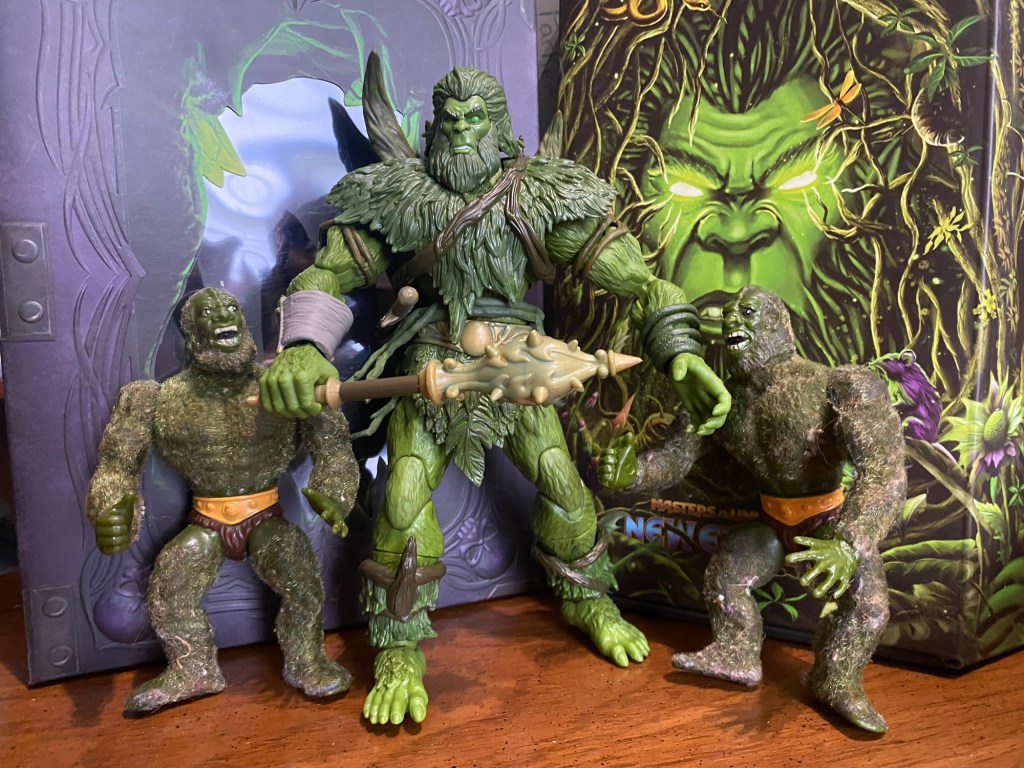
I would eventually get the Masters of the Universe Classics version, which was also flocked. There was controversy at the time…something about “flocked ears.” Mine didn’t have flocked ears.
So how did he turn out? And was he worth the extra $10 paid a year ago? Keep reading!
PACKAGING

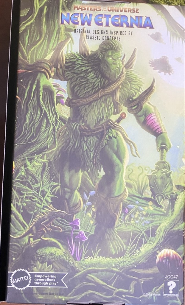
Moss Man came in a plastic-free box that contained no blister, and no photography. All artwork. This is in line with Vykron and Snout Spout. This is a great box to keep for storage, or in my case to beef up the forest scenery in my diorama. It has a large picture of Moss Man’s face with energized eyes, reminding us that in recent versions Moss Man is considered a nature god. This is a wraparound image, that has more plants on both sides and some Eternian animals.
The back has an artwork rendition of Moss Man, rather than a photoshop. So this is very welcome in my book. More Art=More Better. If you watched my YouTube video already, you know I missed the faint images of the Roton flying in the background.
So Roton has been on several MASTERVERSE packages. Is this a hint, Hub City Geeks?
Inside there is yet another figure cover. What is disappointing here is that because the words Moss Man are so prevalent, this isn’t that usable as a diorama piece.
I’m complaining about it not being usable, but it really is. You could cut it up or photoshop it or whatever. They gave you something to work with.

The other side has an opening in the forest revealing the three Eternia towers. It also features a tree resembling Skytree…the oldest living thing in Eternia according to the filmation cartoon series.

WHAT DO YOU GET IN THE BOX?

- Moss Man figure
- Alternate “plant” hand
- Knife (dagger or machete?)
- Belt with knife sheath
- Club (or magic wand/staff?)
So not many accessories here. Notably, he didn’t come with any alternate hands. “The plant hand” thing is also usable in other ways around or on the figure.
FIGURE REVIEW
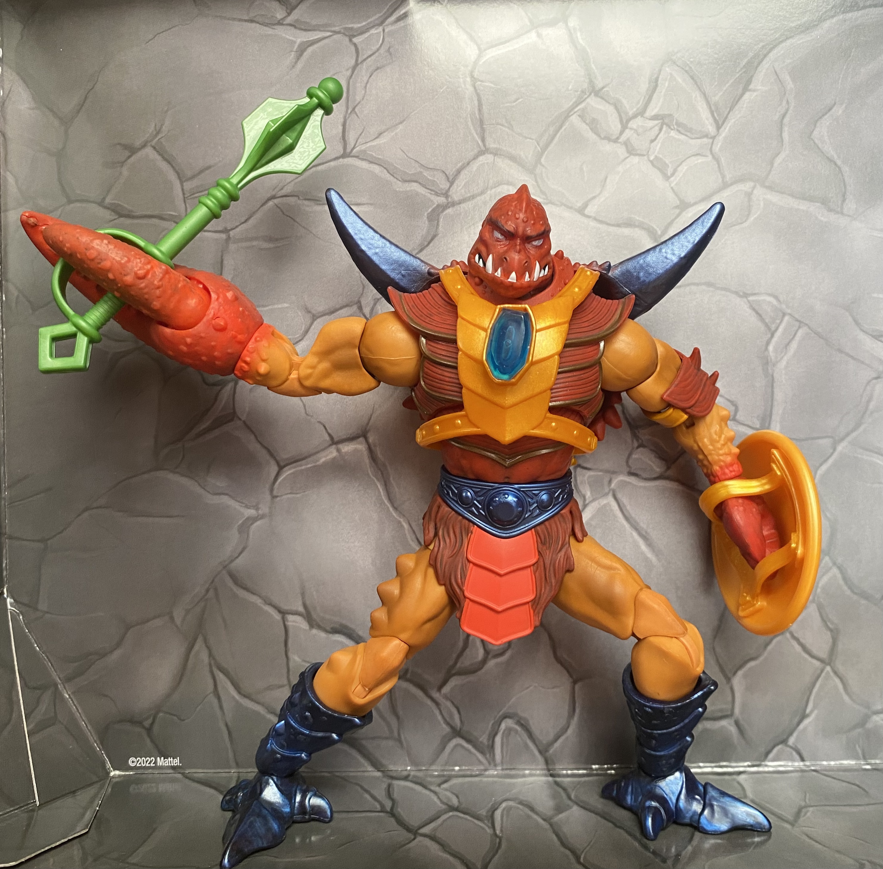
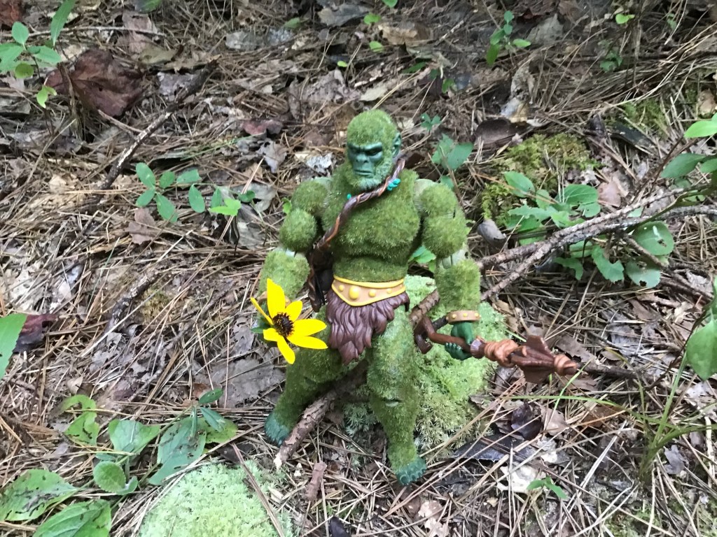
MASTERVERSE New Eternia Moss Man is very large. The horn on his back makes him slightly taller than Snout Spout, and this is saying something! But if you dig a little deeper, you can see what is really going on here.

You basically have New Eternia Beast Man’s buck with an armor piece over the top of it. It is clear that the torso, the biceps and elbows, and the thighs are all the same parts that were on NE Beast Man. And this is kind of fitting, considering that the vintage figure was a repaint of Beast Man with flocking.
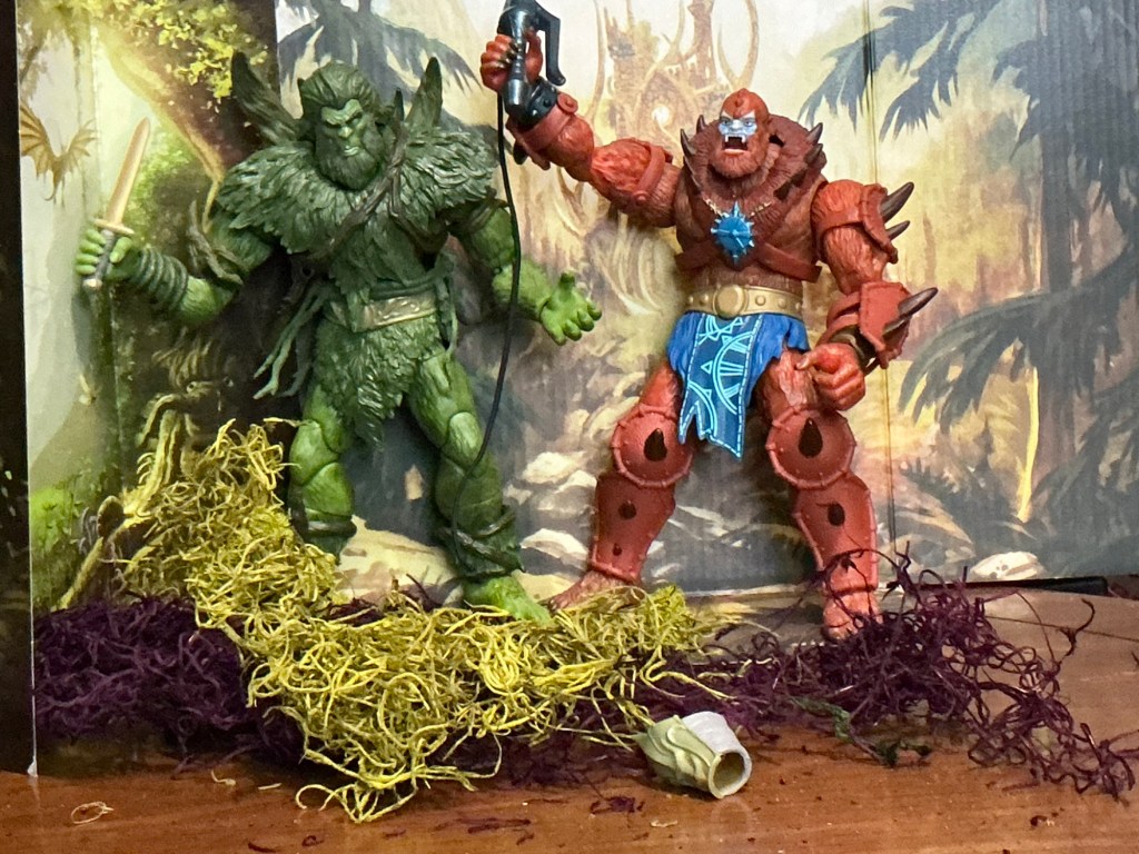
Sometimes I think big companies (like Mattel) want US to forget about stuff that came before. For instance, we had a Moss Man in MASTERVERSE already…it was based on the Kevin Smith show. I never picked it up because it didn’t look like MY Moss Man. And they probably want us to forget about the New Eternia Beast Man shown here. (They have two more recent Beast Man figures…the movie version and the ugly version with the articulated jaw. BUT THE SPARTANNERD REMEMBERS! And so Moss Man is using Beast Man’s parts.
I haven’t removed the armor, but that armor is what makes him so tall…it has the spikes on the back similar to Clawful’s armor.

In turning Moss Man’s head, he has so much Michael Bolton hair that his head can’t turn without popping off when his beard rubs against that armor. This is an articulation point worth mentioning, but it is a common problem so I won’t mark off for it. Just the same, don’t be disturbed if your Moss Man loses his head…it goes right back on.
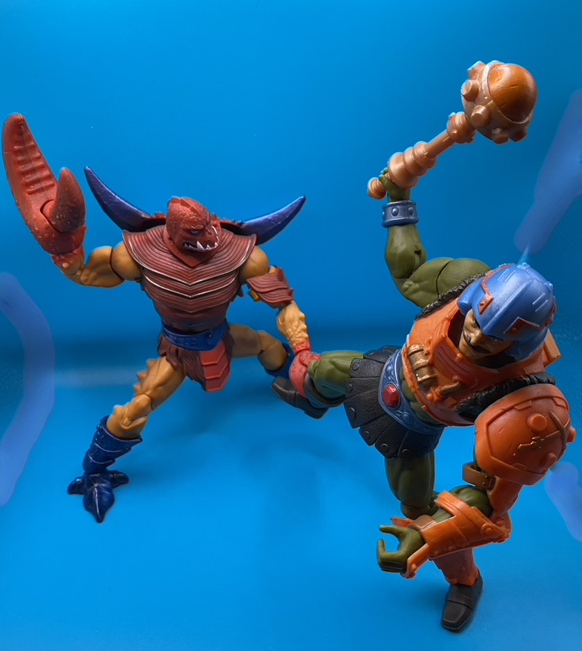
He stands very well, with big feet. But he is kind of stiff in the articulation department. He doesn’t’ seem to be “lanky” like Two-Bad, but he is such a chunk at least I kind of want him to stand there and flex on my diorama.
THE FLOCKING DEBATE
I don’t know how I feel about this not having flocking. The flocking is such an embedded characteristic of the character.
The sculpt on NE Moss Man is undeniably good. But by removing that fuzzy texture (and piney scent,) it is like removing the soul of the character.
Now if he was flocked, we would lose those sculpted details.
By not releasing him with flocking, they increase their artistic opportunities. But I wonder if there might be a compromise somewhere. Also…maybe one day this will be releases with flocking. OK…one more thing. NE Beast Man and a few others have SOFT GOODS. It just seems like somehow that fuzzy furry quality could have been represented somehow. Maybe make that plastic armor piece cloth goods or something. Or the arm wraps cloth goods.
On the other hand, you can clearly see that my two vintage toys have taken a beating. And that flocking has rubbed off around the joints.
I don’t have to have a totally flocked Moss Man, but that part of his legacy needed to be honored here.
Check out this Earl Norem image from the He-Man and the Masters of the Universe Magazine, May 1985 issue. (I haven’t removed the poster, so I can only show the bottom corner)

Check out this DC comic, He-Man and the Eternia War Issue 10 (this one has Skeletor transforming on the front)

DC New 52 designed him with these horns, but just the same he is a hairy beast. He also wears the gold armor that they seemed to favor.
SPARTANNERD RATING
Sculpt- 1 point. My only complaint about the sculpt is that Mattel doesn’t take efforts to hide the joints. But this is across the board in this line. And at large the figures are under $25. So they aren’t Mythic Legions sculpted and engineered by the Four Horsemen studios.
Paint- 1 point. This is a good paint job. Maybe something could have been done to make his face “pop” a little better in a green context, however.
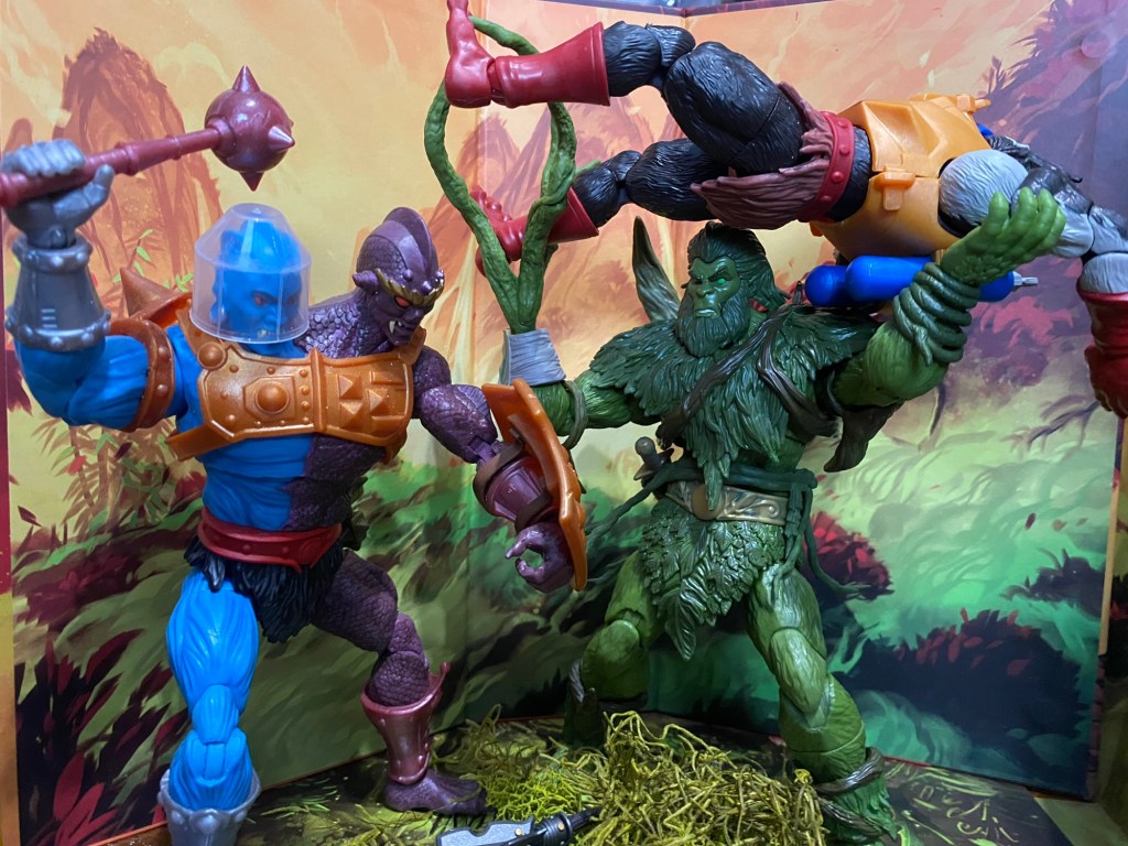
Articulation- 1 point, with no real “stupid problems”. He stands very well, AND in this picture where he is throwing Stinkor at Two-Bad, I left the room for awhile and returned and he was still standing there holding him all stable!
Accessories- Why didn’t this come with more stuff? Why no left gripping hand? BOO! I would even be ok with paying more money for more appropriate accessories.
The feels- Well he’s Moss Man. I have so many fond memories! Playing with him outside in the moss and getting fussed at! On the heroic team, we have needed a Moss Man.
I am not marking Moss Man down for not being flocked. But I am marking him down for not having more accessories. I used that craft moss I got from Hobby Lobby. Mattel should have given us some plants and trees and such. In fact…I had this complaint about the Classics version. (That flower in the photo was in the wild when I took the photo.)

I rate MASTERVERSE New Eternia Moss Man a 4/5, losing a point for not having many accessories. I also feel that there should have been some way to present flocking on this figure, if not having him totally flocked. And it isn’t like the technology doesn’t exist…go check out the Mythic Legions “Bryophytis” (I don’t own this one)…he looks just like Moss Man should with a different head.
Do you agree or disagree? Let me know in the comments!